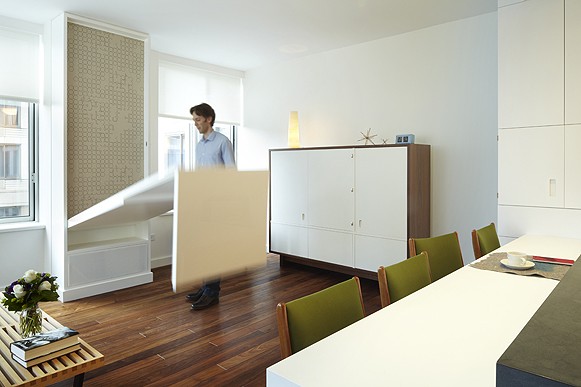
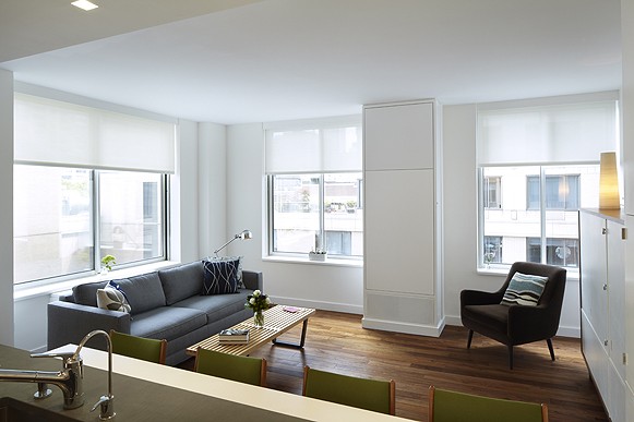
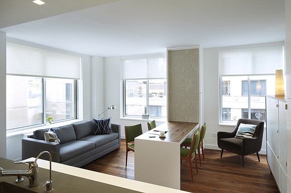
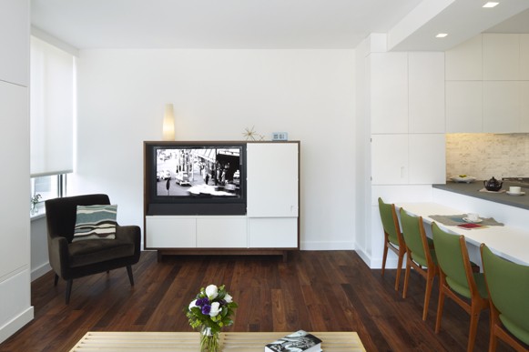
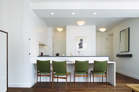
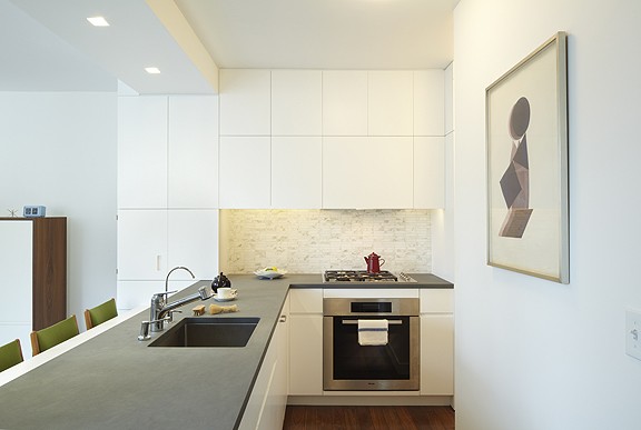
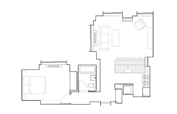
This inventive and efficient Manhattan apartment is only 650 square feet. Yet it looks and feels bigger thanks to the efforts of architects Jon Handley and Melissa Baker of Pulltab Design. A starter apartment of a young professional couple, the project did not have a big budget. So, the architects used several simple solutions and custom multifunctional furniture pieces to achieve the result. The most notable item is the clever dining table, that folds down like a murphy bed when the owners have guests and blends with the wall when not in use. Another beautiful piece is a cabinet, hiding a TV. It looks pristine and uncluttered, while ready to be transformed for a movie night. I am also quite taken by the storage unit, framing the kitchen. It blends seamlessly with the color of the wall, allowing the eye travel and perceive openness of the space. A large mirror and a unified whiteness of the surfaces complete the illusion of a grander dwelling.
Photographs by Mikiko Kikuyama
Thank you!!
When you said not a big budget, what’s the range?
Yes, I would like more details for these intelligent solutions : where can you find the pieces ? or are they custommade ? how much do they cost, app.?
and what is the surface area of the flat ?
Thanks and bravo !
Very cool!!
This seems as a total custom work so I would guess the cost was pretty steep. Begs a question how can a person who can’t afford a bigger apartment afford a custom renovation like this. But, an absolute architectural master piece. Just proves the value of getting a professional designer.




Just loved the blog! Congrats! <3