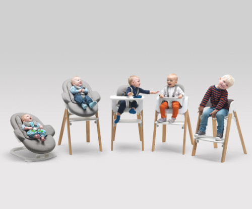
Steps chair by Norwegian company Stokke is designed to adapt to the child’s growth, step by step (hence the name). This modular system will accomodate a baby of 3 to 10 years of age. It can be transformed from a bouncer into a child’s char and everything in between. The piece is made from solid beechwood and PPC-PA, it comes in a variety of colors.
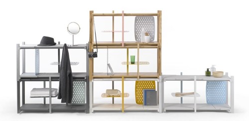
This exciting new shelving system is a creation of the Bangkok based design studio THINKK. They took a simple wooden stackable construction and jazzed it up with corrugated metal sheets. These metal elements can be inserted into wooden surfaces via special slits. They can serve as screens, dividers, even additional horizontal shelves, making this modular system very efficient. The modules are available in natural oak or in a variety of colored stains. The perforated sheets come in several colors, allowing you to contrast or compliment any of the wooden bases. Clever.
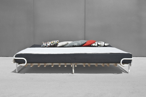
I like the idea of a properly sized bed that can be easily disassembled into pieces and put in the closet. Fin, created by German designers Sofia Löser and Henrik Bettels, is just that – a collapsible bed that can be easily stored and moved. The frame is made from metal tubes, the base – from birch plywood. The plywood pieces follow a specific pattern that ensures the sturdiness of the structure. This design also allows to achieve low material consumption, a happy detail for the eco-conscious.
– Apparently, there is no such thing as “left-brained” or “right-brained”.
– This is every bad corporate ad ever produced.
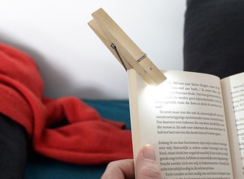
– Clothespin lamp. Yes!
– Hauntingly beautiful photographs of abandoned places.
– Adorable. A pelican learns to fly.
– And something for perspective. The Universe in a photo and a video (the yellow dots are galaxies).
Have a great weekend, everyone!
Clinq hanger by German-Latvian studio Flow Design is a very neat idea. The pieces snap to any metal bar or surface without any messy hooks. And because magnets naturally repel each other, there are always even gaps between the garments in your closet. Attractive to look at, easy to navigate… Cliq is handmade in the EU, using local resources, and comes in black, white and natural birch. Available for purchase from the studio website.
(via minimalissimo)
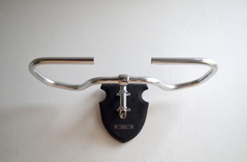
Bicycle Taxidermy is an eccentric project by UK based designer Regan Appleton. The idea first came as an attempt to immortalize his father’s old bikes that could no longer serve their purpose. “A somewhat sentimental take on a mass produced object becoming defunct, the handlebars are given the care and craft of a preserved family pet, – designer explains. – The bikes have now been re-appropriated as a family heirloom.” You have a choice of buying just a plaque (with your own epitaph text, engraved on a stainless steel plate) and mount parts of your departed bike on it. Or you can buy a plaque with the newly sources handlebars already attached. Very cool. The pieces can also be used to hang coats, bags, umbrellas and other items.
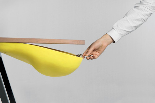
If you are a packrat, you have two choices – fight the habit or make a ritual out of it. The second choice is what this piece of furniture can help you to do. Balka console by French designer Gregoire de Lafforest is a clever and attractive receptacle for all those forgotten items you might need sometime in the future. The top features a shoot through which you simply slide your things out of the way. And an oversized soft pouch is there to help you find them quickly and easily. The piece can also hold keys, loose change, glasses or any other small objects you don’t want lying around the apartment.
Photography by Colombe Clier
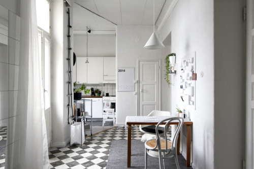
This small home belongs to a Brazilian graphic designer, living in Helsinki. I have stumbled upon her Instagram account and immediately knew I was hooked. I love how airy the place looks, thanks to the strategic color scheme, thoughtful details and smart space-saving techniques. See more images after the break.
(via raw design blog)
De Rotterdam is a mixed-use vertical city in a former harbor district in Rotterdam, Netherlands, built by the famed architect studio OMA. One of the cool things these towers offer is a series of small urban apartments that measure under 650 square feet. I was delighted to see how these spaces were organized. In the video above you’ll see a tour of the apartment and demonstration of various space-saving tricks. Enjoy!
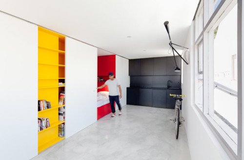
This small studio apartment in Sydney has been designed by Nicholas Gurney. The ascetic approach has made this 27 square-meter space is look spacious. The uniformed whiteness of the room is interrupted by the yellow bookcase, which is covered at night by a sliding panel, in turn revealing the built-in red sleeping area. The third functional zone, kitchen, is black. Thus, color only marks the utilitarian areas, leaving the rest of the apartment bare and untouched. Clever and beautiful. “The micro apartment offers a proposal for future high-density urban living for one person families; the fastest growing demographic,” – designer states.
Photography by Katherine Lu
