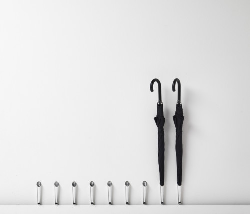
When the space is tight, even such an innocent thing like an umbrella stand can ruin the flow of the entryway. Italian designer Carlo Contin and furniture manufacturer Mogg came up with the clever solution. This minimalist floating umbrella stand, called Piove (“it rains” in Italian), only stands out a couple of inches off the wall. Made from aluminum with a mirror finish, the piece can be used both inside and outside. It features a small hole in its base, through which the moisture from a wet umbrella evaporates. Beautiful.
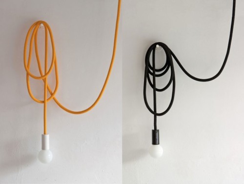
Here is a nice concept for those of us who live in rental buildings and can’t be very creative with electrics. The Loop Lamp, envisioned by Romanian designer Pani Jurek, can be attached to any available outlet and brought over any, even distant, surface. The 23′ cord will allow you to hang the lamp under the ceiling or as a sconce fixture on the wall. You can also move with the light to another room. What a lovely idea! The cord is available in black and yellow, the bulb socket comes in black, white, raspberry red and denim blue.
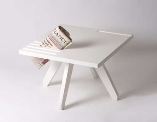
Good News is a small table created Norwegian designer Karl Marius Sveen for the furniture brand Mokasser. This simple and elegant piece holds your magazines and newspapers without cluttering the surface. The table is made of oak wood veneer and comes in three finishes: white, black and natural. A nice idea for a coffee or side table, especially when the space is tight.
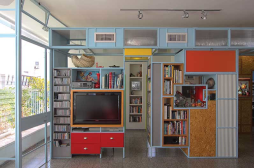
This small Tel Aviv apartment is a home to a family of three, designed by Benjamin Lowenstein. The open space is divided by a partition in the middle, creating privacy for two workspaces and a library. Made from iron and pressed wood, the partition is coloblocked with shades of blue, red and yellow. These friendly colors inform the scheme and the vibe of the apartment. Another clever part of this layout is that the partition is built perpendicular to the wall of windows, allowing light travel freely in all areas. I love how other elements of the place pick up the aesthetic of this core feature. Like the kitchen, which is adjacent to the partition, is continuing the colorful theme with bright green and pale pink accents.
Photography by David Frenkel
– Possibly the best looking patisserie shop I’ve seen to date.
– My friend Joe of the great Bookofjoe blog spotted this stunning trailer (and even had a look inside).
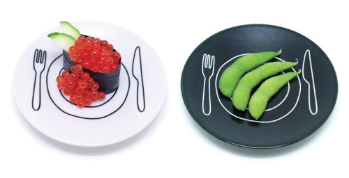
– Love these playful plates by Duncan Shotton.
– Simply wow. A 15th century cathedral transformed into a modern bookstore.
– An amazing view of a bike jump.
– Have been hypnotized by this picture all day.
– The end of Starbucks? A cool concept for a digitalized barista kiosk.
– A new to-do app that holds a lot of promise (I’m still loyal to my teuxdeux though).
Have a pleasant weekend, ladies and gents!
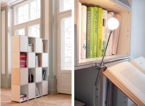
This modular storage system from German design duo StudioMok rethinks the traditional stationary shelving idea. The boxes are held together with strong magnets, allowing you to create multiple configurations in a snap. The collection is comprised of simple rectangular components that can be put together to fit your needs or space requirements. The same magnets that hold the shelves in place can be applied to secure various accessories – bookends, lighting fixtures etc. Easily rearranged, the shelving system adapts beautifully to life changes and can be taken apart for moving and storage.
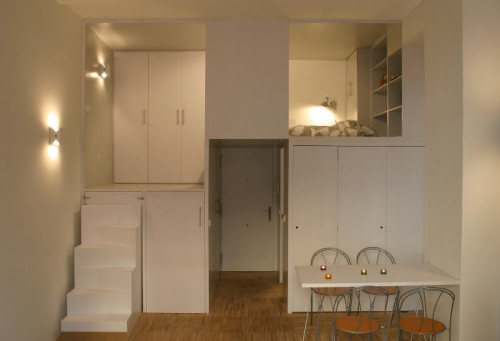
This tiny apartment in Madrid, Spain has been designed by Beriot Bernardini Arquitectos. A 28-square-meter pad has been transformed to include all functional attributes of a much larger space. The clever loft box, built above the kitchen and bathroom, includes a sleeping nook and an ample storage. Even the very steps to the higher level serve as an extension of the closet. This concentration of elements allows the rest of the apartment to remain open and spacious. The unified whiteness of the place creates an illusion of openness and volume.
(via desire to inspire)
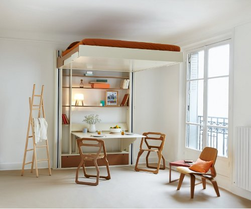
I’m in Europe right now, and I came across this interesting piece of furniture – mobile bed. A clever hybrid between a murphy bed and a loft bed, this piece can maximize space and create multifunctional areas (a concept particularly useful for shoebox dwellers). The bed is simply lifted to the ceiling when not in use, allowing you to enjoy the extra room. And, unlike murphy or loft beds, the mobile bed doesn’t require you to climb any stairs or adjust messy bedding. Simply lower it down when you’re ready to turn in for the night. Quite brilliant. Available for purchase here.
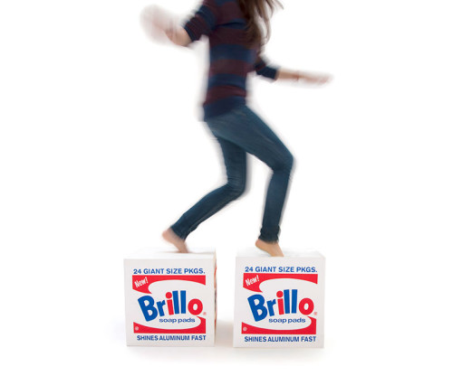
Editor’s note: This is a guest post from Donald M. Rattner.
In 1964 Andy Warhol made a huge splash in the art world with his Brillo sculptures. Blurring the boundaries between art and industrial production, Warhol asked whether these two previously distinct categories could remain separate in an age of mechanical reproduction and mass media.
Recently, the Andy Warhol Foundation teamed with the multi-disciplinary interior and product design firm Quinze & Milan to ask the question again today – only now it’s a piece of furniture that bears the famous logo. Made of plush and easy-to-clean QM foam, and measuring 15 3/4 inches in all directions, the Brillo pouf works as a seat, an ottoman, a pedestal or your own piece of post-Pop sculpture. Purchase here.
– How to core a head to iceberg lettuce in 3 seconds? Watch.
– Adorable. Baby LED light suit halloween costume.
– This wooden bread knife is a beauty.
– Typography geeks – for your enjoyage. Type:Rider app.
– Another smart way to deal with unruly cordage.
– The world’s worst cities for air pollution (not the ones you’d expect).
– An amazing installation – Trace of Memory.
– And something for the senses – panda sunset.
Have a lovely weekend, everybody!

