
I’m a big fan of the Bouroullec brothers’ designs, and this particular one is especially endearing. The little smooth shelves, called Corniches, create beautiful and multifunctional storage. Here is how designers describe their idea: “The same way that we hang our belongings on a rock jutting from a cliff before diving into the sea, we need small, informal storage in everyday life too.” Shaped as individual, isolated protrusions in space, Corniches adapt to your unique taste and purpose. Use them for your keys beside the front door, as a pedestal for a small collection of objects or as a broad wall display, – the choice is yours. And to aid your creative process the manufacturer, Swiss brand Vitra, created an iPhone app that lets you take a picture of your wall and virtually test the location of your chosen shelves. So cool. Corniches are available for purchase here.
– The first look at the new exhibition of Ron Mueck’s brilliant sculptures.
– As a formal Brooklynite I have a soft spot for the projects like this one – Constellation Quilt by Haptic Lab. (via swissmiss)
– Fascinating. How histrorical figures would look today.
– I heart this mirror. What a clever idea…
– Dramatic shots of volcanic eruption made from space.
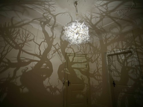
– A really cool chandelier that creates tree shadows.
– The Inbox – a short film depicting spam messages.
– And something for the senses – a stunning shot of cherry blossoms in bloom in the Tszuki Ward of Yokohama, Japan.
Have a great weekend, guys!
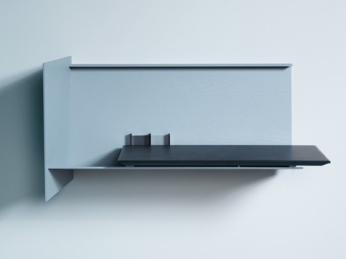
The Desk Pad by Eric Degenhardt is a minimalist and space-saving alternative to a traditional home office arrangement. The piece is wall-mounted, which means – no precious floor real estate have been wasted. Perfect for those of us living in tight quarters! I also love the combination of thin powder coated steel and leather. The Desk Pad contains storage compartments for you files, papers and writing tools. Though compact and streamlined, it has enough space for a power strip, a necessity of our time.
(via trendland)
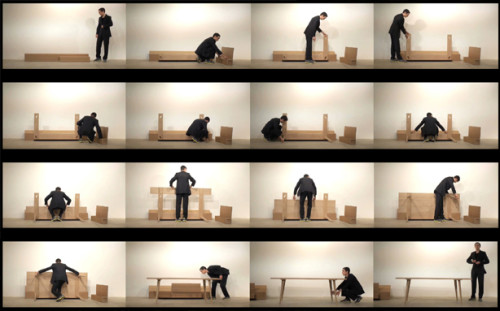
It is always a thrilling moment when a good idea makes it to the production line. Even more thrilling is actually seeing it happen. One of my all-time faves, the Timber table by talented designer and carpenter Julian Kyhl, is about to be funded at ideacious. So, ladies and gents, if you’re on a market for a collapsible dining table – check it out. Watch the mesmerizing assembly video after the break to see how the piece works.
(thank you, Kenna)
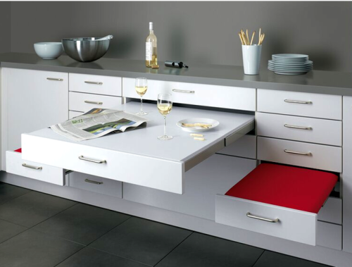
Last week I made a post about a disappearing kitchen, this time – it’s a dining room that disappears. German manufacturer Alno created a set, table and two seats, that is built right into the kitchen cabinetry and can be tucked away when not in use. A lovely thought for a tiny space dweller. Although the weight capacity of the pull-out pieces is a concern, I really love the idea. In a small studio where all functional areas are interchangeable, it is nice to have an option of a dining set that takes no room. I’m curious though – what kind of witchcraft magic designers used to fit the table into that narrow cabinet…
(via core77)
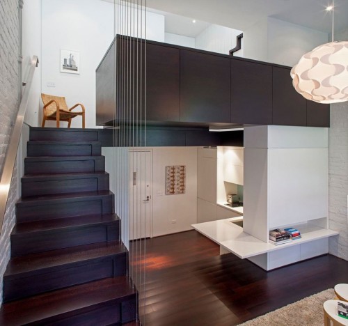
This beautiful loft is located right in my neighborhood, Manhattan’s Upper West Side. The initial layout was challenging, as many New York apartments are (see the dramatic before photos after the break). The footprint of the place is only 425 square feet, but luckily the height of the unit is ample and generously crowned with access to a roof terrace (a big luxury in our steel jungle).
Here is how the architect, Specht Harpman, describes this project: “Our solution created four separate “living platforms” inserted within the space that provide room for all the essentials and still allow the apartment to feel open and light-filled. Given the minuscule size of the apartment, every inch of space is put to use. Stairs are not merely for circulation through the apartment, but feature built-in storage cabinetry and drawers below. The main bath and shower, in fact, are also built below the primary staircase. The kitchen featured fully concealed appliances, flip up high storage units for easy access, and a countertop that wraps into the main living space, becoming a virtual “hearth” with built-in entertainment system.”
Thanks to all these built-ins, there isn’t much need for the traditional furniture. Only three pieces remain – a couch, a bed and a chair. This ascetic approach creates some open space and contributes to the minimalist style of the interior.
Photography by Taggart Sorensen
(via contemporist)

– Gorgeous monochromatic underwater photography by Hengki Koentjoro.
– Remember Patch, a stylish self-watering planter? They are Kickstarting! Pledge to get yours.
– First Taste – an adorable video of children tasting unfamiliar foods.
– Really heart this notebook/iPhone holder by DODOnotes.
– A weird and funny ad for Windows.
– If we have to dwell on our failures, let’s do it creatively – The Museum of Brocken Relationships.
– This awesome Pumpcast video has made my day.
– A stunning thread bookcase by Raw Edges.
Have a pleasant weekend, everybody!
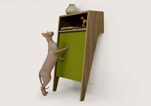
Every cat-lover has to face the inevitable – cats will always attempt to scratch furniture. Of course, you can try to plea, negotiate, threat and/or offer them scratchy toys. But all these patronizing techniques are usually dismissed by the animal, who is infinitely better at patronizing than any human. Not to mention – scratchy toys add clutter to the room. So, what are the options? I quite like the idea, developed by artist and designer Crystal Gregory for studio Modernist Cat. She incorporated scratch-pads into lovely mid-century inspired storage. The Circa50 console, aside from the cat-friendliness, is a beautiful leaning piece, ideal for any small apartment. It takes very little floor space and creates a functional solution for keeping important items at hand, while giving your cat the ultimate place to express herself. The piece is handcrafted from walnut hardwood veneer ply and features removable/replaceable carpet tiles for scratching. The carpet tiles are available in five colors.
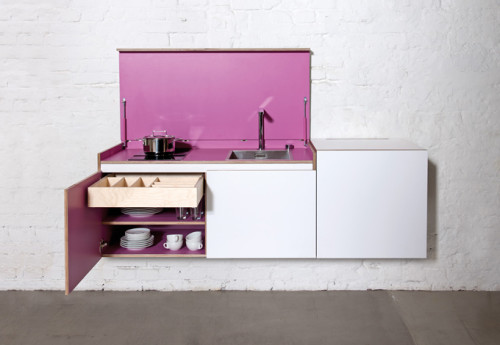
Miniki modular kitchen has been created with small spaces in mind. Designers considered the fact that in most studio apartments cooking and lounging areas are squeezed into one room. So they envisioned a kitchen that disappears after use. “This is the only way to turn the living room back into a room to live in,” – they point. The finished product is a beautiful and clever system of three interchangeable units that hide all cooking paraphernalia and look like an elegant sideboard. Fabulous. And with 15 colors available – there is every chance to customize the piece for any interior. Miniki kitchen scored several awards including the Reddot Design Award 2012 and the Interior Innovation Award 2013.
(via stilsucht)

It’s that time of year again when urban folks experience seasonal envy toward those who can grill on their backyards. I say, embrace your limitations, fellow-urbanites, and check out this cool item from German designer Henrik Drecker, called Bruce Handrail Grill. As the name suggests, the piece is attached to the handrail of your balcony (or fire escape). It functions like a proper charcoal grill and takes as much space as a flower pot. The grill can also be attached to the wall directly for a more permanent arrangement. Love it!
(via like cool)
