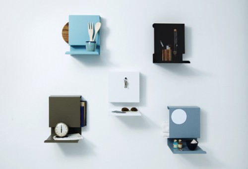
This cool and versatile shelf from Danish design studio Linde&Linde takes very little space while providing a convenient solution for many storage scenarios. The item is perfect for entry area, kitchen, bathroom, home office, even by your bedside… Made from powder coated metal, it can also double as a magnetic board. The variations are endless. The shelf comes in a variety of neutral colors.
Editor’s note: This is a guest post from Donald M. Rattner.
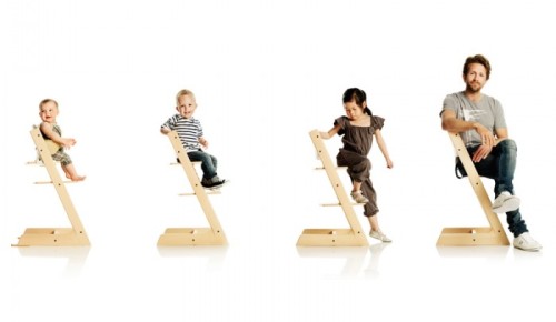
In 1972, Scandinavian designer named Peter Opsvik took it on himself to revolutionize the design of infant high chairs after watching his son’s struggles with table eating. The result was the Tripp Trapp Convertible High Chair.
Opsvik’s thoughtful response to the challenges of early eating stages was to more fully engage the child with loved ones by making it possible to slide the chair right up to the table without an intervening tray. Presciently, he also designed the chair to accommodate growth by making its various parts adjustable, thus anticipating today’s cradle-to-college design philosophy and its associated environmentalism.
Winner of multiple awards, the Tripp Chair was selected as the signature piece at MoMA’s 2012 exhibition “Century of the Child”. Check out the wonderful video produced by the museum. Purchase here.
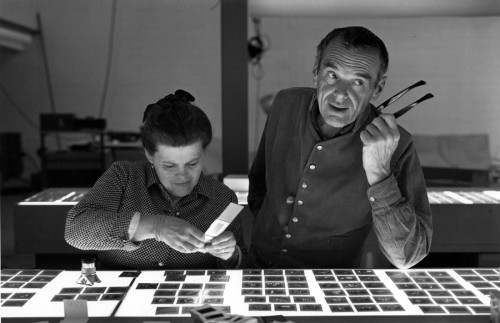
– Feed your Eames fetish, if you have one – Best Eames Videos.
– Absolutely stunning parking garage in Miami (thank you, Steve).
– Fascinating read about quantum computing.
– The mystery of Prince Rupert’s Drop explained (and shot with a high-speed camera – yay science!).
– Incredible lava kayaking footage.
– The most confortable mug in the world. Why haven’t I thought of that…
– Here is what you can do if you have a slow day at the office and lots of post-its. Post-It Note Arcade.
– And for your visual pleasure – a plane dives into fog…
Have a fantastic weekend, everybody!
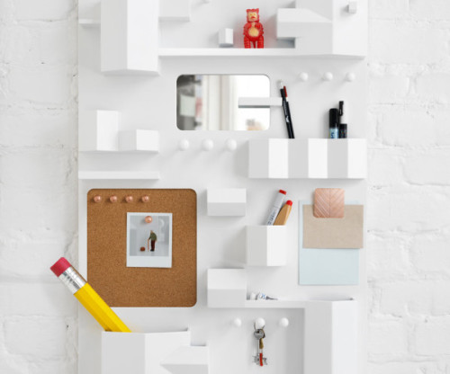
I’m a big fan of Note studio designs, and this one is especially delightful. Suburbia is a wall storage, created for Italian brand Seletti. The piece is made to resemble the bird’s-eye view of a town. Each cubby represents a house or a section of a building. Adorable! The piece is made from wood with brass details.
(via design-milk)
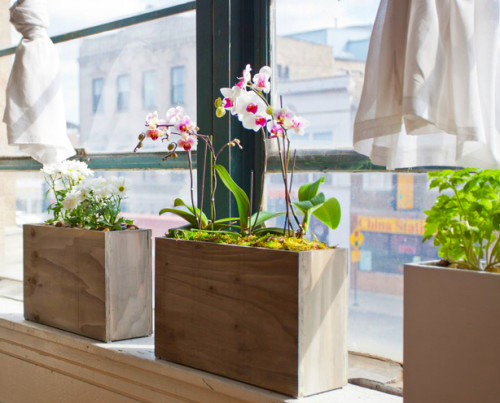
There are quite a few hydroponic systems out there, and they all make sense in terms of cultivation of plants (more or less). But there is one thing I dislike about many hydroponic kits – they tend to look like appliances rather than beautiful planters. Luckily a Chicago couple Sarah Burrows and Nick Behr managed to bring together technology and aesthetics by creating Modern Sprout, a stylish windowsill box you actually want to look at. Here is how Nick and Sarah describe their project:
“Modern Sprout was created by the two of us, two people who live and work in a tiny apartment. As avid cooks, eaters, and project planners, we decided the next logical step was to grow our own garden. Unfortunately, we have no space. (Our small Chicago apartment doesn’t have a yard). After researching non-traditional options, we found hydroponics. But every kit we tried was expensive, difficult to set up, and more homely than homey. We were unimpressed with our options, so we planted the seeds for Modern Sprout. Now we provide planters that are simple, stylish, and fertile with success. Just add water.”
The planter is narrow enough to fit any windowsill, tall enough to hide all its hydroponic equipment inside and comes in four finishes – chalkboard, weathered gray, high-gloss white and reclaimed wood. Pledge on this Kickstarter page to get yours.
(via urban gardens)
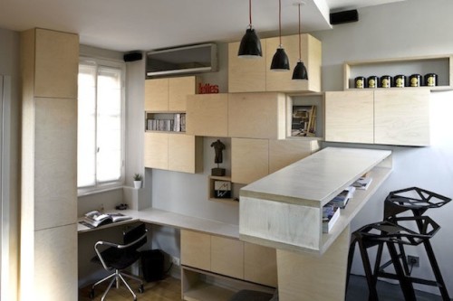
This tiny apartment in the Montparnasse neighborhood is a collective effort of architects Marc Baillargeon and Julie Nabucet. Converted from a master suite, it is now a 130 square foot dwelling for one. I am very impressed with the use of space in this project. By elevating the kitchen/dining/bathroom area designers created a clever hiding place for a full sized mattress that doubles as a sofa during a day. And of course the place is a showcase for custom made storage. Steps to the second level, desk, wall cabinetry – all these elements allow storing things without cluttering the view of the apartment.
(via inthralld)
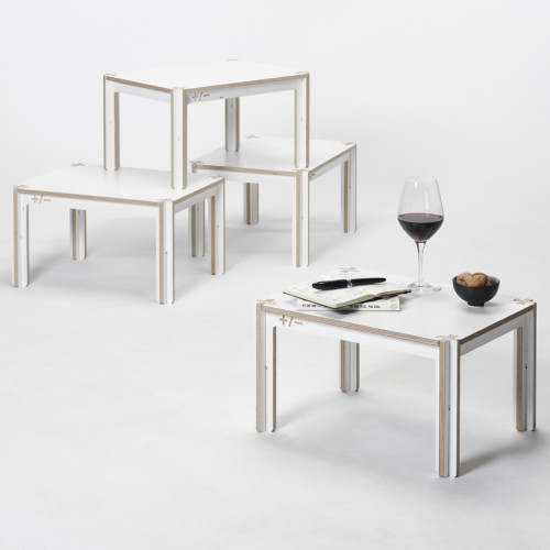
+ Table series by Amsterdam based studio Fraaiheid is a line of multifunctional pieces that can be used for working and dining. The + in the name refers to the connecting principle. Each table can be assembled in minutes without the use of hardware or tools, simply by interlocking the parts. The pieces are made from CNC-cut laminated birch plywood and come in a variety of colors.
(via minimalissimo)

German designer Florian Gross, whose work I featured in some of my previous posts, came up with a cool new lighting fixture – Kobe. Inspired by the hyperbolic cylinder, the piece consists of twelve oak slats, two aluminum disks and a lamp socket. To assemble the lamp simply clip wooden slats into the indentations of the two aluminum disks and twist them into position. You can change the height of the light and silhouette of the lamp to your liking. And it’s just as easy to take apart for moving and storage. Beautiful.
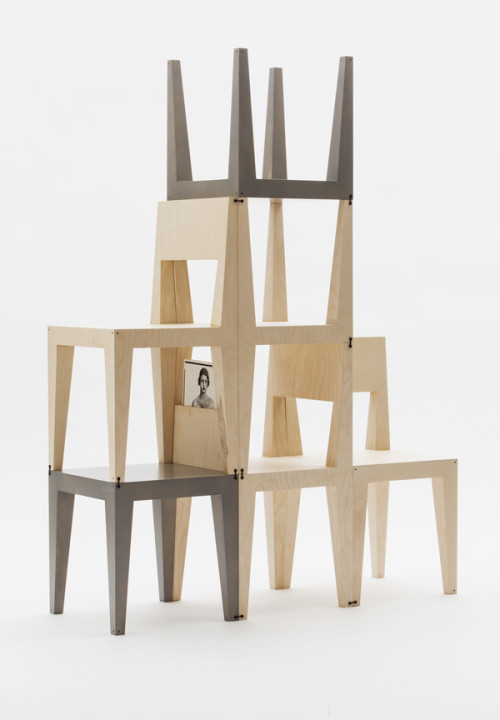
Seating and storage are the things any home needs more of. So Sweden based designers Kyuhyung Cho and Hironori Tsukue obliged and created the Oneness collection, consisting of two chairs and a low table that can be flipped, stacked and turned into a shelving unit. Designers explain their vision: “The multifunctional purpose and extendable system can enrich a variety of spaces from office to home, through its simple, combinable and modern form inspired by the fusion of East Asian and Scandinavian design.” The assembly is easy and intuitive – the structure is fixed by connecting each element with a clip inserted into small holes on the corners of the chair or table. This way you can build your storage as high and wide as you like by adding more chairs and tables. When the chair is turned upside down to make a shelf, it reveals a hidden space on the bottom of the back for books and other small objects. Oneness is made from Finnish natural birch plywood.
– Delightful on many levels – desserts, inspired by modern art. And more.
– Rejoice, lazy humans, there is now a cleaning robot for an iPhone.
– Now this is seriously cute – Helveticat.
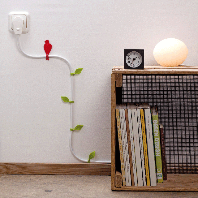
– Another creative way to deal with cordage – Wire Blooms.
– Utterly awesome idea – The Minuum Keyboard Project.
– This is how vintage social networking might look.
– Absolutely stunning yarn typography installation by Pae White.
– And something universally beautiful and for some lucky people nostalgic – The Quiet City: Winter in Paris. #sigh
Have a great weekend, guys!
