– Gorgeous pet portraits by Gerrard Gethings.
– The cool things you can go if you have two iPads mini.
– Absolutely incredible site. It allows you to design your own jewelry in the real time.
– Aww… Kinder Surprise marriage proposal.
– Possibly the world’s best looking water filter.
– Stunning. City Hall subway station.
– Amazing natural phenomenon – frost flowers.
– This made me laugh – world’s first portable phone.
– The Little Prince in brail. Beautiful.
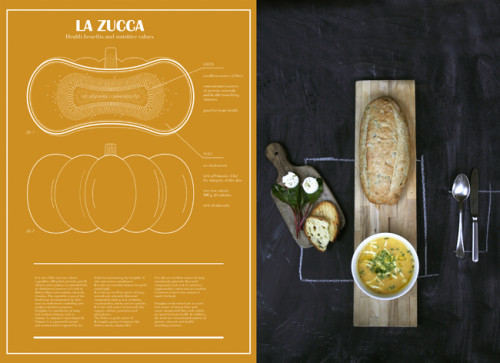
– Stunning architectural food diagrams by Valentina Raffaelli.
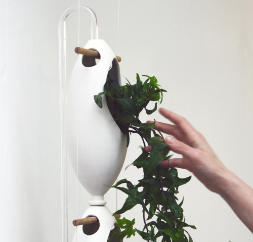
If you are an aspiring (or even accomplished) indoor gardener – this cool hydroponic system will delight you. Designed by Cristiana Favretto and Antonio Girardi of Studiomobile, the Re-Watering vertical garden allows you to grow your plans all year round. One of the neatest features of the project is the water-reusing technology. It rotates and filters water automatically, so the plants are being watered and the planet’s precious resource is being saved at the same time. The watering column and the three egg-shaped components are handmade from ceramic, a material that looks lovely next to any plant. And because the system is suspended from the ceiling, it takes no counter space – a godsend for small apartments. Check out the installation procedure after the break.
(via klat magazine)
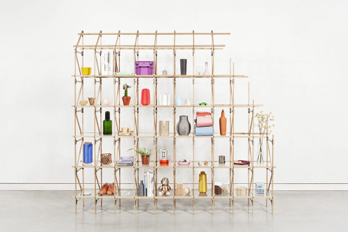
Dividing rooms with shelves is every shoebox dweller’s natural decorative reflex. And many designers today cater to this universal need for zoning and storage. Divider, and interesting item by Danish designer Mieke Maijer, has caught my eye. Looking a bit like a neat scaffolding, the piece is delicate and transparent. You can regulate your privacy level simply by filling the shelves. Based on a classic Lattice structural principle, the shelves are lightweight and sturdy enough to span upwards and forwards. Divider consists of thin oak slats connected by steel plates, which give it a cool industrial look. The product is modular and fully customizable. Within the Divider system variations in height, length, depth, composition, form, color and material are possible. You can also choose between open and closed shelves by adding panels and boxes.
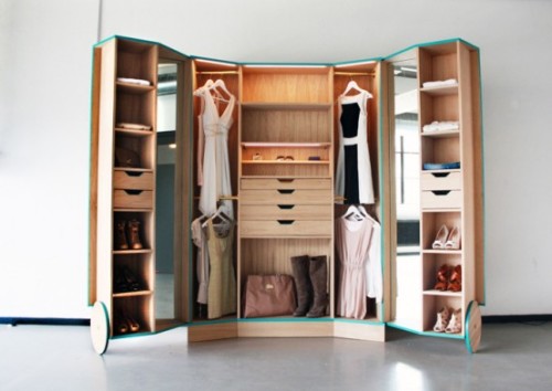
What shoebox dweller doesn’t dream about a walk-in closet… And while real estate limitations are hard to overcome, the solution might still be found. Consider this clever wardrobe by Netherlands based young designer Hosun Ching. The innovative item opens up to create a dressing room experience. Here is how Ching describes the idea:
“The depth of a standard wardrobe is 60cm. That is simply not practical, because it means that you literally lose sight of your clothing; and what you don’t see, you don’t wear. Walk-In Closet is a smart storage unit designed to solve this problem. It opens out into a mini-fitting room, complete with mirrors to view outfits from every angle. The focus is on organisation and visibility. There are drawers for accessories and the reduced depth does away with those ‘hidden’ stacks.”
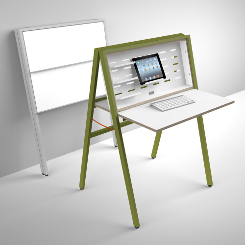
HIDEsk by Michael Hilgers of studio Noroom is an inspiring way to deal with space limitations. The foldable piece allows you to create a work area anywhere instantly. This pop-up office can change a bedroom or a hallway within seconds into a small but functional working space. The powder-coated metal back hides cables and chargers and can be individualised with flexible aluminium shelves. The frame and flap are made from durable birch plywood with white film coating. In its folded state HIDesk takes as little room as a folding chair and can be stored easily. The product will be officially premiered at the IMM Cologne in January.
Editor’s note: This is a guest post from Donald M. Rattner.
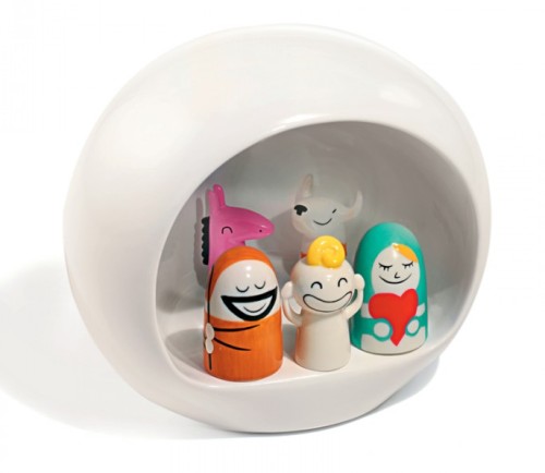
Porcelain figurines are among the great traditions in European decorative arts, but that doesn’t mean contemporary designers can’t make their own contributions to this rich legacy. Case in point: the charming Presepe Nativity set from Alessi.
Designed between 2007 and 2010 by comic strip artist and illustrator Massimo Giacon and Alessi designer Laura Polinoro, the set includes 5 hand-decorated figures and a wonderful manger in a symbolic egg shape.
The basic set comes with the manger and five figures: Baby Jesus, Joseph, Mary and two animals. The Three Magi, a pair of Sheep, Amir and Camelus, and two sets of angel musicians can be purchased separately to expand the scene. All of the figures are rendered in a smile-inducing illustration style that aptly conveys the joyous nature of the holiday.
The scale of the figures makes them very suited to a small space. The manger measures 6 1/4 by 5 by 5 1/4 inches, and the figures range in height from 3/4 to 2 inches. Purchase them here.
I don’t usually come back to the same topics, and I have mentioned this apartment in one of my previous posts. But there is something in Kirsten Dirksen‘s films that makes you see the same space from a completely new perspective. And what a space it is… So, I thought a revisit was in order. Enjoy!
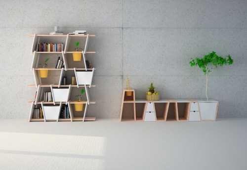
Korean design studio Monocomplex created this innovative modular shelving system, called Hide and Seek. Beautiful geometry of the shelves combined with harmonious plant integration make for ideal urban storage. Choose between closed drawers and open sections, straight and tilted dividers, regular shelves and the plant friendly ones. Such an elegant idea. I especially love the clever compartment for bigger flower pots incorporated into the unit. You can have an actual tree without sacrificing any floor space. That’s hard to beat.
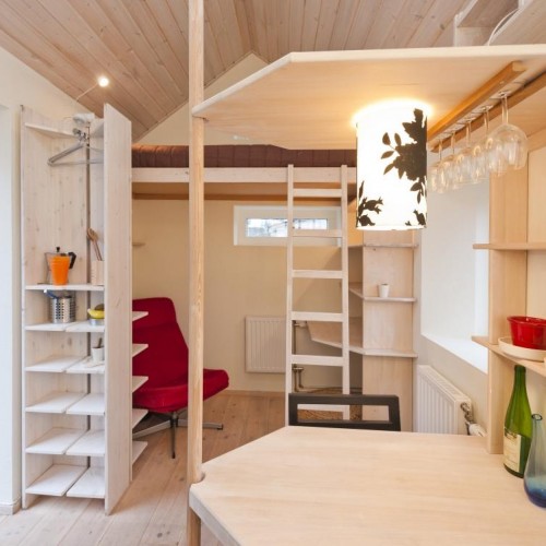
Here is an interesting student dwelling concept from Swedish company AF Bostäder. As an alternative to multi-unit dormitory housing, they have built a small cottage with all the essentials a young scholar may require. The place includes a kitchenette complete with dining area, a shower bathroom and a sleeping loft. A study desk is conveniently located below the sleeping area. There’s even an outside plot for a bit of gardening. The projected rent amount for the cottage is the equivalent of $370 – something any student can afford. Right now the company is petitioning authorities to expand and create more free-standing student houses like this one. And the existing sample cottage is a subject of a steady competition among students for the right to live there.
(via dornob)
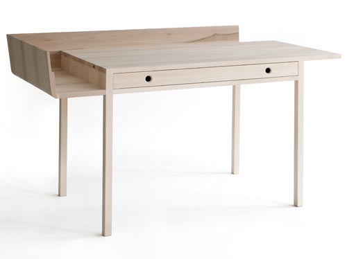
November Desk is a beautiful little piece created by Danish designer Louise Campbell for Nikari brand, as part of their 2012 Designs for Nature collection. The desk is made of solid maple and treated with a natural oil mixture. I love the clean and minimalist look of the piece. The asymmetrical outer shelf provides additional paper and book storage while the wide drawer can hold all your writing paraphernalia. I’m also quite moved by the poetic description submitted by designer herself: “November: my cold, dark, wet and windy enemy. How to find something good in you? I think of gentle light, maybe just a candle, a soft chair, this little desk, its drawer full of pens, its shelf full of paper, and I can almost welcome you.”
(via design-milk)

