Editor’s note: This is a guest post from Donald M. Rattner.
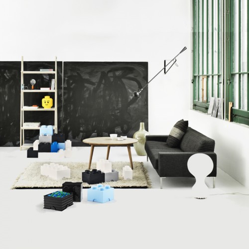
It’s interesting to see what happens when you take a traditionally small design object and then blow it up to many times its conventional size. In the case of the classic LEGO® brick, the result is something both different and the same, as demonstrated by these new Room Copenhagen LEGO® Storage Bricks.
What’s clearly the same in the oversized versions is their interlocking capability. Like their diminutive counterparts these bricks can stack and join with each other to form larger compositions. Classic LEGO® colors, such as black, blue, yellow and white, are also recognizably consistent with their models. All this means you can build stuff that looks a lot like classic LEGO® – only much, much bigger.
But the real news is that these bricks are in fact cleverly designed storage bins. Pop off the lid, and inside is a generous amount of space for storing all sorts of stuff, including your LEGO® collection! Available for purchase in multiple sizes here. Circular storage heads add a dash of whimsy and can be found here. Hope you like it. And that you had a happy thanksgiving.
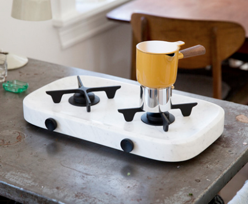
Tuamotu gas top by Norwegian studio Andersson & Voll is an elegant portable solution for limited space cooking. The solid marble base and cast iron details create a perfect combination of contemporary slickness and rustic warmth in one piece. I love how elegant and luxurious the piece looks, especially for a pragmatic space saving design. The Tuamotu cooking hob (along with the Good Morning moka pot, which is also a stunner) was shown at the Design Tide Tokyo exhibition as part of the Food Work, a collection of objects for cooking and eating produced by eight Norwegian designers.
(via dezeen)
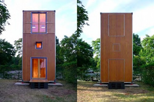
Architect Han Slawik built this tiny home, called Housebox, as an attempt to create an affordable housing solution for people on the move. Inspired by shipping containers, the place is only 150 square feet big. Thanks to the fact that Housebox is a three story building, its footprint is even smaller, approximately 75 square feet. The first floor houses a small kitchen, dining area and bathroom; the bedroom is on the second floor, and the third floor is a place for a living area. Smart storage solutions around the house make this layout efficient. The benefits of this concept are numerous – the house this compact can be moved, it can fit in tight spaces, even parking lots. A true nomad home…
(via inhabitat)
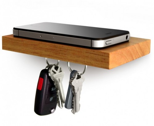
It’s that time of year again when small thoughtful items are in high demand. This little floating shelf can be considered a great gift to someone who is struggling with limited entryway space. Plank by iLoveHandles can hold your phone, wallet, glasses and other essential whatnots. The magnetic underside is perfect for your keys. The installation process is a 3-step breeze (described on the box the shelf comes in). Lovely.
– An utterly stunning project – Wine Museum in Lavaux.
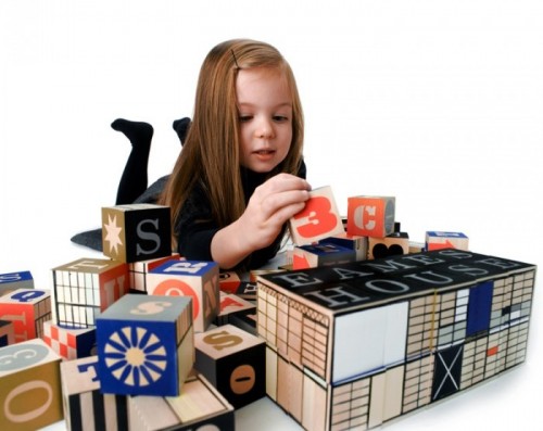
– Raising an Eames aficionado? Then this East House block set is a must.
– Fascinating. Birds teach secret passwords to their unborn chicks.
– The Ministry of Silly Walks clock – instantly wishlisted .
– Wild animals like you’ve never seen them before – amazing photography by Tim Flach.
– Something cool for next summer – Yield picnic bag/blanket.
– Gorgeous and designy new hotel in Nolita, NY.
Have a fantastic weekend, everybody!
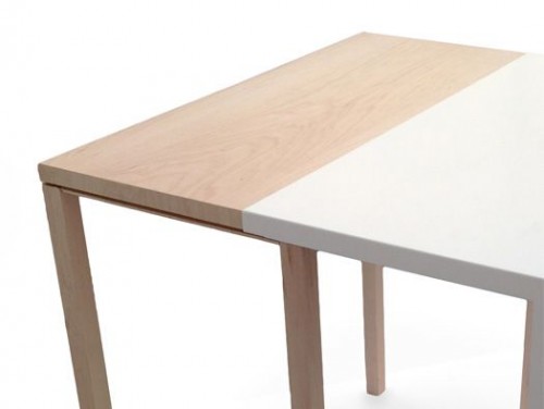
It is always exciting to see innovative extendable dining tables. This piece, called TTabe and created by UK based designer Joshua Browne, is definitely a noteworthy one. The idea of the table is quite brilliant – a sheet of metal simply glides over the existing wooden table, hiding it when extra table top is not needed. No mechanics or elaborate construction elements. A combination of maple and white sheet metal creates a nice visual effect. Here is what the designer says about the piece: “The purpose of the TTable is to enable users, who are living in small flats with little or limited space, to have a dining table that can allow for both one person to dine alone or, with the extension, accommodate for both visitors and extra space.” Amen.
I recently came across this local wood shop, specializing in bike storage. You can imagine my excitement! Father and son operated business, called Urban City Bike Shelves, is located in Queens, NYC. “Originally, this idea of a bike shelf came about by living in NYC and trying to make small apartments comfortable, stylish, and creative,” – designers say. Not only these shelves display your bike as an art piece, they also serve as extra storage for your books and various entryway items. Each piece is handcrafted from either cherry or walnut wood and finished with natural wax. Dimensions are customizable.
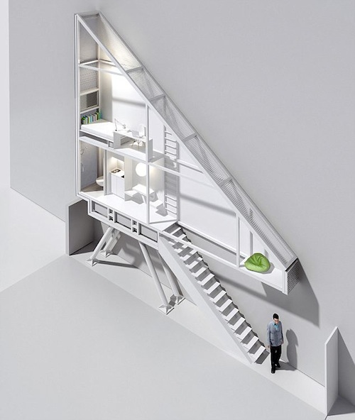
This project has been recently completed by Polish architect Jakub Szczesny in Warsaw. More of an installation and social experiment than an actual dwelling, the object is a response to the rising problem of urban housing in Poland. The house occupies a gap between two buildings, at its widest point it is less than 5 feet wide (and only a little over 3 feet at its narrowest). The building is so slim, there isn’t even a space for a window – sunlight enters through the tiny holes in the bedroom wall. “Research shows we are approaching a social disaster because too little living space is built, – the architect said in his interview to Daily Mail. – You don’t need that much space to live in, so it is worth considering building smaller scaled, cheaper housing.” Szczesny approached Israeli writer and film director Etgar Keret to get involved in the project. Keret will live in the building for six months, on and off.
(HT to my reader Ben Vlass)
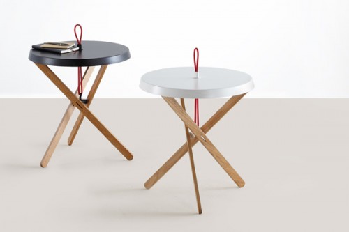
I absolutely love these elegant and simple side tables by Stuttgart based designer Simon Busse. Thanks to their clever construction, the pieces fold flat when you need to store them. And when some extra tabletop space is required – you can assemble them in minutes. Here is how designer describes his concept: “Only if all its components interact the table stands firmly. Three flat wooden legs other form the basis and are brought into position by a connective element. A hook on the top side of the connective element holds a coloured elastic band – the marionette’s string. The band runs through the wooden legs towards a tabletop and turns into a carrying handle on the upper side. In order to lock this fragile structure, the tabletop is bevelled downwards, the legs are kept in position and the entire table stands firmly.”
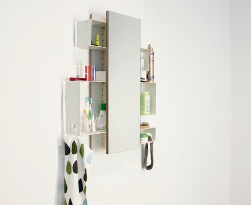
Rudolf bathroom cabinet by Ariane März is a beautiful space-saving piece. It is comprised of a simple frame, hidden behind a mirror, and five storage boxes of different size. The boxes can be attached to the frame in a variety of ways, creating different configurations. I especially love the combination of open and closed storage, where all intimate items can be placed behind the mirror. Thanks to its flexible design, the Rudolf cabinet can accommodate items of any size. Two towel rails complete the piece.
(via stilsucht)

