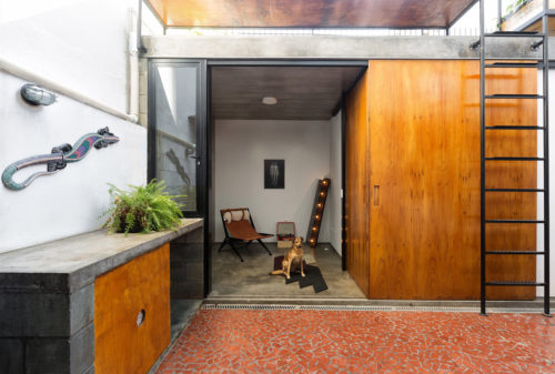
Architects from São Paulo based studio Vaga came up with the clever way to add space to a small home. They have built an annex that incorporates two bedrooms, a bathroom, and a rooftop deck. The sliding door allows switching between privacy and open use of the spaces. The rooftop deck is used for a herb garden and as an extra hang-out space. Cool modern idea. See more photos after the break.
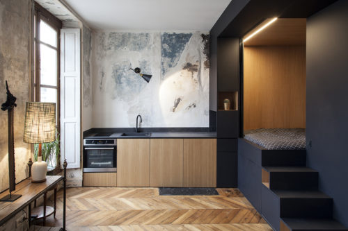
This tiny 345-square-foot Paris studio has an ingenious bedroom solution. Instead of a loft, common in small spaces like this one, architects at Batiik Studio created a structure that houses the bed, closet, mirror, light, and a number of small shelves that double as a staircase. Clever and unique. Check more images after the break.
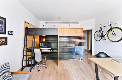
This project has been designed by Polish studio Modelina Architekci for a client who wanted to organize a small space where he can live and work. Maciej Kawecki, owner of Brandburg studio, found this small apartment and immediately knew this would be a perfect place for him. To create multifunctionality, designers built a modular box that houses both the kitchen and the office. The moving shelf can be removed and reveal a hiding area for Maciej’s 6-year-old son. The rest of the place left as open as possible. The dining/conference table can be wheeled around, depending on the situation. The bike rack and strategically selected visual elements in the room, turn the bike into an art object, when not in use. See more photos after the break.
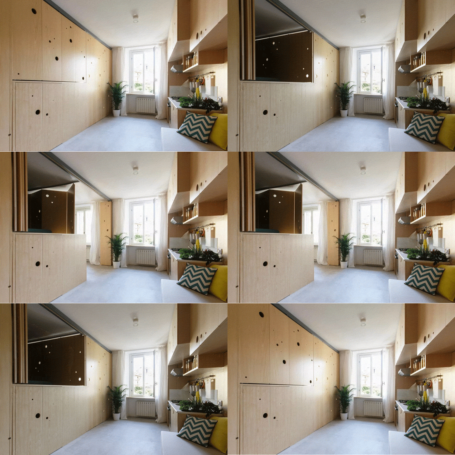
This small apartment by studio PLANAIR delivers a record number of space-saving ideas. A tight 322 square meter pad, intelligently furnitured and laid out, contain a kitchen, dining/working area, bedroom, lounging area, and even a walk-in closet. How? By incorporating a multi-functional unit that transforms the room, depending on the desired activity. The series of mobile panels open and close to create privacy for sleeping, reveal a dining and working room, lift the bed to give access to the closet. Ingenius. See more photos after the break.
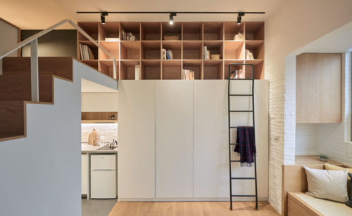
I love the quiet elegance of this small loft in Taipei, Taiwan. Young creatives from A Little Design studio managed to build an airy and serene dwelling, with only 236 square feet to work with. The flow of this apartment contributes to the illusion of spaciousness. The narrow passage between the kitchen and the bedroom opens up to the living room, immediately creating a feeling to a much bigger room. The built-in couch is quite big to accommodate enough people, yet it is out of the way, tucked in next to the window. The bar tables, placed against the wall, also take very little space. They double as a desk, and, if guests are over, they can be put together in the middle of the room to create one full-size dinner table. The swing-arm lamp rotates between the desk and a couch. The loft contains a bed and another small desk. High shelves complete this interior, providing storage and an illusion of height.
This video shows a delightful report on living and entertaining in one of New York’s smallest spaces. It made my weekend.
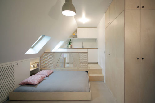
This lovely renovation of the 161-square-foot apartment is a proof that there is hope for any space, however tiny, to be livable and chic. Studio Batiik transformed a dingy old attic into a light and beautiful pad, inventive in its flexibility. The kitchen is raised above the main level, providing an ample space to hide the bed and free the room for dining and entertaining. When the bed is away, the kitchen counter unfolds to fit four guests comfortably. It is even possible to hide the bed half the way, add pillows, and turn it into a lounging spot. Every bit of non-slanted wall is used for storage. The tiny space next to the bathroom houses a small desk, with the natural light coming from the window. See the photos after the break for a full tour.
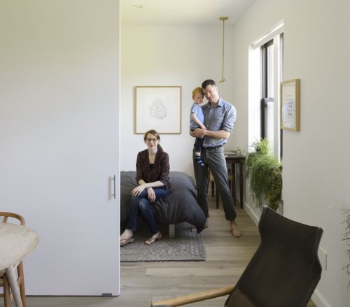
The thoughtful asceticism of this space simply made my day. Imagine, a young couple with two small children, residing in a 675 square-foot apartment, is able maintain a minimalist lifestyle. Gives hope to many of us, doesn’t it. A dark and outdated pre-war one bedroom apartment with an awkward nook, used as a second bedroom, was transformed by the architect David Bucovy into a serene and spacious pad. All beds here, children and adult, are murphy beds. All items have a clear purpose. Most spaces are multifunctional. Toys (including laptops) are stored away when not in use. I love how the neutral and calm tone of the apartment serves as a backdrop to the carefully curated mid-century furniture pieces (a separate swoon for the Wegner dining chairs). Check out the photos after the break for the full tour.
Photography by Matthew Williams.
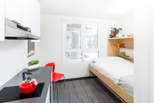
This tiny 140 square-foot studio is a prototype of student housing, offered by the University of British Columbia in Vancouver, Canada. Thanks to the inventive use of space, the Nano Stuite includes all the essentials, such as a kitchen, bathroom, and sleep/study space. The main space-saver here is the bed, transforming into a desk. Very clever. Check out the video after the break to see a virtual tour of this apartment.
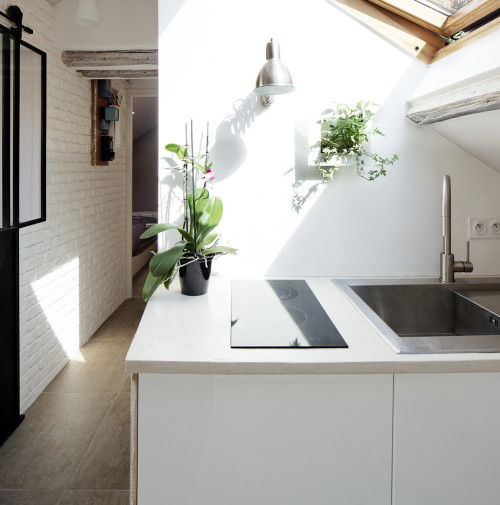
This clever and chic little apartment is a reincarnation of the awkward attic, redesigned by Prisca Pellerin. To maximize the space and make a good use of the natural light, the architect removed doors and created a unified flow between the living room, kitchen and bathroom. The only truly private spots here are the toilet and the small bedroom, which is minimalist and serene. The color scheme of the entire project explores combinations of white and grey, guiding the eye through different textures of the same two colors (another trick to visually expand the space). Check out the floor plan and more photos after the break.
