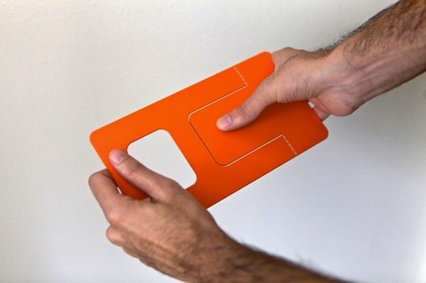
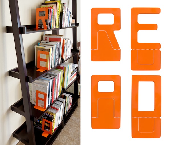
Graphic designer Jack Curry made these brilliant (and orange!) bookends, called Biblio, for his own bookshelves. He also gained an instant fan the minute I saw them. As a typographically inclined individual, Jack initially searched for ready-made type-centric bookends. But after series of unexciting woodblock letters or “A & Z” bookend sets, he decided to make his own. ‘Using some off-the-shelf black bookends as a reference, I began figuring out how each letter would begin to look if used in the given framework, – says the designer. – After several different directions I came to the conclusion that the best solution would be to simply have the foundation of these forms contain both sides of the base, which would swing out in opposite directions; not unlike a gymnast doing forward splits.’ The first batch of letters (spelling out “READ”) were then produced from 16 gauge stainless steel and powder-coated in classic library orange. Beautiful!
(HT Typetoken)


No comments yet, be the first!