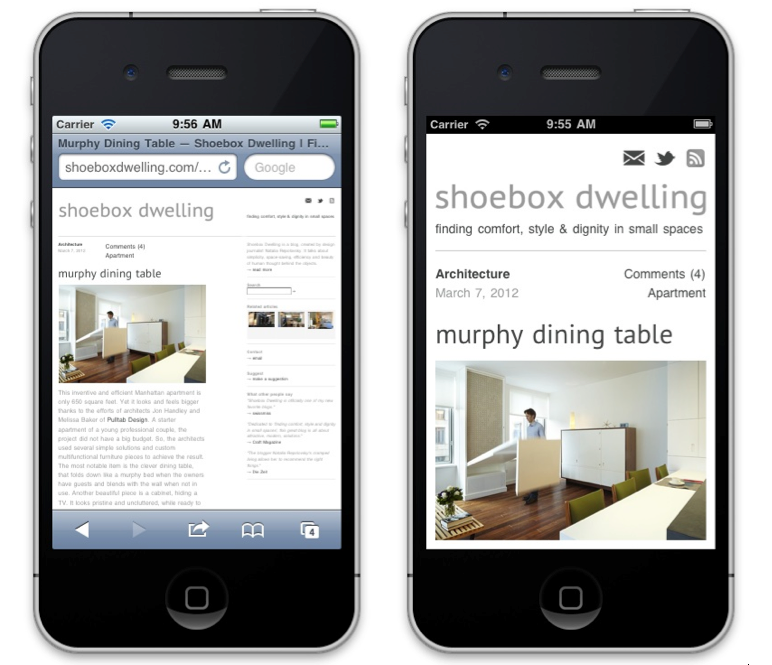
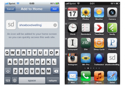
Folks! I would like to introduce an enhancement – the mobile version of Shoebox Dwelling got optimized today. This change came with a story. My reader, Kyle, emailed me recently and shared his thoughts about the user experience of the site. He pointed out that reading it on the go made him frustrated by its lack of mobile-friendliness. And, being a media developer, he wrote a code to fix the problem. As you can see from the before and after shots above, the new mobile version is much more streamlined, it zooms on the posts right away and eliminates side-scrolling. Also, if you wish to place a Shoebox Dwelling bookmark on the screen of your device, you will get a minimalist, easy on the eye icon (a small detail, but an aesthetically crucial one for some finicky people, author included). I hope you guys enjoy these improvements. Thank you for this beautiful gesture, Kyle!
Announcement
April 17, 2012


No comments yet, be the first!