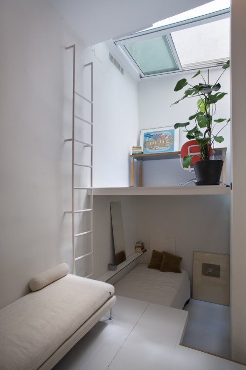
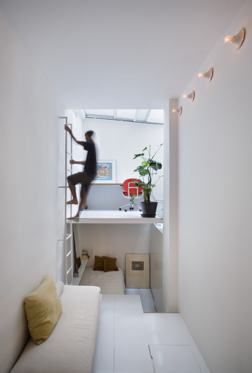
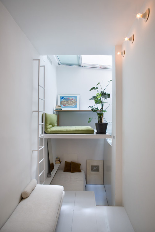
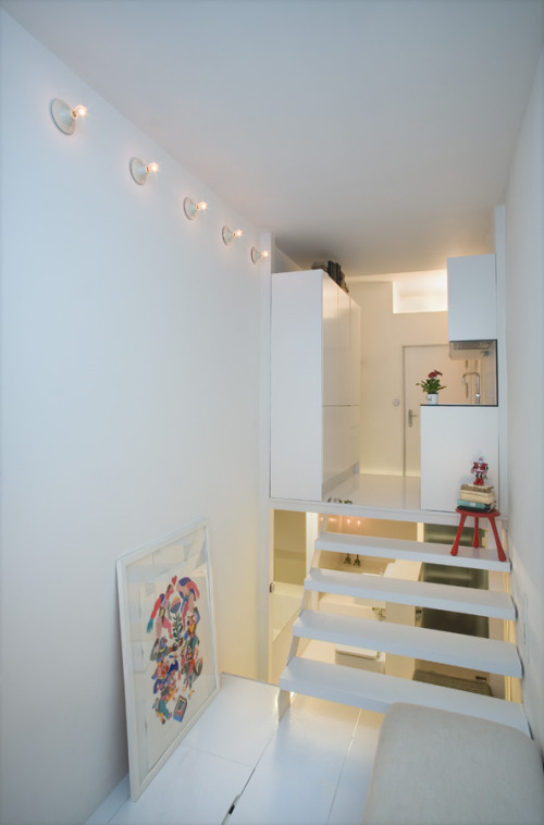
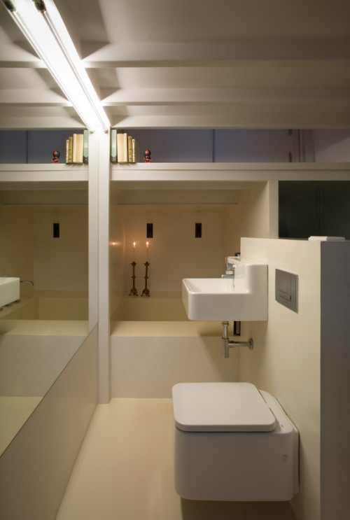
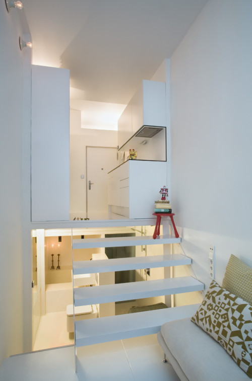
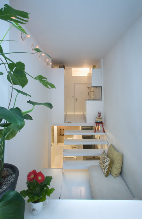
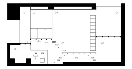
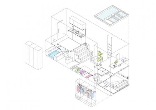
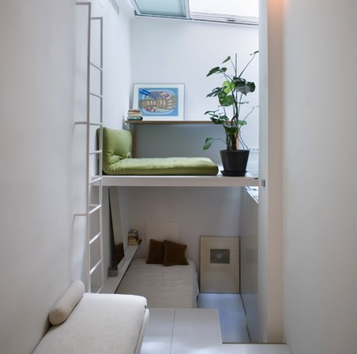
This cool minimalist pad has been designed by Madrid based studio MYCC. The challenge was to create a livable home within the strict limitations of a tiny footprint. Without the room to expand horizontally, designers made the most of the vertical space by building several levels and creating a non-linear path. All functional zones are connected and open to view, even the bathroom is within sight. This openness contributes to the illusion of a much more generous size. Each zone serves multiple functions, for example – the bed slides beneath the living room platform, transforming the bedroom into a open space. The office above turns into a lounge, thanks to added seating. In spite of its smallness, the apartment looks quite luxurious, it even has such rare features as hamman bath. Watch the animation to see how the place functions in different social situations.
(via minimalissimo)
I could see myself rolling back on that chair just a little too far…
I love the unique architecture. Not sure about the open and not-so-private bathroom/toilet area…

What an amazing space. I love how airy it feels despite its narrow dimensions.
http://www.fullbellywornsoles.com