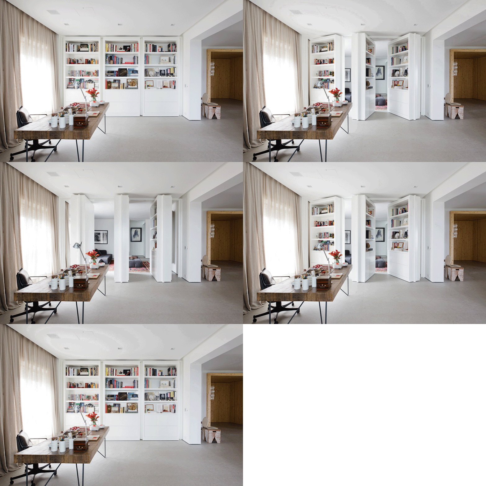
This amazing wall of books is part of the apartment in Brazil, designed by architect Consuelo Jorge. And even though this particular space is not small, this element can work very well in a studio or other open-plan apartment. It creates privacy and a heck of a visual impact. You can see the rest of the apartment here.
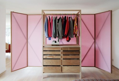
This closet, created by Studiomama, can transform to a flexible room divider. A great news for open layout studio apartments. The piece includes a central hanging rail, as well as ten drawers in different sizes. The doors expand to create a lightweight screen. “Instead of building walls and dividing the space up permanently, – designers say, – we found that this solution with a flexible and non-permanent screen to divide the space into two when needed – gave us the opportunity to use our space in an optimal way.”
Photography by Dennis Pedersen and Elsa Young
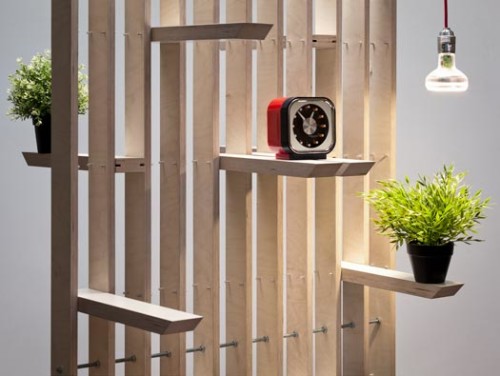
Plug Divider System by Estudio Ji gets a massive thumbs up from me. A rolling vertical unit that incorporates narrow slide-in shelves can function as a room partition or a desk accessory (or both). Perfect for zoning small spaces, the piece is light, both structurally and visually. I like how versatile it is. With the ability to support many different configurations, the Plug divider can be used virtually in any room. Designed by Jorge Frías Montes and Irene Zurdo Prieto. Made by hand in Spain.
(via mocoloco)
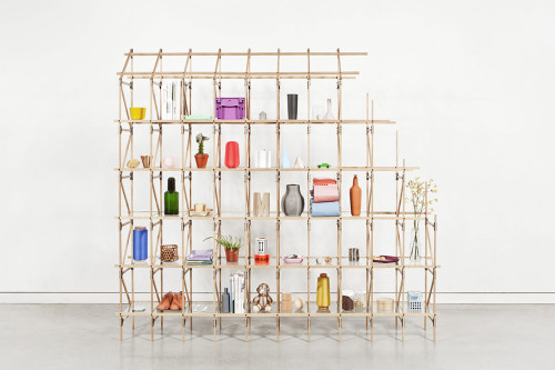
Dividing rooms with shelves is every shoebox dweller’s natural decorative reflex. And many designers today cater to this universal need for zoning and storage. Divider, and interesting item by Danish designer Mieke Maijer, has caught my eye. Looking a bit like a neat scaffolding, the piece is delicate and transparent. You can regulate your privacy level simply by filling the shelves. Based on a classic Lattice structural principle, the shelves are lightweight and sturdy enough to span upwards and forwards. Divider consists of thin oak slats connected by steel plates, which give it a cool industrial look. The product is modular and fully customizable. Within the Divider system variations in height, length, depth, composition, form, color and material are possible. You can also choose between open and closed shelves by adding panels and boxes.
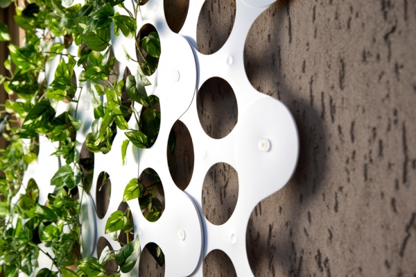
Indoor gardeners – rejoice! Someone had been thinking long and hard about your situation and came up with something rather delightful. The two Italian designers, Francesca Bonfrate and Alessandra Bove, that make up Bubble Design created an at-home gardening collection called Green Kit. The line is comprised of four different but equally useful items (see photos after the break): Invaso – a climbing plant support object, placed directly into the pot; Serravaso – a miniature greenhouse (in two sizes) that will create a perfect environment for plants to grow; Travaso – a clever and useful loose soil collecting surface, allowing your to easily poor the excess potting soil back into the pot; and Trifoglio – a modular climbing support wall that can also be used as a hanging divider (and you know how much I love hanging dividers). So there you have it – a perfect gardening quartet that will keep your green thumb occupied during all those long winter evenings.
(via design-milk)
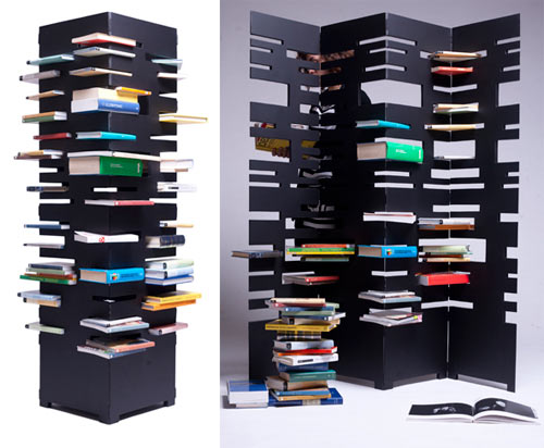
Since we’re on the subject of interesting room dividers, here is another one I couldn’t pass by. B-OK is a space-saving alternative to the usual bookshelf, created by Italian designer Marica Vizzuso. The piece unfolds into a screen and folds back into a tower, depending on your preference and space limitations. B-OK is also fun – instead of stacking books side-by-side, you pile books on top of one another into a variety of slots. ““Why do you place books in a conventional way when you can have both an amusing and aesthetically interesting alternative?” – aptly asks the designer.
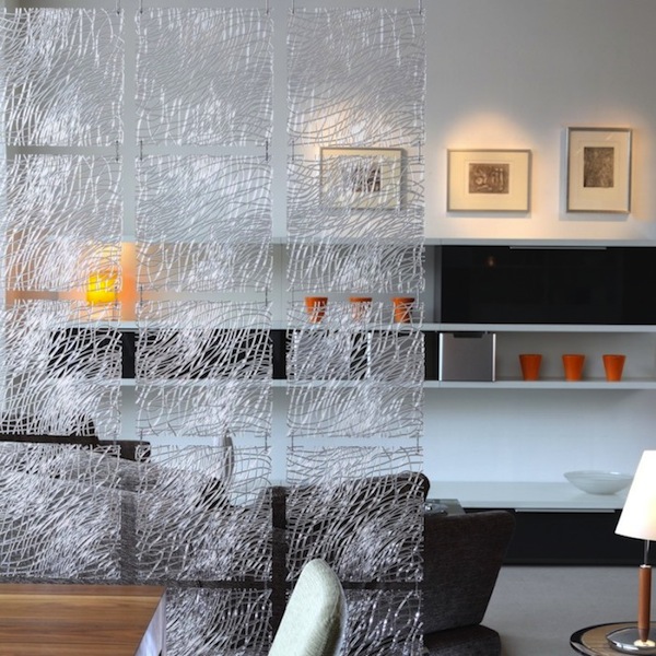
These modular partitions from German brand Koziol are a new obsession of mine. Semi-transparent and light, they create beautiful and subtle dividers in a room of any size. The installation of the product is simple – connect the panels using the steel hooks provided, then place them wherever you want in your space. They work equally well as screens, decorative wall hangings, or light diffusers in front of windows. The panels obstruct view, yet allow light to shine through – a great quality for small or poorly lit studios. Being modular, the panels are interchangeable, so you can let your artistic flag fly and combine multiple colors and patterns. Available for purchase here.
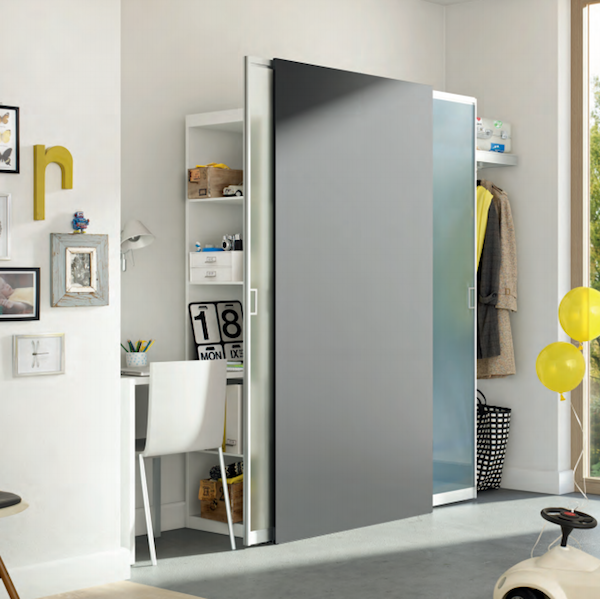
Mobile is the name of the storage system, designed by Raumplus. This multifunctional product is based on a well-known sliding door principle. Only unlike traditional sliding door closets, which can take some considerable space in your room, this piece has no frame and no ceiling rails. Just doors, storage boxes and/or clothes racks and thin air. Thanks to this open approach, Mobile can fit virtually anywhere in the room, even in the middle of it, creating a stylish and functional divider. You can also hide a home office behind these sliding doors, instantly putting working paraphernalia away when the work is done. And of course, since Mobile is essentially a sliding door closet, there are many customization perks – you can run wild with colors and finishes and select the precise configuration of storing components you need.
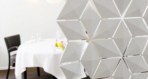
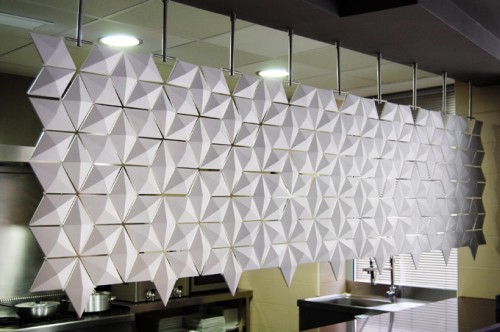
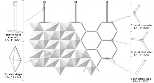
Facet is a clever modular space divider designed by Bas van Leeuwen & Mireille Meijs of Bloomming. Produced by 3form, the item is made from all recyclable materials and can be easily incorporated in any space, big or small. This truly versatile object allows you to customize width, length and even transparency of your divider – the segments rotate 360 degrees and create various patterns and levels of privacy. The installation is easy, the components attach to a frame with a simple click. Beautifully well thought out product, ideal for open floor plans and studio apartments.
Since we are on the subject of interesting storage, here is another beautiful piece – 180º shelving unit by Valencia based studio Cuatro Cuatros. This modular storage is part of a collection, called Angles. It is comprised of four pieces, inspired by V’s of different amplitude – two shelves (30º and 180º) , a carpet (0°) and a vase (90°). The line is based on optical illusions and their play in furniture design.
Designers elaborate: ‘The collection s called Angles, given the importance of the point of view from which to observe the products. The effect appears and disappears, provoking an interaction with the viewer. When the effect is created, our perception deceives us and makes us see things as they are not.’
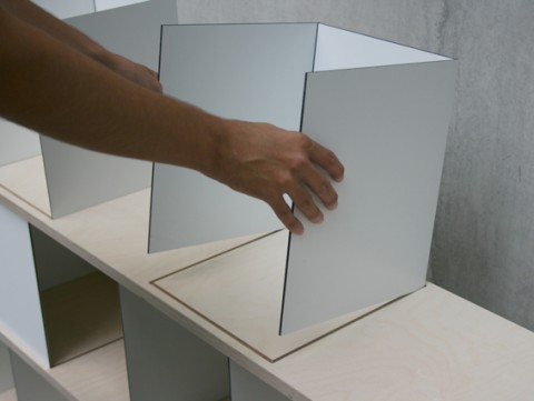
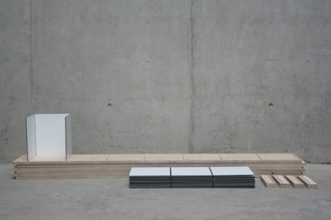
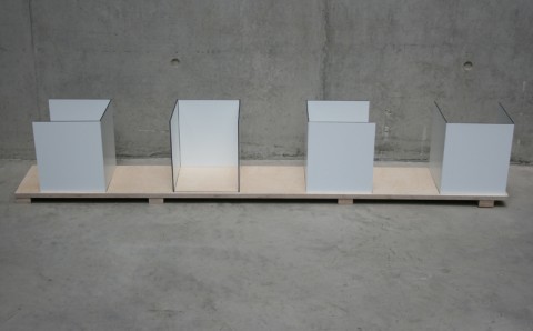
This particular piece is a clever flatpack construction, that can be easily assembled by one person with zero tools required. The shelves have grooves into which the metallic boxes are fitted. You can position the boxes in four different ways, creating various visual effects and alternating between open and closed storage. You can even make your components accessible from both sides of the shelf and use the piece as a room divider. The hight of the unit can vary depending on how many rows you stack. Brilliant!
See the entire Angles collection here.

