In the moment when the whole civilized world is thinking of the Oscars, faithfully yours is in the award rush of a different kind – The Homies. It’s that time of year, when Apartment Therapy, one of the greatest blogs about interior design, is surveying blogosphere to determine the crème de la crème of home blogging. So, if any of you, kind readers, wishes to share the love and vote for Shoebox Dwelling – you can go here, sign in, and make your voice heard. Thank you all (especially those folks who put my link up there, you’re all kinds of awesome)! xxx
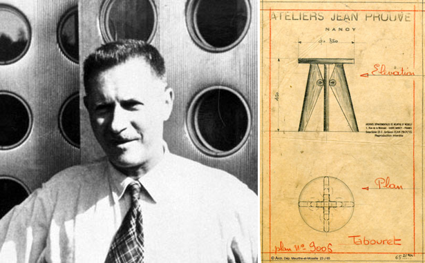
Here is something for the senses – an exciting special edition line, based on designs of renown French architect and designer Jean Prouvé. The project is called Prouvé RAW and carried out by Swiss brand Vitra in collaboration with jeans manufacturer G-Star, who was the initiator of this makeover. According to Cool Hunting, 14 Prouvé’s classics, modernized and updated, are on display at the Vitra Fire Station in Weil am Rhein, Germany until 31 July 2011. Between October and November this year, nine of the pieces will be available to buy through Vitra.
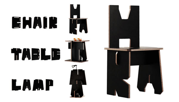
If you love typography and flat-pack furniture – you will appreciate these pieces. Originally designed as an advertising campaign for Penguin Books, this line was created to promote reading. The concept is pretty simple – every book is made up of words; and all words are composed of 26 letters of the alphabet, arranged and rearranged in infinite combinations. Building on this fact, DDB Singapore advertising agency created a new Penguin font with one unique difference. Each letter, cut out from plywood and coated with black laminate, could be slotted into another to form furniture. Thus, the letters C, H, A, I, and R make up a chair; the letters T, A, B, L, and E – a table… You get the picture. The campaign was held in eight busy urban locations, encouraging passers by to stop, sit down and read something. The Alphabet collection is now on sale to general public and can be purchased here.
PIN-UP Magazine and Phillips de Pury & Company recently embarked on an interesting quest – to reinvent the nightstand. Eleven designers were asked to submit their creative take on this humble everyday object. Check the video below and this slideshow for a quick view of the works.
[vimeo http://vimeo.com/23493977]
In the world of design there is a specific order in which business takes place, ideas get selected and objects get produced. The order New York based online company StyleFactory attempted to change… Instead of leaving it for manufacturers to decide (or guess) what is the demand on the market, they manage to create the demand before the manufacturing process starts. This is achieved by the interactive nature of the website, where you can pre-buy an item or vote for designs you like. The site is also a democratic platform, where designers can introduce their concepts and, if the demand arrises, see them produced. Thus, their creativity is empowered by the ones it was directed at – consumers. A perfect circle.
Break Down: Design in Your Hands event, organized by StyleFactory, Design Milk and Bobby Berk Home as a part of New York Design Week, was a tangible manifestation of the virtual concept. Visitors could observe the design objects and vote for their favorites.
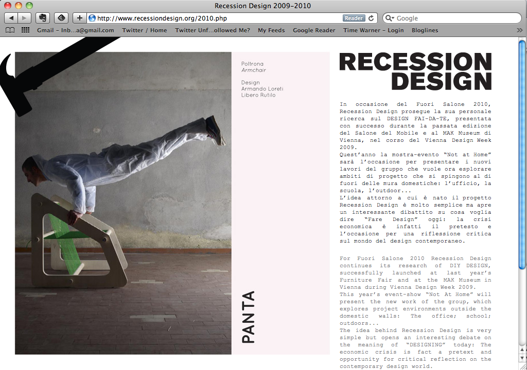
Recession Design is a group of creative individuals who explore DIY architecture and design solutions for low-cost living. Their project My Place was shown during the recent Design Week in Milan and included modular objects and Do-It-Yourself concepts. Here is how designers define their creative credo: ‘The idea behind Recession Design is very simple but opens an interesting debate on the meaning of “DESIGNING” today: The economic crisis is fact a pretext and opportunity for critical reflection on the contemporary design world.’ There is also a book in plans – ‘Do-It-Yourself Design, Ideas Against The Crisis.’ It doesn’t hit closer to home than this, does it?..
Via Serena Confalonieri


