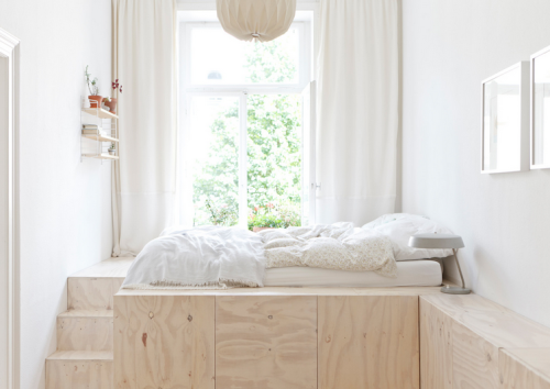
I’m positively in love with this small apartment in Wiesbaden, Germany, designed by Studio Oink. The owners, a young couple, are major Scandinavian design fans, so shades of white and blond wood play a big part in the aesthetics of this project. In order to adapt to the elongated shape of the rooms, designers custom built several elements. Namely, the kitchen nook, bed podium and the vast tall closet wall in the corridor. The bed podium, aside from elevating the bed off the floor, provides ample storage, allowing the rest of the space look neat and serene. See the photos after the break for the full tour of this beautiful home.
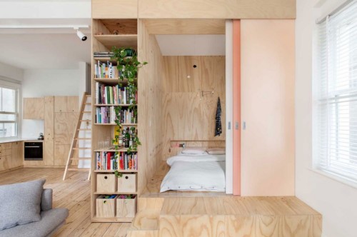
This unusual project was a remodel of a 75-square-meter apartment in the center of Melbourne. The goal was to maximize sleeping areas for the occupants without giving up too much of the living space. Designers, studio Clare Cousins Architects, managed to do so while increasing sitting areas and storage. Here is how they describe the project:
“The clients, who were expecting a baby at the time, wanted to convert the only bedroom into two small bedrooms. Plywood joinery was used to define spaces rather than build walls. The child’s bedroom was sized to just fit a single bed between walls. The adults bedroom utilizes 3 colourful sliding screens which allow the room to be totally screened from the living room or opened up to allow the bed platform to be used as part of the living space.”
I love the little podium on which the adult bedroom resides. The steps also double as seating for the living room. The multiple plywood panels, while dividing the space into zones, also hide storage, which is never a bad idea in a modestly sized space. See more photos after the break for the full tour.
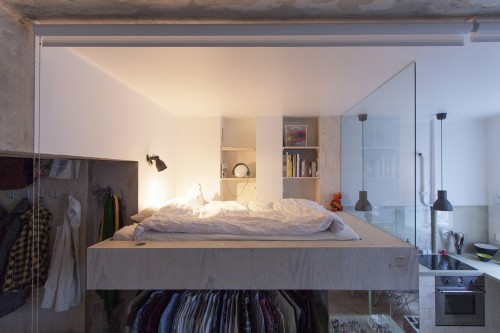
This small 36 sqm (a little less than 400 sqf) Stockholm studio has been designed by Karin Matz for a client who wanted to have a walking closet, all appliances for everyday life, a large shower/bath, and the sense of airiness in the room. Quite a tall order, considering the initial limitations of the space. Here is how designer explains the result:
“The result is an apartment divided in two parts. One where everything is part of one structure, which is based on the Ikea kitchen units. Everything in this part is completely redone with electricity inside the walls and with all surfaces painted white in order to bring in and reflect light. Here all the functions are squeezed in on top of, in-between, under and inside each other. Bedroom, kitchen, wardrobe and storage are all one. The second part is left with things free-standing with all surfaces more or less as they have been for the last 20 years. The holes in the the walls have been filled in, loose wallpaper and paint taken down and electrical cables and outlets have been added running on the outside of the walls. The bathroom becomes the connection between the two parts.”
My favorite part of the project is the elevated bed sharing a glass wall with the kitchen. And the clever storage solution underneath it. Check out more images after the break to see this unusual built in more detail.
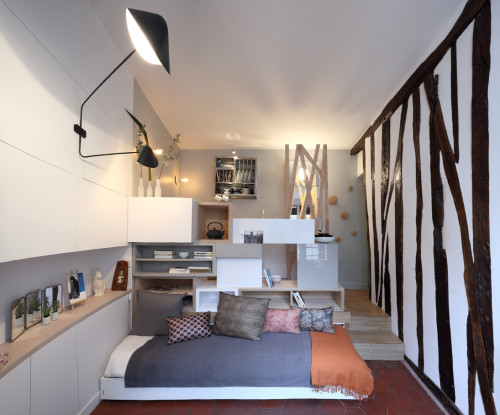
This tiny 129-square-foot studio in Paris, completed by architect Julie Nabucet, is all kinds of awesome. Stylish and light, it encompasses several rooms in one. The life of the place revolves around a wooden structure that divides the living room from the kitchen. Serving as storage on both sides, it allows flow and doesn’t block the light. It also houses the bed that can also be used as a sofa. The elevated kitchen shares the space with the bathroom sink that didn’t fit into the actual uber tiny bathroom. Ample built-in storage finishes the arrangement, allowing the rest of the room (however tiny it is) to look neat and serene. See the video after the break for the tour of this unusual home.
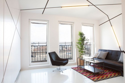
This unusual studio apartment has been designed by Polish design studio Mili Mlodzi Ludzie for the client who loves minimalism. I love how designers handled this small space/small budged project, they managed to furnish and equip a 26 m2 apartment, and, in spite of the limitations, make it truly original. In order to achieve the uncluttered appearance, the desk, TV, storage space and kitchen are all hidden within the white front panels. Handles along with the lines on the ceiling and walls, are arranged in a broken pattern, giving a unique character to the room. “We decided to put the night zone above the bathroom to free the client and the zero level from the daily routine of bed making, – designers explain. – Contrasting statements are extracting from low-cost and common materials and giving them new values.” See more photos after the break.
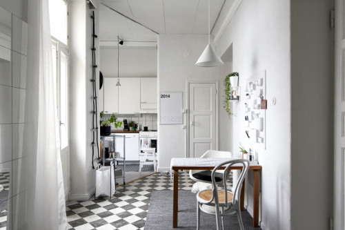
This small home belongs to a Brazilian graphic designer, living in Helsinki. I have stumbled upon her Instagram account and immediately knew I was hooked. I love how airy the place looks, thanks to the strategic color scheme, thoughtful details and smart space-saving techniques. See more images after the break.
(via raw design blog)
De Rotterdam is a mixed-use vertical city in a former harbor district in Rotterdam, Netherlands, built by the famed architect studio OMA. One of the cool things these towers offer is a series of small urban apartments that measure under 650 square feet. I was delighted to see how these spaces were organized. In the video above you’ll see a tour of the apartment and demonstration of various space-saving tricks. Enjoy!
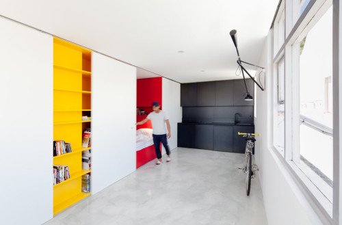
This small studio apartment in Sydney has been designed by Nicholas Gurney. The ascetic approach has made this 27 square-meter space is look spacious. The uniformed whiteness of the room is interrupted by the yellow bookcase, which is covered at night by a sliding panel, in turn revealing the built-in red sleeping area. The third functional zone, kitchen, is black. Thus, color only marks the utilitarian areas, leaving the rest of the apartment bare and untouched. Clever and beautiful. “The micro apartment offers a proposal for future high-density urban living for one person families; the fastest growing demographic,” – designer states.
Photography by Katherine Lu
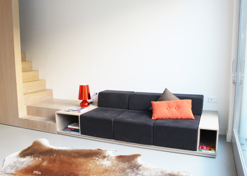
This 76-square-meter residence in Leiden, Netherlands has been built by Dutch firm 8A Architecten. The goal was to create a temporary dwelling for a family living in Paris, the place was intended to be low key, but comfortable and spacious. In order to create an illusion of space, the house was completely stripped of all interior walls. The ample storage is hidden inside multiple built-ins, custom made for this interior. But my favorite feature by far is the staircase that merges into a sofa. It gives fluidity to the design, creating a long continuous line of oak wood, which also adds to the optical illusion of a bigger space. For a full tour of the house see more photos after the break.
This video shows the day in a life of the resident of the compact unorthodox loft, built by Spanish studio Elii. The Didomestic apartment, as the architects call it, occupies a refurbished attic in downtown Madrid. The open layout is achieved by suspending nearly all functional elements from the ceiling. This way each area can play multiple roles, depending on the situation. The design also features multiple built-ins, hiding ample storage in the walls, floors and ceiling. The sliding panels allow zoning the space, adding privacy when needed. The video is created by photographer and filmmaker Miguel de Guzmán. See more images of the apartment after the break.
