Alain Monnens, the guy who designed the Flip lamp we like, came up with something interesting again. His new creation for tossB is called 25DEGREES. This unusual light fixture is made out of quadratic aluminium tubes, cut at a 25 degree angle. When mount on a wall or a ceiling, the lamp creates projection of light on the surface. This effect really comes to life when you position several 25DEGREES fixtures side by side. 360˚ rotatable, they can create multiple patterns of light on your wall or ceiling. 25DEGREES lamp is available in white, black and grey paint or brushed aluminum.
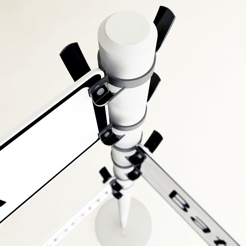
One great man once said that it is the useless things that make life worth living. This inspired design object does not add a lot of functional goodness to the interior, but I want it anyway. Traffic Jam coat hanger, created by serbian designer Vukašin Vukobratović was one of 11 winning projects of the 2011 ‘Young Balkan Designers’ competition. And you can clearly see why. The beauty and humor of this thing are irresistible. To be fair, the signage is interchangeable and can provide an actual direction to human masses in schools, hotels, offices and other public places. And for us, shoebox dwelling creatures, it can become a much needed eye candy.
Source: Designboom
Twist is a stackable bookcase created by Giuseppe Bavuso for Alivar. The idea was to create a versatile and visually stimulating storage unit, suitable for any room. The final product fills the bill brilliantly, and then some. Twist can be used as a bookcase, a display unit, a night stand, even a pouf, if used with a cushion. Stackable components are made out of the Hi MACS acrylic stone. The units are divided by the glass shelves, which makes them even more light and airy. The illusion of irregular cubic shapes is a nice touch, it creates beautiful dynamic.
This unusual lamp was designed by the young Pasadena-based designer Soo Kwon. The idea of the piece, which is reservedly called Licht, was to combine high-design with low-tech manufacturing (the latter allowed for the relatively low price of the product). Kwon noticed how the traditional lamp silhouette shapes the light and made this shape an inspiration. The result – clever, functional and effortless design. The piece comes in two colors and in both floor and table versions. The Licht can be purchased online.
Source: Losangelist
The words ‘modular’ and ‘customizable’ are music to our ears, especially if we live in an awkward and/or limited space. Consider the Cocoon, a versatile shelving unit created for Ideal Form Team by the Italian designer Paola Navone. The Cocoon allows all customization imaginable – the shelf can be built to fit any space and any stylistic preference. You can choose between open and closed storage, various effects and finishes, several digitally printed designs… The combinations are endless. As is fun to pick and change them.
It is always nice when a piece of furniture has a soul. Even if it is a mysterious Russian one. This unusual object, called Tipsy Star, was created by the Moscow-based designer Alexander Matveyev. Envisioned as a chair-transformer, the piece is build around a titanium frame with hinges, which allow it to take and retain many shapes. The Tipsy Star is incredibly versatile, it can serve as a chair, a stool, an ottoman, a mat… Made out of a poliurethane foam and covered by a durable upholstery fabric, it requires very little maintenance. It might be the first tipsy thing you will actually like having round…
The fewer pieces of furniture we have, the more they have to matter. This item, for example, is not going to stand in the corner unnoticed. Designed by Pierre Brichet, the Marie-Sophie chair is definitely made to create a visual impact. Manufactured out of steel trellis and leather, the piece seems to be suspended in the air. The clever geometry of the base creates a negative space around the seat and showcases the elegant simplicity of the object. The Marie-Sophie chair is currently displayed at the Coming Soon Galerie in Paris.
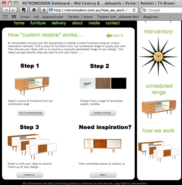
This furniture has practically everything we, design-conscious shoebox dwellers, adore. It is recycled, gives a cool retro flair to the room and allows us to participate in the designing process. The Australia-based restoration company Retro Modern found a clever way to bring old midcentury furniture into modern homes. We are invited to select an object, pick finishes and hardware, email our design to RM and get their mock up. A couple of weeks after approving the mock up, we will receive the completed piece and bask in glory of our choices. The initial item can be picked from the Retro Modern gallery or provided by the client. So, this might be a good way to breathe a new life into some old family heirlooms.
As the world is increasingly switching to energy-saving lighting, nostalgia enters designers’ hearts. The good old Edison’s lightbulb makes a comeback, if not in function, at least in its warm and familiar shape. This sentimental product from Vienna-based designer Maciej Chmara is called Sympathy for the Bulb. It masks the energy-saving bulb inside the more rounded and traditional aperture. Note the clever packaging – another emotional aspect of the piece.
Every home has awkward areas we do not quite know what to do with. Entryways, spaces beneath the windows, uncomfortable corners… A piece that would humanize those areas would be a blessing for any interior. Meet the Weigel Bench, a recent creation from Square Form, originally made as a shoe rack for the entryway of the client’s home. The understated beauty and functionality of the piece earned it a new licence to live. Made out of noble and natural materials (salvaged 5/4″ western walnut, salvaged Alder, and steel tubing), the Weigel Bench adds class, warmth and a much-needed storage to any space.


