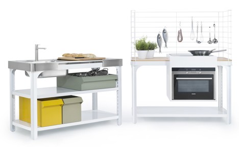
Since we are on the subject of kitchen space – here is an interesting idea from German designer Kilian Schindler. His Concept Kitchen, designed for Naber, is a modular system that allows to built various configurations on the same frame. You can combine your basic worktop with either an oven, sink or storage. The basic elements are made from steel and easy to disassemble. They feature pre-drilled grid patterns for the flexible arranging of construction and storage shelves. So, if you decide to move house or remodel the existing one – there is at least one major project you can cross off your to-do your list.
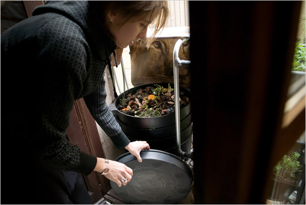
Eco designer Petz Scholtus recently celebrated the completion of her most personal project. She adapted her own apartment in Barcelona to a green lifestyle. The place, located in the historic Barri Gòtic area, is on the smallish side – only 58 square meters (624 square feet). It was in the desperate need of a major gut reno when Petz bought it in 2006. In order to make the apartment livable and green (and to save some green too), she implemented the five Rs of eco design: Reuse | Reduce | Recycle | Restore | Respect. The result is a hip and responsible eco pad, full of innovative solutions and fun details. Do watch the video of the apartment tour, revealing lots of great space-saving ideas. Also, check out Petz’s blog to see all stages of the process and many useful resources.
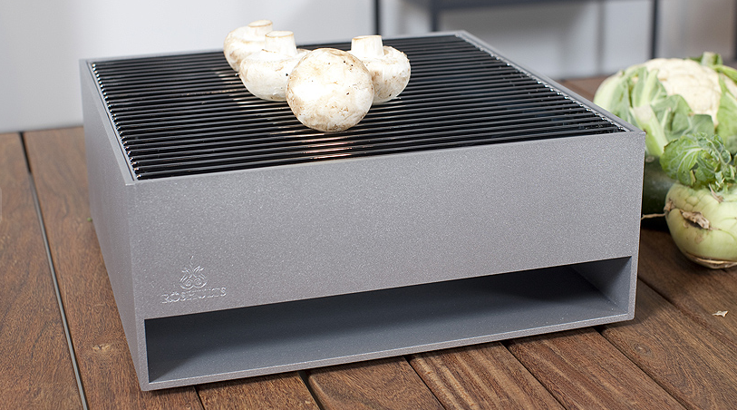
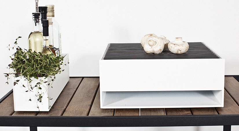
Photos by Stefano BuonamiciThe grilling season is upon us. And if you live in a tiny city apartment with limited outdoor space – you need a plan. This elegant solution by Johan Ridderstrale and Mats Broberg, designed for Röshults, might help. The sleek charcoal table grill is easy enough to put together – it only consists of one removable zincked charcoal holder, an ash catcher, and a chromed cooking grate. The piece measures 35 x 35 x 14 cm, which makes it suitable for even the tiniest of balconies. And when the summer is over – it can be easily stored away. The table grill can be powder-coated in silver, antracit and white.
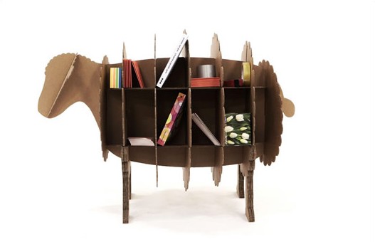
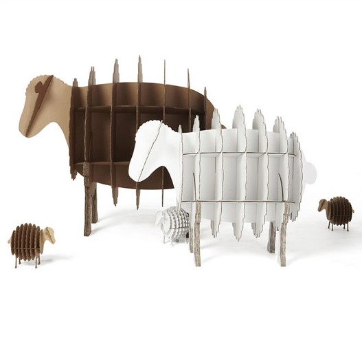
This furniture collection from Australian company KARTON made me gasp. The pieces are so elaborately designed – I can barely perceive them as temporary solutions. Constructed from high grade corrugated cardboard, the line ranges from seating, dining and sleeping pieces to office furniture and modular storage. No tools and hardware are required to put these objects together. And when not needed, they duly fold flat, just like cardboard should. It is easy to individualize your KARTON furniture too. Paint and varnish only improves the product by creating a protective layer. Genius!
The nature of the real estate market in Manhattan makes it a breeding ground for small space creativity. Here is another soaring example of an ingenious use of space. This Upper West Side 450 square feet studio was designed to fit all the essentials and even a few extras. The place includes: living room, kitchen (with plentiful counter space), bar area, home office, sofa bed, extra bed for guests, closet, even library. A large blue custom-made cabinet allows the transformation to happen. Watch the video for the interview with architect Michael Chen of Normal Projects and to see the ‘unfolding apartment’ in action.
Photos by Aya Brackett
Yes, it’s that time of year again when urban people start fantasizing about great outdoors and indulge in monologues about nature being an escape from pressures of city lifestyle. It might be true in theory. Reality tells us that the only way we can survive in nature is by bringing comforts of our urban lifestyle with us. The nice people from SwissRoomBox knew this. They packed all our spoils in a clever compact box that can fit in any hatchback. The set allows to build cooking, dining, bathroom areas, as well as a double bed and even a lounging suite. Impressive! And the best part is – all components are slot-in and require zero tools for assembly. Swiss efficiency is no myth…
(Thank you Inga)[dailymotion id=xhow4p]
Triplette Chair by French designer Paul Menand takes the whole new approach to the stackable chair concept. Instead of nesting on top of each other, the chairs seamlessly interlock, creating functional sitting. This 3-in-1 design allows for more flexibility without costing you in space. Makes a lot of sense for those who has count square footage.
When the Keukenkabinet is closed, it is just a piece of furniture that is a part of living space. By opening it you crete a new space – a compact kitchen. The piece was created by Dutch designer Johanneke Procee in collaboration with Plugers & Vercoulen. The inspiration for it came during Johanneke’s trip to Sough America (I’m guessing she saw a few studio apartments here). She sensed the need for a design that can fit into confined living spaces, where cooking and sleeping is happening in the same room. ‘The compact spaces inspired me to approach the different functions a single room house needs to have from an other perspective,’ – says the designer. The end result turned out to be this elegant and functional piece. We, urban dwellers, are grateful!..
This modular, movable and foldable kitchen by Belgrade based designer Goran ‘Goci’ Bjelajac – has it all. It is fully equipped with all essentials, including fridge, oven, sink, dishwasher, and cooktop. All elements are mounted on the mobile screens, which in turn can move those elements, creating multiple shapes. Thus, you can build your kitchen according to your space needs or simply fold it and remove it from your sight when not in use. The screens allow for mounting on both sides, so you can use them as functional partitions. Ingenious.
Someone I infinitely admire once said: ‘An object isn’t generous enough if it has just a single function.’ This room divider by Guadalajara based designer Diego Gutierrez Hermosillo is generous. In addition to its space-separating role, it also provides sitting, illumination, and visual delight. Called Zebra for its stripy wooden pattern, the piece looks equally amazing with and without LED light, enhancing space on both sides. A far cry from your average partition…

