Editor’s note: This is a guest post from Donald M. Rattner.
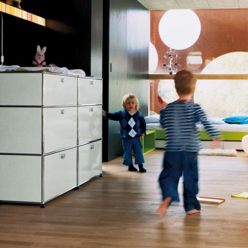
More than forty years ago, Swiss engineer Paul Schärer and architect Fritz Haller set out to create a flexible shelving and storage system based on modular architectural structures. Reflecting their respective professional backgrounds, they made it a goal to marry technical perfection and durability with design elegance. The result was the USM Haller furniture collection.
Being streamlined and contemporary in styling, USM furniture works as well in the private home as it does in office and other environments. And since it’s modular, you can configure the piece to slip comfortably into the available space rather than settle for something just because it ‘fits’.
The USM palette comprises just three elements: a metal panel, chrome steel tubes and a chrome-plated brass ball joint that connects them. These elements provide the supporting structure and the exterior envelope for the components and materials contained inside the modular units. It’s hard to imagine a more minimalist vocabulary yielding as broad an array of design possibilities.
This month MODULE R is holding a promotion on USM products. Click here for details.
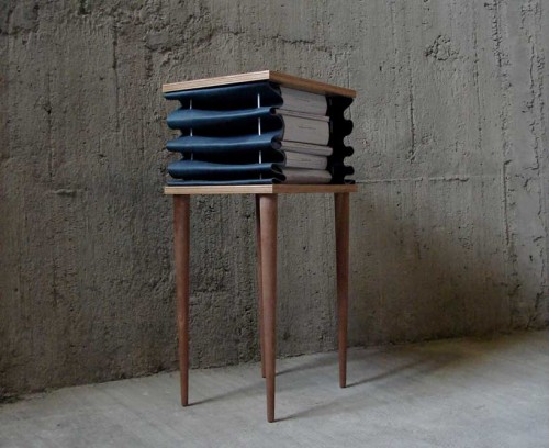
The Un-tidy side table by Milan based designer Kostantia Manthou provides a clever and unexpected extra storage for various reading materials. Thanks to its accordeon-like leather pocket, the piece expands, creating a bookshelf between two surfaces. Perfect as a bedside table and a reading chair companion, Un-tidy is flexible and can store as much or as little as you like. The item comes in a variety of finishes and several colors of leather.
(via designboom)
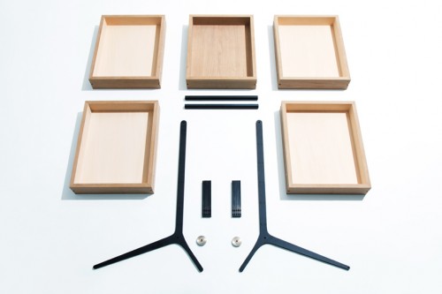
Whenever Keiji Ashizawa comes up with a new item – I’m always excited. For those who don’t remember – I featured some of his works in my previous posts. I love the simplicity, beautiful craftsmanship and mobility of his designs. This piece, called Bon Drawer, is no exception. The object is comprised of five drawers that double as trays (the closest translation of the word Bon). These trays are removable and can be used to carry and display the items inside. The metal frame is equipped with two small wheels and a handle for easy movement. The Bon Drawer can be taken completely apart for storage. I can see it being an ideal companion for a desk. Wishlisted.
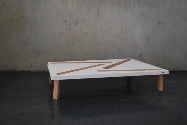
Without any reservations – this must be the most innovative hybrid I’ve seen so far. The Random coffee/dining table by Germany based designer Philipp Grundhoefer is converted into either state by pivoting the legs (see the photos after the break). The simple L shape allows for both lengths to be seamlessly interchangeable. Once the legs are pivoted – the table top can be turned upside down, the leg lock into the slots and voilà – the new function is achieved. How simple and clever! The tabletop consists of alternating layers of oak and MDF, the legs are made of oak.
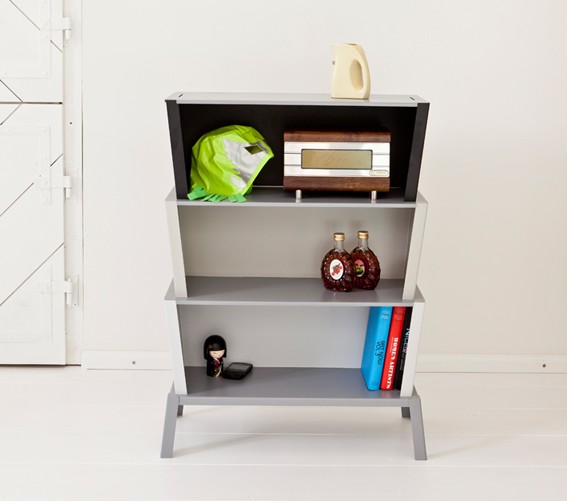
96° shelf system by Germany-based designer Karoline Fesser is a successful attempt to break the routine of conventional shelving. Each of the basic elements – base, box and cover – follows an angle of 96 degrees (hence the name). “Stackable into each other the elements mount up to a shelf by an alternate layering. Interlocking edges and cuts allow an easy and stable stacking without any additional fixtures,” – designer explains. The modules come in various colors, allowing to create personalized palette.
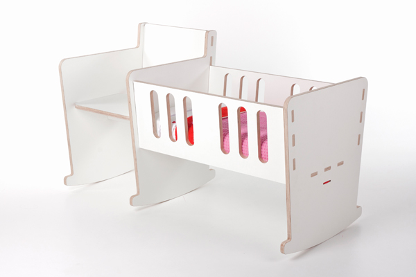
The Netherlander Dirk Ploos van Amstel designed this clever hybrid between a baby crib and a rocking chair, called Moep. Both pieces are morphed into a singular rocking unit, allowing a parent to accommodate the child with ease. “MOEP symbolizes the strong bond between parents and their new-born,” – says the designer. When the little one overgrows the crib – the side unit changes into a magazine rack, so Moep gets a new life as an adult piece of furniture. I like the laconic shape and neutral design of the piece – cute enough for the baby and quite elegant for everyone else.
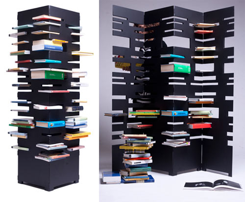
Since we’re on the subject of interesting room dividers, here is another one I couldn’t pass by. B-OK is a space-saving alternative to the usual bookshelf, created by Italian designer Marica Vizzuso. The piece unfolds into a screen and folds back into a tower, depending on your preference and space limitations. B-OK is also fun – instead of stacking books side-by-side, you pile books on top of one another into a variety of slots. ““Why do you place books in a conventional way when you can have both an amusing and aesthetically interesting alternative?” – aptly asks the designer.
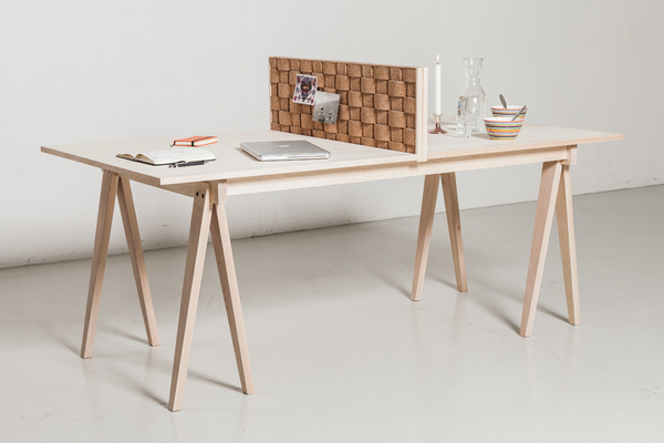
This elegant and rather witty table has been created by Reykjavík-based designer Theodóra Alfreðsdóttir. The surface of the piece is divided in two parts by a cork partition – the work area and an eating nook. On the days of big dinner parties, the partition is being removed and the proper dinner table is being set. “The inspiration for Flétta comes from medieval banquets around the 1500s, – says the designer. – At the time, halls were multifunctional and dining tables were raised upon trestles so that they could easily be put away after the feasts and the halls put to other uses. Nowadays tables are often used for more than just to sit down and eat at. Flétta can be divided in two with its middle, which is made of cork, thus creating a working space on one side and a space for enjoying dinner at the other side without having the day’s work in sight. ” The cork divider can be unfolded and used an as insert expending the tabletop even further. Beautiful idea.
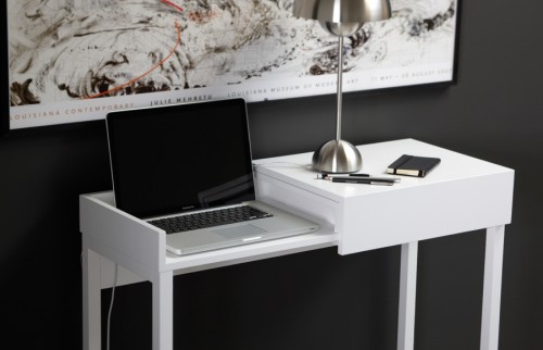
Hidden is a small desk, designed by Swedish studio A2. Created specifically for laptop computers, the piece, as the name suggests, hides both a function and an object. Simply slide the cover to the side to expose the laptop work area, and back again to hide it – brilliant. In the off-duty hours, Hidden can function as a console or a sofa table. The piece is made of painted wood and MDF. It suits laptops up to 15 inches.
(via apartment therapy)
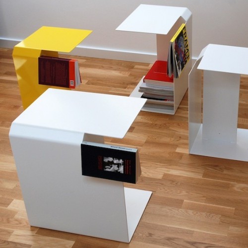
If you are an avid reader – you know how easy it is to turn your bedside area into a “librarint”. This minimalist and clever bedside table by Polish designer Pawel Grobelny, called Bookmark, is there to prevent the book clutter from growing, and it also allows you to keep track of your reading progress. The piece is a hybrid of a table, miniature bookcase and a bookmark. The internal storage area has two separate spaces – one for regular-sized books and one for magazines. An edge of the table works as a bookmark. The item can be used as a bedside or coffee table. It is made of powder coated steel and comes in three colors – white, black and yellow.

