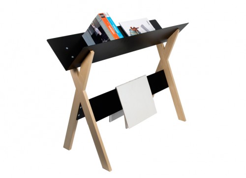
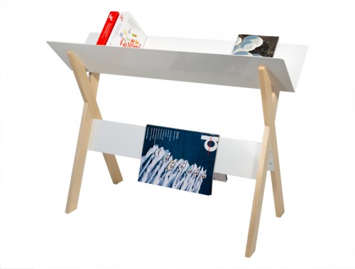
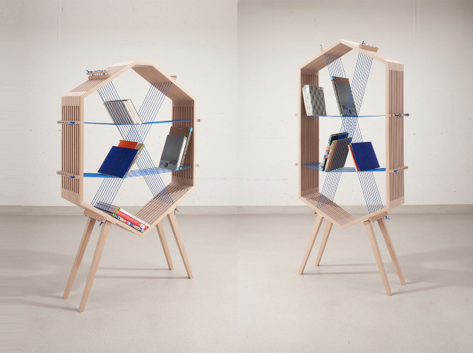
Here is another attractive holder for the active piles of books, otherwise creating visual clutter and blocking the passages between your furniture (mostly speaking for myself here). The piece, called Lesefutter (which can be translated as “reading matter”), was created by Italian design studio Covo. Its function is to provide space for the favorite books and magazines you want to keep in reach – beside your sofa, your table, your bed or wherever you are in need of some brain food. The inspiration for this design came from the archaic form of an animal’s manger. Clever. The piece offers a built-in bookmark and comes in black and white.
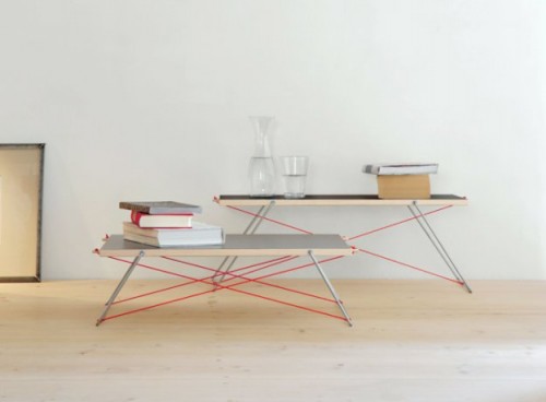
Paul and Paula tables were created by German designer Matthias Ferwagner for Nils Holger Moorman. Both tables feature reversible tabletops (you can choose between black and gray), made from untreated ash and covered with anti-slip linoleum layer. The airiness of the design comes from the stainless steel legs and the red synthetic fibre strings, connecting them visually. The tables, purposely designed in two different sizes, create a functional and striking combination. “Paul and Paula – they feel most comfortable as a couple and really shouldn’t be separated, so have a heart and take both of them home. Paul in meticulous black beside Paula in grey, casual and laid-back. Or Paula in black, half-shaded by her big brother – they always make a good impression with their reversible tabletops. Even alone they can effortlessly tempt you with their friendly nature and nonchalant cable design.” – says the designer.
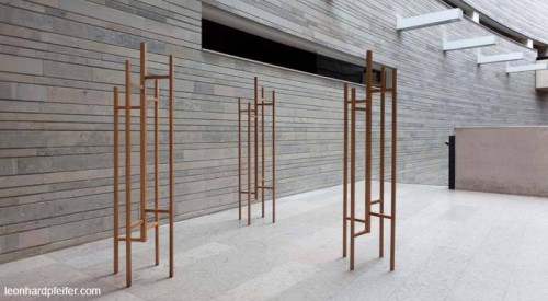
This elegant coat stand has been created by New Zealand born and London based designer Leonhard Pfeifer for the furniture brand Woodman. Simple and sculpturesque, the piece looks equally beautiful empty or laden with things. Here is how Pfeifer describes it: “I was drawn to the geometrical strength of the design and to the practicality of the vertical elements with horizontal joining members, both of which act functionally to provide areas to hang coats, scarves, bags and the like, but which also form strong design elements. The proportions minimise the footprint for compact entry halls, while ensuring a sufficient base to maintain stability.” The Eiden coat stand has recently scored a 2012 Design Guild Mark from the Worshipful Company of Furniture Makers in London which recognises excellence in design, use of materials, manufacture and function.
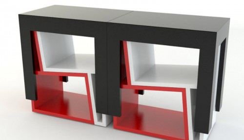
Project UTFSM is a new creation of the studio Elementodiseno. The series of lounge chairs and tables can be stacked together as a puzzle when not in use – what a cool concept. In its folded state, the furniture can serve as a shelving item. And in a party situation (or even in a need of an extra workstation) – the unit can be taken apart to provide searing and surface space. Fabulous.
This clever cabinet by Leipzig based designer Yi-Cong Lu expands, doubling its storage capacity. How? The principle is simple and ingenius. The drawers of the growing cabinet are located on the side. By pulling the drawer, extra space is created. “This kind of interaction makes it a “living” object, that changes its shape and size according to its usage,” – says the designer. The piece is made out of plywood and MDF.
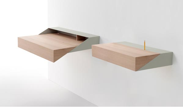
Since we’re on the subject of desks, here is one I am truly delighted by. DeskBox by Israel-born UK-based designers Yael Mer & Shay Alkalay of Raw Edges studio, created for the furniture brand Arco, is a soaring example of elegant simplicity and clever space-saving. A practical small table/cabinet that is hung onto a wall is ideal for small apartments. It its “box” mode, the item is barely extended from the wall. But as you pull the cover down – it turns into a nicely sized workstation, sufficient for a laptop or some writing paraphernalia. The opening on the back for cables and cords and a small storage compartment complete the piece.
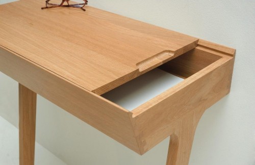
I believe in the virtue of small desks. Especially if our tasks are limited to writing, reading and light computing (which is usually the case for many people at home). Limited surfaces keep you organized and, if you add a clever storage hack to it, you’re set. The Quello table by British designer Phil Procter is exactly that – a tiny desk with the neat storage compartment. When not in use as a work station, Quello can serve as a console in a hallway or vestibule. Add a chair to it – and it transforms. The top of the table slides both ways allowing one to reach the storage underneath without disturbing objects on the surface. Lovely idea beautifully executed.
This beautiful storage system was designed by Italian studio Joe Velluto for the furniture company Muvom. Called Joe’s Addiction, the modular unit combines many elements into functional and easily customizable configurations. Thanks to the variety of components and the array of different colors and finishes, you can build unique storage, properly fitting your individual space. And if you want to change the look of your item – the parts can be easily moved and rearranged to your liking.
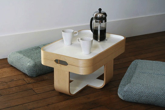
Mister T is a cute and clever multifunctional piece, created by Paris-based designer Antoine Lesur for French brand Oxyo. In its folded state the item takes less space than a small pouf. But as you unravel it, Mister T becomes a side table, a tray, a stool, a footrest, and even a dining/seating arrangement for two. And each incarnation is marked with functional elegance and simplicity. Who knew that a small basket with two pillows and a tray could do all that… Wishlisted!
(via design-milk)
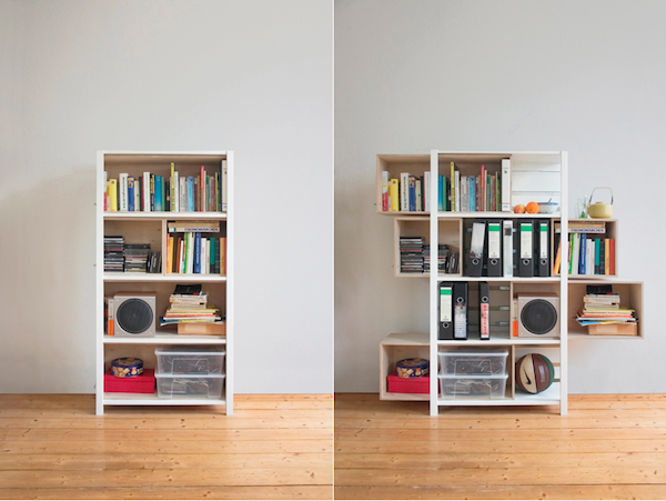
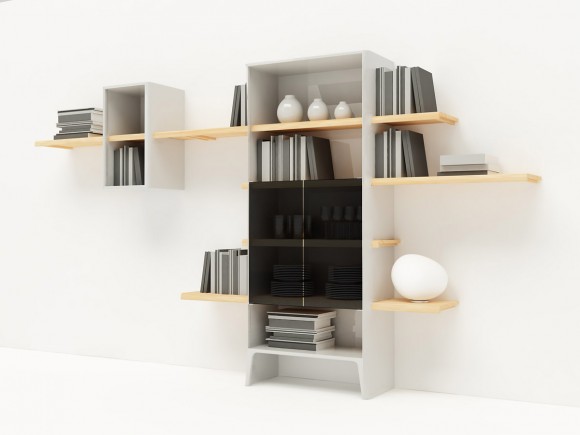
The www shelf by Victor Matic captured one very important aspect of today’s design – change. We live in the era of consumer bliss and rapid social and financial fluctuations. As the result, nearly any item in our home becomes a variable. Victor’s shelf fully embraces this idea and offers a flexible form that morphs into many shapes and dimensions.
Here is how he describes the design: “In an accelerated era full of freedom of forms and the change as a status quo I am creating an object which itself has no definite state and which is capable of interacting with the user and his environment. ‘www’ is an interpretation of the ‘shelf’ archetype. Between form and function, between space and dimension, between a not-yet and a not-anymore it creates concrete opportunities and specific associations. Through its parts it is not only a modular system, but also a type of installation in an ever changing space.”
Check out the video to see the changing shelf in action. The piece is currently on display at the Salone del Mobile 2012.

