Barcelona based company Arasanz has decided that sharing a bedroom with a sibling doesn’t have to mean style and space compromises. That’s why their Cromatic collection of kids’ bedroom furniture allows every child to express his or her individuality without stepping onto somebody else’s. The range of furniture includes bed, storage and desks that can be configured in a number of different ways. All of the furniture is on casters, making it simple to move around into different positions in the room. Each configuration is designed to take little space and allow multiple activities. Moving and transforming the pieces is easy enough for kinds to handle. Watch the video above to see this idea in action.
(via dornob)
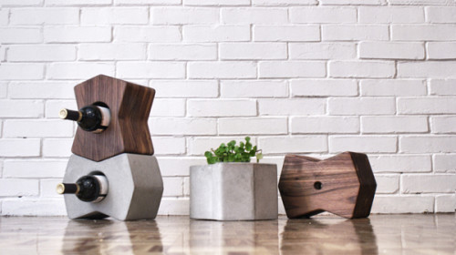
This sculpturesque storage system from Alberto Villarreal is a beauty. A refreshing combination of walnut and cement paired with the bow-tie pattern creates a lovely effect. You can stack the elements on top of each other or position them horizontally, if your space allows it. Litos storage system can be used for displaying wine, plants or any small items.
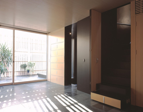
Population density in Tokyo is notorious. And that’s why inventive uses of limited space really flourish there. The Drawer House, built by the renown Nendo, is a good example. Using the concept of drawers, designer created an elegant and multifunctional layout. Several rooms worth of objects and furniture are concentrated in one wall and applied interchangeably. Here is how Nendo explains the concept of the house: “The residential functions are condensed into one side of the wall, and can be pulled out when necessary, like drawers. A simple mechanism, but this adaptive and flexible space is very effective in the limited housing situation in Tokyo.” A beautiful idea and seamless execution.
(via minimalissimo)
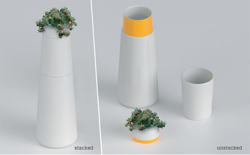
– Up Top – a lovely modular pitcher with the stackable cup.
– If you’re as obsessed with packaging as I am – you’ll love these beautiful cake boxes from A La Modo.
– 10 lifehacks of the past. Still surprisingly useful.
– Awesome idea – USB bed risers.
– Nice animation by Herman Miller – 108 Years of Herman Miller (in 108 Seconds).
– A designy doll house – just the thing to give your child to spike creativity.
– How cool is this – a silk scarf with prints from Nasa’s Hubble images.
– This gave me some serious goosebumps. Glance – a stunning short film by Conkerco.
Enjoy your weekend, folks!
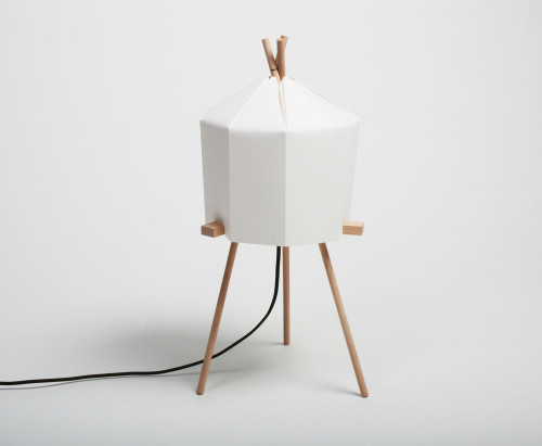
Having a soft spot for clever flat-pack designs, I thought this product deserved a mention. Paper Lamp by Honk-Kong based studio Milk Design is a lovely little item that provides soft ambient light. Inspired by origami, this lampshade is made from sustainable and innovative bamboo paper from Conqueror, the shape is held by pins. All elements are slot into each other, making the assembly a child’s play. The lamp is available through Milk Design store. Just be sure you don’t have a cat, because she will conquer the Conqueror lampshade in seconds.
Even for the creature of comfort like me – this video felt good, almost enticing. Imagine the freedom of your own boat, parked (or moored rather, if we’re being serious about sailor jargon here) in pricey West End London. Freelance fashion stylist Emma Freemantle lives on a narrowboat, the type of a vessel built over the centuries to fit Britain’s narrow channels (some are less than 7 feet wide). Her floating home is part of the community of narrowboats on London’s Regents Canal where she has lived for 6 years. Emma describes her tiny dwelling as a “floating caravan log cabin” that made her go back to basics. Woodburner, filling the water tank, replacing canisters of butane gas, heating water on the stove… It’s camping in the middle of the city allright. But Emma loves it. “I think it’s really good to have a little bit of hardship to really appreciate how you live and where it’s all coming from,” – she says. Check out the video above, shot by Fair Companies, to see the full tour of this unique home.
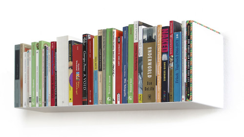
a_Books shelf by German design studio linea1 is a beautiful minimalist way to store and display your reading and DVDs. The essence of these shelves is in their absence. The thinnest steel-sheet is bent to a resistant form. The geometry of the folded sheet metal makes a shadow that hides the mounting detail, creating a seamless blend with the wall. So, all you see is your precious tomes. The piece holds approximately 40 books (up to 15.6 cm of depth) and pocket-books or 46 DVDs. Sold here.
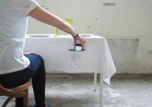
A while ago I featured the awesome Underful Tablecloth, which offered an inventive way of dealing with stains. This next product fights a much bigger dinner time nuisance – cell phone addiction. Dublin based designer Paula O’Connor created Zip It tablecloth. It celebrates the ritual of dining by providing a zipper pocket on the side of each guest for the phones and other distracting technology. Here is what Paula says about the project: “Dining is an important ritual. For many, the act of dining and eating together has been lost. For several individuals, dining has been reduced to a rushed affair. We “eat” but do not engage in a dining experience. Zip It, is one piece from the collection; Dining Together Matters, which aims to encourage a different way. My intention is to celebrate the joy of eating and dining. Establishing the importance of eating with others is the core message of this project.” The tablecloth is handmade from 100% Irish linen, using screenprinting techniques.
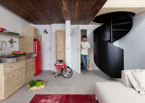
Architect Alan Chu created this fun micro bachelor pad for a recently divorced client in São Paulo, Brazil. The space is quite small, only 36 sqm, distributed in two floors. In order to keep the clutter from spilling out, the massive storage unit was built against one of the walls of the apartment. It included dresser, pantry, media storage, kitchen cabinets, collectibles, – all in one piece. I love the crate-like boxes the unit is comprised of, they look very low key and unpretentious. Red accents play beautifully against the white walls and pinewood cabinetry. The spiral staircase leads to the second floor, where the bedroom suite is located. The color scheme there is dark and subdued, giving a more private feel to the room.
Photography by Djan Chu
(via arch daily)
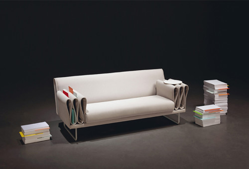
This unusual leather sofa has been created by London based designer Camille Paillard for Swiss brand De Sede. The folded armrests aside from looking quite striking, also provide storage for papers and small things. Here is how designer describes this project: “For me, it was interesting to play with the beauty of the folds and the material’s innate sensitivity. I designed the sofa with this motif in mind in terms of the armrests. The folds are not only aesthetic, but also practical for slipping in magazines and books or hiding items.” Love this idea.
