It seems the world became obsessed with folding metal furniture. Or maybe it’s just me. Here is another beautiful example of this efficient eco concept – Recto Verso collection from Krizalid Studio. The line includes a coffee table and a bookshelf, both of which are constructed of 2 mm perforated sheet of steel. The items arrive to you flat, and you assemble them following the simple diagram. There is virtually no dounside to this design – the items are sturdy, minimalist looking, flexible (the shelf can be folded in two different ways, which allows for the tilt to the right or left), the material itself is recyclable. Recto Verso shelf received an honorable mention at the Reddot Design 2011. Both pieces are available for purchase at the SitOnDesign.
How difficult it is to throw away magazines after you’ve read them? For many of us the answer is – very. They are shiny, they smell of print, and we like to think that we will need them one day for some uber important reference. And that is why magazine clutter is virtually impossible to conquer. But maybe we don’t have to? What if instead of throwing away our precious Vogues and ADs, we could turn them into a design inspiration? Designer Rush Pleansuk did just that. His Full-filled coffee table embraces magazines and uses them as a structural element. By filling this metal folding with your periodics – you create a table surface and, at the same time, turn your clatter into storage.
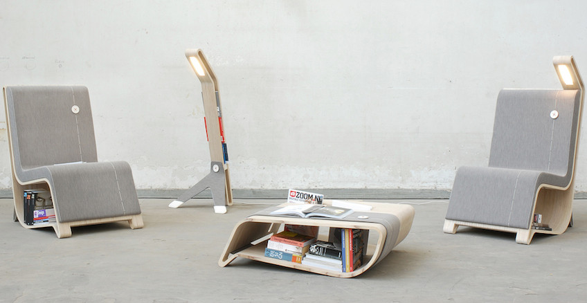
Bookworms – rejoice. There is a new way of storing and displaying your favorite tomes. Dutch designer Remi Van Oers created an entire furniture line, dedicated to reading. Made from wood and fabric, these pieces are not only modern and elegant, they also include a much needed book storage (the chair is equipped with the light to complete the experience). All pieces allow very generous space for books, making them a subject of showcase and a proud part of the design. A room full of book just got the whole lot cooler…
Source: Co.Design

Here is an example of taking a good idea and making it even better. Initially the Window table, created by Eero Koivisto for Offecct, had an inserted colored glass feature that served as a stylish way to indicate the storage area. Now Koivisto went further and replaced the glass with an insertion for flowers and plants. The result is refreshing and chic. The timing is right too. Spring is coming, so it might be a good idea to give those planters another optimistic try…
Here is an idea – furniture inspired by puzzles. And not just any puzzles – burr puzzles, assembled without a single nail or fastener. The result – a collection of beautiful pieces, made of natural, ecological materials, with no high-tech and no harmful glues. The project belongs to the Bulgarian studio Praktrik and created by the designer Petar Zaharinov, who sees big utilitarian and environmental potential in this puzzle idea. All items are sold in pieces that can be assembled and disassembled if not exactly with ease, but definitely with a lot of fun.
Acoustable is a coffee table/sound system, created by two Belgian designers Jérôme Spriet and Wolfgang Bregentzer. The table consists of a base and a top with an advanced acoustic system resting in between. Here is how the designers describe the concept: ‘The project Acoustable is born out of a reflection on music and ways of listening to it. As the digital revolution has made music more widely available, mobile and compact, so a good quality dock is essential. The idea of an object which combines good acoustics with user-friendly ergonomics arises from these considerations. The coffee table at the center of the room becomes the sound system and the power terminal. There are no visible technical elements, only the player and a remote which can both be stored in a built in pocket.’ So there you have it – the table with one more good reason to gather around.
Source: Freshome
When space is limited each item has to add something valuable to the equation. It can be done by amplifying the function or, in this case, the visual impact. The Bushel Table, designed by the New Yorker Devin Rutz, was not meant for blending with the wall color. It demands the room to itself. The name came from the idea of a bushel of sticks in your hand. ‘If you were to take that bushel of sticks and cut them down on one side a surface would be created,’ – Rutz explains. The other side of the sticks became legs. The holes in the surface add to the random beauty of the piece. They can be used for greenery or simply left alone.
 Oh, the peculiar things that drive designers’ fantasy! This time it is an earthquake, or thee earthquake rather. This coffee table, designed by Mexican architect Ricardo Garza Marcos, is called San Andreas and reminiscent of the San Andreas fault, the famous tectonic boundary in California. The sides of the table come apart just like the plates of the earth during a massive natural disaster. Only instead of a gaping abyss, here we have a cheerful color and some useful additional storage space.


