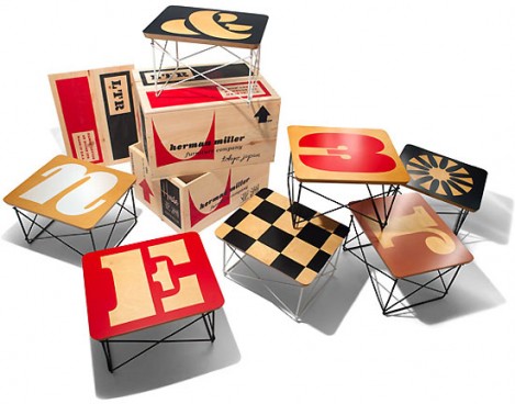
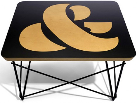
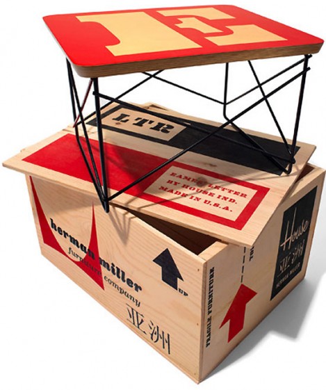
If you have an Eames fetish – this is definitely your lucky day. The type foundry House Industries and furniture manufacturer Herman Miller embarked on a collaborative project to produce a limited edition series of 80 Eames wire-base tables. The pieces are hand-printed with letters, numbers and ornaments from the Eames Century Modern font collection. Forty tables were displayed in Hong Kong at the Herman Miller Reach event on September 16, 2011, and another forty will be available at the House Industries exhibition at the Herman Miller Tokyo Showroom on October 27, 2011.
(HT TheDesignerPad)
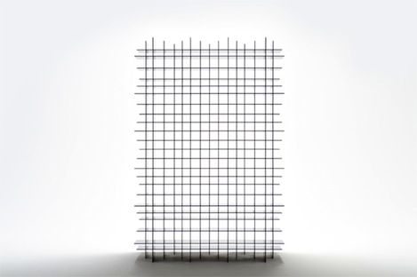
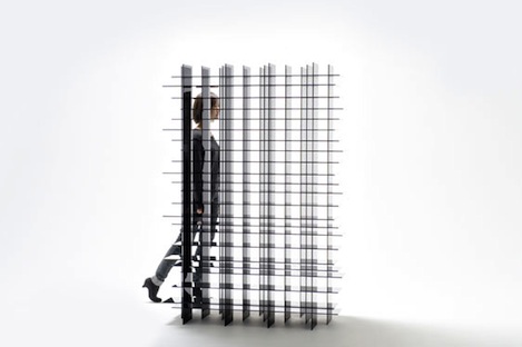
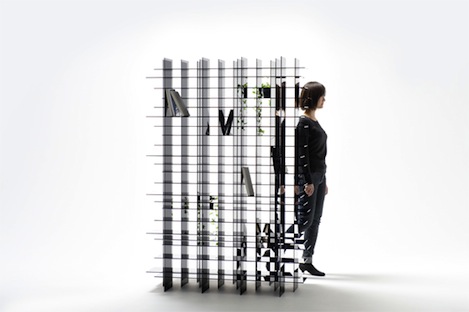
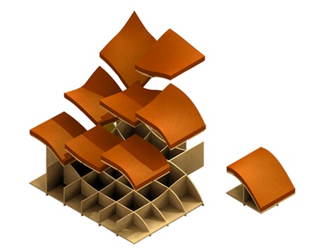
The Scatter shelf by Nendo is a made out of thin black acrylic panels in a grid form, stacked in three layers and slightly displaced. The result is this rather stunning shelving unit where all stored objects look as if they are suspended in a spider’s web. When viewed on an angle, the glossy acrylic face creates a series of reflections within the shelves, making the ‘opaque’ acrylic appear to be transparent. All this aesthetic goodness makes the shelf perfect in any spot of the room, even in the middle of it as a room divider. Watch the video below for a closer look at the piece.
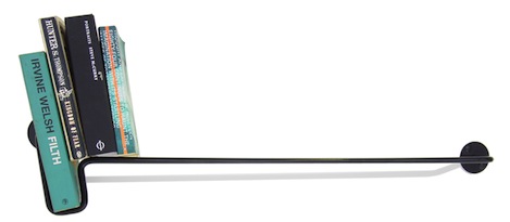
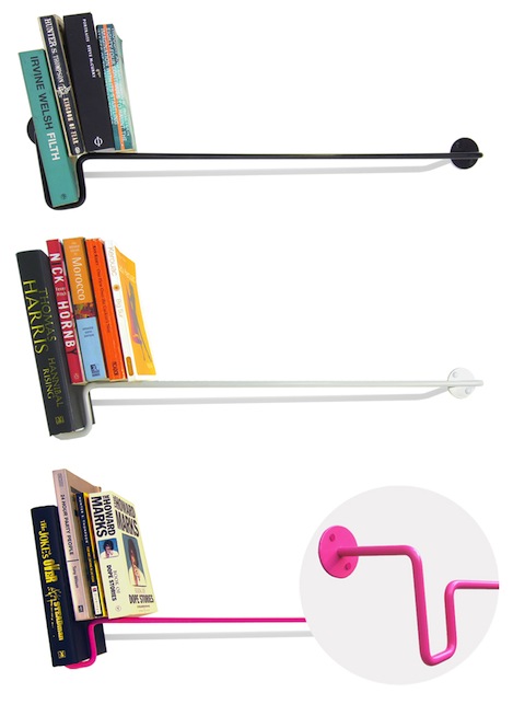
This minimal bookshelf was designed by Max Lamb for British brand Deadwood. The piece is nothing but a single bar of wire extended from the wall. But thanks to its U-shaped form on one side, it allows you to support and showcase your favorite book, which in turn serves as a bookend and keeps all other books in place. It is amazing what one cleverly directed piece of wire can do…
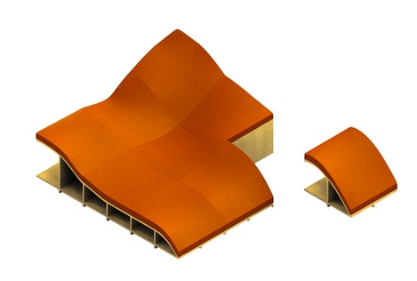
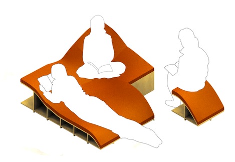
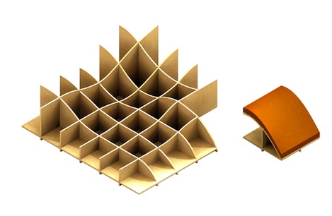
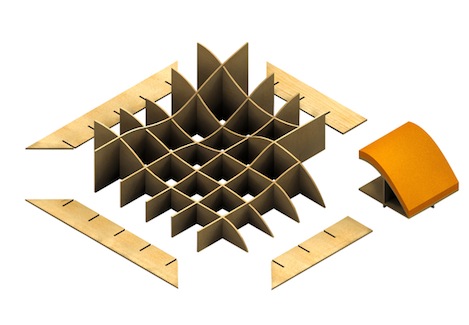
This unusual modular lounge piece was created by Portuguese designer Joana Santos in collaboration with Patricia Fernandes and Ines Carvalho. The concept explores the physical nature of reading and aspires to provide the most comfortable position for the bookwormy user. Comprised of several modular panels, the piece can be put together to create a lounger with several different levels of support – horizontal, vertical and inclined. One of the pieces can even be used as a free-standing foot stool. Santos thought that reading is a process deserving its own furniture. I couldn’t help but agree.
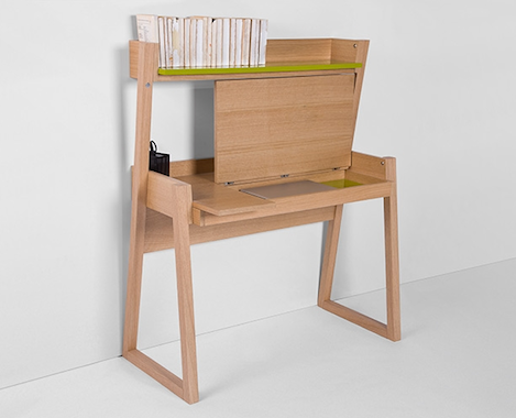
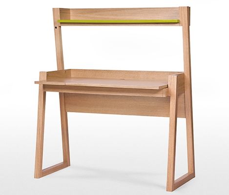
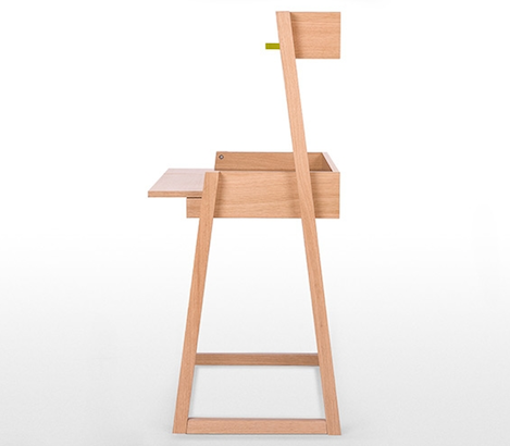
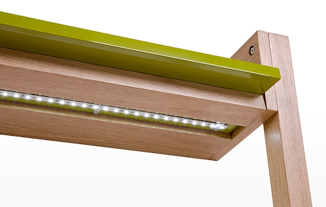
The Watson desk from UK based manufacturer Made.com is small in size and generous on impact and practicality. Made from oak veneer with glossy contrasting details, the piece includes several space-saving solutions. The storage compartment with holes for cables takes care of clutter. The shelf with integrated LED lighting (optional) allows to store and display books and other small items while illuminating the working surface. The manufacturing process itself is an exercise in efficiency. The items are produced in small batches only when backed up by high web approval ratings. The deadline for placing orders is given to the voters, after which all orders are processed together, ensuring that there is no waste of storage space for unsold products. This clever and eco-friendly strategy reminds me of the StyleFactory here, in New York.
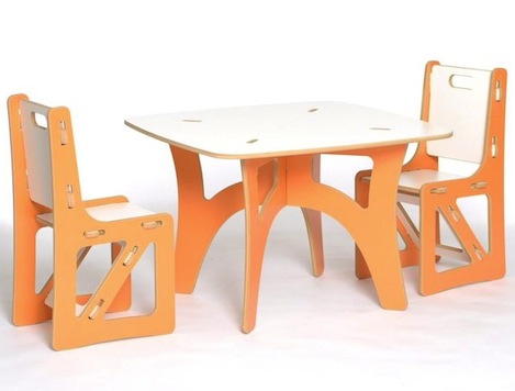
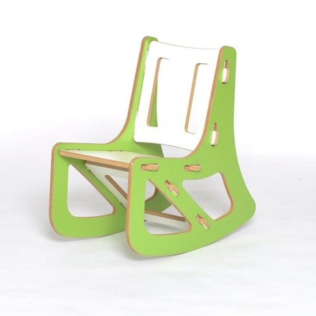
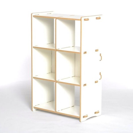
Sprout is a modular tool-less furniture collection some of you might remember by this lovely Kickstarter video. This line is designed to be simple: simple to make and simple to use. It’s easy to assemble and disassemble, making moving and storage easy. No tools or hardware are required, components are interchangeable, allowing you to change the color, style, or even functionality. And with the eco-friendly and virtually waste-less manufacturing process, this furniture is kind to the environment too. As the company’s creator Clark Davis tells me, Sprout has recently rebranded and went in production. Now, that’s a success story I’m really happy to hear!
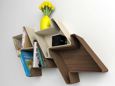
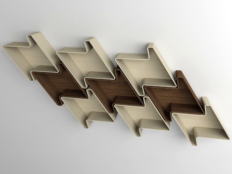
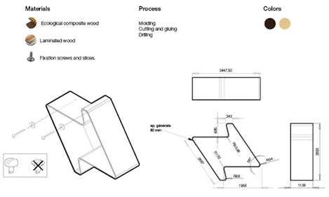
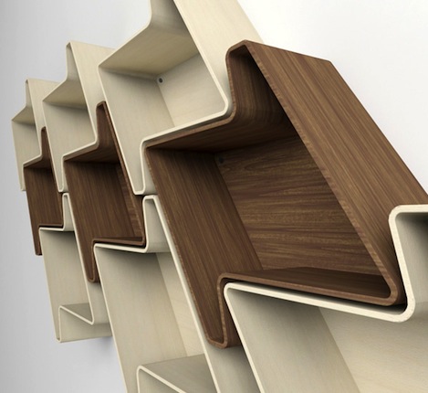
There is not a reason in the world why should we have boring storage. This modular system by Julia Quancard is anything but. It imitates the houndstooth (or Pied-de-Poule) woven pattern, which makes for a fun and beautiful shelving display. The units come in two colors made of laminated composite wood. Each piece is hung using only two screws. So you can create configurations of any size with the space you have at your disposal. Sweet.
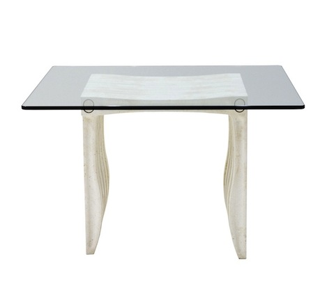
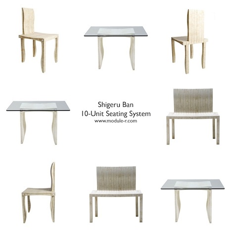
There is a lot to love about the 10 Unit System by Japanese architect and designer Shigeru Ban – it is modular, eco-friendly, good-looking and can be easily assembled by one person. And most importantly – it is ideal for limited spaces, because it allows us to built and customize our furniture according to our immediate needs. The series of L-shaped units can be combined to make different kinds of seating, from individual chairs to multi-seat configurations. You can also build table bases for tops of varying sizes with this same system. All configurations are held in place by a simple method of connecting rods, which makes them a child’s play to assemble. The 10 Unit System is made from UPM ProFi, an innovative composite, comprised of recycled paper and plastic. So, it is easy on the environment too. The product is available at Module R.
http://www.youtube.com/watch?v=DzO1-tfwG2E
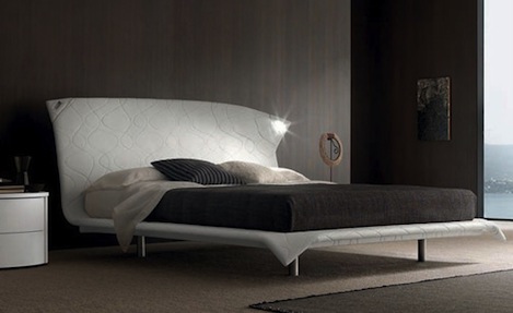
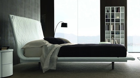
Abbracio is a beautiful upholstered bed designed by Fausto Boscariol for Italian manufacturer Europeo. The most telling feature of this piece is a bending headboard that embraces you (hence the name) while illuminating your reading. Two lights, incorporated into the corners of the bed, can be turned in any direction, giving you the choice of direct or ambient lighting. The bed comes in a variety of colors. Watch the videos to see Abbracio in action.
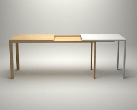
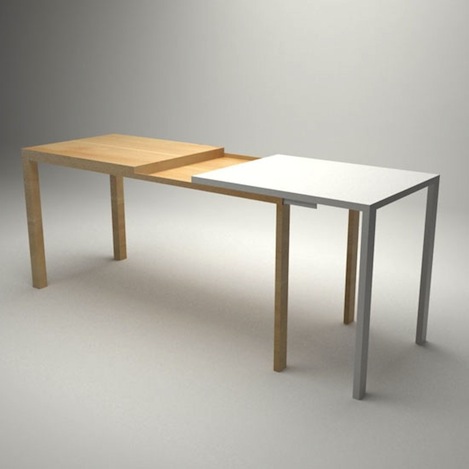
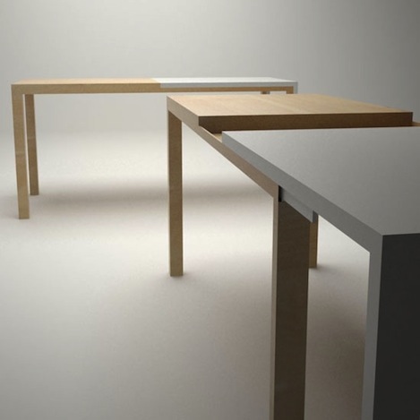
This multifunctional table by Djordje Zivanovic was recently submitted to the StyleFactory for voting (if you want to know how the StyleFactory works – check out this post I made earlier his year). Called 50/50, the piece is comprised of two parts: the wooden one – for dining, and the plastic one – for work. The idea was to have an elegant dining table and durable work station in one designer object. There is also a storage section in the middle (points for space-saving). And if you need to accommodate a larger crowd – 50/50 can be extended with one easy motion. Vote, if you want to see this piece produced. I have.

