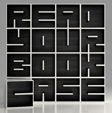
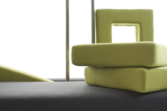
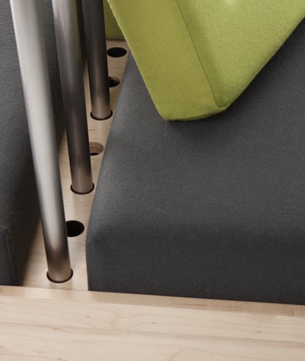
The Libreria ABC by Eva Alessandrini and Italian manufacturer Saporiti – is a modular system, designed to hold books of all heights. Thanks to the specific shelving arrangements, the modules are also capable to resemble letters. The shelves can be arranged into a bookcase, a wall unit, a side or occasional table, free-standing cabinet etc. The configurations, word-like or not, are endless!..
Here is another eye candy for the avid readers and sitters – the Bookshelf chair by Beijing-based designer Wenshuai Liu. This minimalistic piece includes a bookshelf right below its seat, which resembles the good old school chair only far more elegant. It is nice to see that in the era of electronic readers, books are still going strong and giving inspiration to designers. Maybe even more than they did before…
Half lamp, half bookshelf, all brilliant… Called Readme, the piece belongs to German designer Peter Böckel. The shape of this unusual object resembles a lampshade with some characteristics of a small chest. The elegant hybrid includes two storage levels, one inside the ‘shade’ and another one – on top. The business part of Readme is made of steel and supported by four maple legs; the light is coming through the translucent top surface. The piece will be presented at DMY Berlin this week.
Since elementary school we know that gravity is a natural force that makes objects fall on people’s heads. US-based designer Alejandro Gomez Stubbs of Malagana studio employed gravity for doing exactly the opposite. The Equilibrium bookcase he designed is a combination of tilted shelving components that keeps things in place without the use of bookends. The modules are connected via hidden steel joints and look as if they are floating in the air. This weightless feeling is a disguise for a sturdy construction, that can withstand over 160lb. The piece can be assembled in minutes without the need of any tools or hardware, and, when disassembled, all pieces fit into each other for easy storage. The Equilibrium bookcase was shown at the American Design Club’s Use Me exhibition during the New York Design Week.
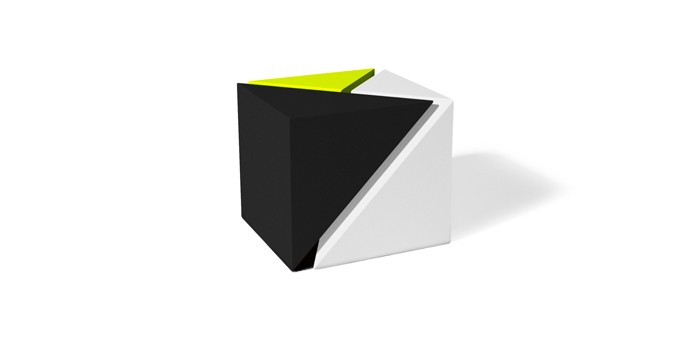
The 3:1 table is a cool creation by Chicago based studio TJOKEEFE. Their signature is in playing with geometry and distilling an object down to its essential parts. Powerful form and efficiency is what TJ O’Keefe, the founder of the studio, strives to achieve. This table, for example, is a clever geometric set of nesting tables, each of which can function independently. Even if scattered around the room, the pieces ‘interact’ with each other, creating a visual tension. The 3:1 table is made of matte powder-coated aluminum.
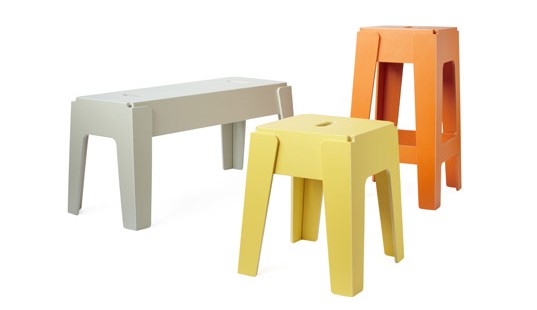
This colorful collection from DesignByThem is understated and fun. All three pieces – stool, bar stool and bench – fold flat for easy storage. And the assembly of the Butter Stool is literally a matter of seconds. The product is made from 100% post consumer recycled content, derived almost entirely from recycled milk containers. So it is eco-friendly as well as good looking. All Butter pieces are stackable, suitable for indoor and outdoor use, and come in 8 different colors. Can’t beat that!
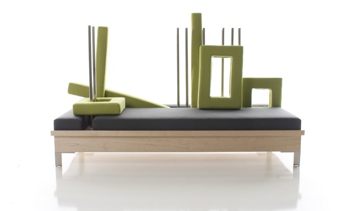
Mathew Otto of the NMU School of Art & Design created this clever chaise lounge in the effort to achieve sustainability through adaptability. The piece, called Construct, is indeed adaptable and can be transformed from daybed to pillowed sofa. By mixing the elements, we are invited to ‘construct’ a lounge piece to our liking. ‘The lounge stays new, never blending into the world around it and allowing the users to continually reuse it, rather than replace it,’ – says the designer. Smart.
[dailymotion id=xhow4p]
Triplette Chair by French designer Paul Menand takes the whole new approach to the stackable chair concept. Instead of nesting on top of each other, the chairs seamlessly interlock, creating functional sitting. This 3-in-1 design allows for more flexibility without costing you in space. Makes a lot of sense for those who has count square footage.
When the Keukenkabinet is closed, it is just a piece of furniture that is a part of living space. By opening it you crete a new space – a compact kitchen. The piece was created by Dutch designer Johanneke Procee in collaboration with Plugers & Vercoulen. The inspiration for it came during Johanneke’s trip to Sough America (I’m guessing she saw a few studio apartments here). She sensed the need for a design that can fit into confined living spaces, where cooking and sleeping is happening in the same room. ‘The compact spaces inspired me to approach the different functions a single room house needs to have from an other perspective,’ – says the designer. The end result turned out to be this elegant and functional piece. We, urban dwellers, are grateful!..
This modular, movable and foldable kitchen by Belgrade based designer Goran ‘Goci’ Bjelajac – has it all. It is fully equipped with all essentials, including fridge, oven, sink, dishwasher, and cooktop. All elements are mounted on the mobile screens, which in turn can move those elements, creating multiple shapes. Thus, you can build your kitchen according to your space needs or simply fold it and remove it from your sight when not in use. The screens allow for mounting on both sides, so you can use them as functional partitions. Ingenious.

