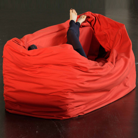
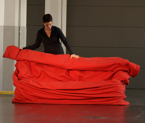
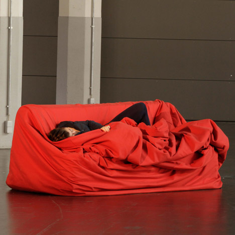
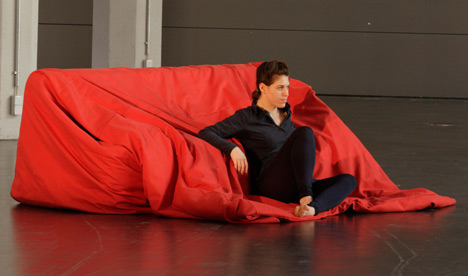
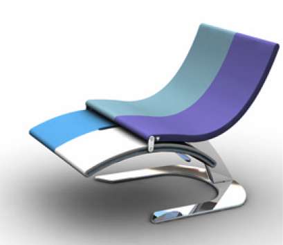
More news from the Cologne 2011. This unusual piece earned its creator Hanna Emelie Ernsting the second place in this year’s [D3] Talents Competition. Moody couch got its name for its ability to take and retain many shapes. The transformation is achieved thanks to the extended textile cover, which can be draped around the base in many different ways. A high quality cotton upholstery is reinforced by wadding, making the material more luxurious and also able to hold the desired form. Thus, the object can respond to changes in environment and user’s emotional state. The designer calls this concept – ‘form follows moods.’ By detaching cover from the base and giving it freedom, Ernsting created a piece of furniture that is as flexible as fabric. A couch that can wrap around you after a long day – who would not like that…
Source: Dezeen
Shelving is as unavoidable as human need for collecting things. Ordinary shelving, however, is possible to avoid. Consider this piece from Opulent Items and see for yourself. Justly called Contemporary Flexi Shelving, this modular collection can fit any space. The units are sold separately and can be compiled into various configurations. The choice of two sizes allows for an exciting visual variety. Each circle comes with a level base, that stabilizes the items displayed. The piece can be used as a shelving unit, a room divider, or both.
It is that time of year again, when the Imm Cologne (one of the biggest furniture fairs in the world) is in full swing. It started three days ago and will end this weekend; and some sneak peeks have already began to emerge. Here is one jewel I could not let go unnoticed – the Rewrite desk, created by GamFratesi design group for Ligne Roset. The concept of this piece goes beyond aesthetics and ergonomics. The desk is build around the phycological aspect of the writing process. A wooden table is surrounded by a soundproof and light resistant ball, made out of walnut and Kvadrat Divina wool. The user feels secure in this work bubble, even if the room is full of people. A lacquered metal box is attached beneath the desk to hide electrical cables and transformers. The shape is both traditional and surprising. And because it is so secluded in its own space, the desk can be located anywhere in the room without interfering with the overall design scheme. Rewrite has already been displayed as a prototype at the Danish Museum of Art and Design in Copenhagen.
And now for something completely different. A wooden stool made out of a series of triangles, generated by a computer algorithm. This innovative piece, created by Riccardo Bovo, only exists in a form of a prototype. But with its enormous geek appeal, it will most likely go far. Each One Hundred Triangles stool is unique; it uses a random set of triangle pieces, that are laser-cut from wood and joined together with cable ties. The result provides for a lightweight, flexible and fun sitting.
It is incredibly pleasing that the American turf can produce its own Jacobsens, Wagners and Kjaerholms. Meet Ryan Diener, a Cincinnati based industrial designer, whose works are inspired by the masterpieces of Scandinavian school. His latest creation – DK Stool – contains all attributes typical for the Danish design tradition. The piece is beautifully crafted, minimalistically shaped and made out of local materials. But the best feature of the DK Stool is that the top of it bends to accomodate the person’s weight, while the legs turn outwards for a better support. No mechanisms, no additional parts; all done by the physics of the form. Clever, simple and elegant… Can your stacking stool do that?
If you live in a shoebox apartment you know how problematic formal dining could be. Having a full size dining table is especially difficult, unless it can go off duty and perform other tasks between entertainments. The Unfold Table, created by a Danish designer Mathilde Witt Mølholm, will do that for you. Inspired by the art of paper folding, this piece can take four different shapes to accomodate any party. The sides of the tabletop are color-coded for contrast and also to indicate level change. The legs slide in and out to support the transformation.
The subtle humour of this piece made me look. Bed Blend, designed by the Netherlander Roy Letterle (aka lero), lives up to its name. A bed and two chars are morphed into one minimalistic piece. The chairs serve as bedside tables and in turn start formation of a headboard with their backs. Both the form and the function of Bed Blend are stripped to their absolute essentials. Even the ‘blending components,’ two chairs and a bed, are quintessentially basic. One simple, rustic idea in all its bareness.
 This candy-colored beauty is a collaborative effort of designers Igor Solovyov and Dzmitry Samal. A chair and a chaise lounge in one – a chair longe. The transformation occurs as the ‘lounge’ part slides under the seat via two railing mechanisms located on its sides. The gap in the middle is not only an eye-pleasing accent, it accommodates the steel handle that locks the chair in its position. Fun and robust, this piece fits perfectly in today’s rapidly changing environment. It can be displayed and used in its full lounging glory or ‘tucked in’ for low key gatherings or simply to clear some space.
 Surely, using typography in interior design was done before. But attempting it on such a literate level deserves a ‘high five’ just for sheer boldness. German designer Marc Lauckhardt created a furniture collection that not only resembles type, it seems to be constructed out of big three-dimensional letters. Surprisingly, this made for fairly believable and functional pieces, which proved once again that a well-balanced typeface can do and be anything…
People living in a megapolis love their bikes. The problem is – ‘big city’ often means ‘small apartment.’ That is why our beloved two-wheeled companions either sit in a storage room gathering dast or get in the way of any basic motion. Wouldn’t it be nice if you could put your bike on the shelf, like a book, and take it from it only when you need it? Well, this exact idea inspired Bike Shelf, created by the San-Francisco based designer Chris Brigham (aka Knife and Saw). The piece is made from walnut or ash and can be attached to the wall via a steel rod mount. The flat surface on top can serve as an actual book shelf or provide storage for bike accessories and other small items.
Source: Designboom

