Say you are a student, or a traveler, or you live in Manhattan and have a cupboard-sized kitchen… Whatever the situation might be, if you are forced to cook in a tiny space, consider CookEase by Liew Ann Lee – a compact integrated cooking system. It contains a heater and two color coated stainless steel bowls. The heater operates on magnetic induction and is made from silicone. The whole set folds into a case, that looks like a lunchbox. Portable, kind to your stomach and fun.
A dishwasher is usually a ‘one trick pony’ kind of object, it rarely performs any functions other than doing your dishes (based on my personal experience – you are fairly lucky if it does just that). But wouldn’t it be brilliant if it could add more to your home? Designer Kim Joomin thought so. That is why he created this incredible concept for Elecrolux. The item, called Dishwasher L, is a light fixture that doubles as an appliance. Positioned over the dining table, Dishwasher L will handle plates, glasses and flatware, quickly eliminating the immediate mess. In addition to its obvious space-saving properties, the piece recycles & purifies used water for the next wash. Because what kind of a futuristic object it would be if it wasn’t eco friendly?..
The subtle humor of this piece made me smile. The Habitco‘s Day Maker bedside phone charger/alarm hub is made to resemble a common kitchen toaster. When it is time to wake up – the phone pops up like a slice of toast, and if you want to snooze – just push it back into its tray (you can do it even with your eyes closed). As a fully customizable alarm clock, Day Maker lets you choose the song on your iPhone (or iPod) you wish to wake up to. It is true that nothing says morning like a piece of toast popping in a toaster. Add your favorite Apple product to it – and it might just make your whole day…
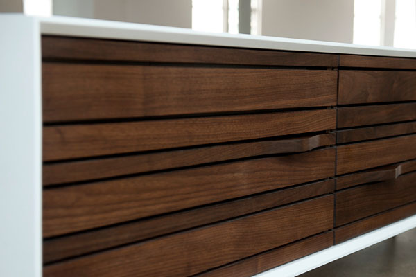
This retro-looking credenza from RAAD studio is not only an inspired piece of design, made to give your space that awesome mid-century vibe. There is a high-end stereo system incorporated into the piece — a solution to all of those hideous stereos and speakers. The cabinet itself is fitted with speakers and at the same time serves as a storage unit. So, no more unsightly music equipment miscellany, and no more wires and cords scattered on the floor. Everything is concealed inside this elegant, hand-crafted living room cabinet.
‘Everything is makeable, anytime, anywhere, by anyone,’ – this is the statement Droog made while launching their downloadable design initiative during the Salone del Mobile in Milan, 2011. The project allows people to design furniture by using an online interface. After finishing your unique item – you can download your design and a digital plan to produce it. Then you can either make it yourself or employ a recommended manufacturer.
This approach will have an enormous impact on the dynamic between the design industry and the consumer. “Taking design to the digital realm opens many possibilities. Not only does it have consequence on transport and storage efficiencies, it also calls for new design approaches, innovative digital design tools and online shopping experiences, and innovative business models for all actors along the distribution chain,” says co-founder and director of Droog, Renny Ramakers. And for us, tiny apartment dwellers, it will mean the unlimited power to create and customize objects for our limited spaces.
Cords and plugs are the worst kind of clutter, if you ask me. They create unsightly piles under your desk, gather dust and become a Bermuda Triangle of unmanageable maze. Luckily Scott Wilson of MNML created something intelligent to deal with the whole cord situation. The Power Pod, produced by Coalesse, is an extension cord with six sockets, cleverly disguised as an innocent office accessory. Just open the base when you need to plug something in, and close it when you don’t. Thanks to its round shape the Power Pod can accomodate even the bulkiest adaptor, which is another reason to love it.
Appliance giant Electrolux combined brainpower with the Domus Academy in Milan in the effort to rethink kitchen experiences. Master students of the Academy were commissioned to come up with innovative designs that “consider sustainability and culture based on existing technology.” The project is called ReSource and includes nine concepts. “To re-source is to re-generate, re-energize, re-mix and re-lax,” says Bruno Lizotte, Design Manager at Electrolux, “and the appropriate space for this multi-tasking is, more than ever before, the home and its vibrant centre – the kitchen.” Check the video below to see these ideas in motion!
[youtube http://www.youtube.com/watch?v=05BW0-X98Es]
Computer and refrigerator are the two most important enablers in our homes. But wouldn’t it be even more convenient and civilizing to combine them in one awesome item? This is the idea behind the iCool project, developed by Belarusian designer Alexey Dmitriev. He proposed to replace magnets, notes and other typical fridge clutter with the functional touchscreen display. The screen comes in different sizes (even door-length) and incorporates Apple or Android widgets. And from this point possibilities become unlimited: weather, music, news, shopping lists, photos, social media updates… anything you can think of! Another suggested cool feature is the face recognition program, that unlocks your widgets as you approach the fridge door. So, you can customize your refrigerator and make it truly personal.


