The nature of the real estate market in Manhattan makes it a breeding ground for small space creativity. Here is another soaring example of an ingenious use of space. This Upper West Side 450 square feet studio was designed to fit all the essentials and even a few extras. The place includes: living room, kitchen (with plentiful counter space), bar area, home office, sofa bed, extra bed for guests, closet, even library. A large blue custom-made cabinet allows the transformation to happen. Watch the video for the interview with architect Michael Chen of Normal Projects and to see the ‘unfolding apartment’ in action.
Photos by Aya Brackett
Yes, it’s that time of year again when urban people start fantasizing about great outdoors and indulge in monologues about nature being an escape from pressures of city lifestyle. It might be true in theory. Reality tells us that the only way we can survive in nature is by bringing comforts of our urban lifestyle with us. The nice people from SwissRoomBox knew this. They packed all our spoils in a clever compact box that can fit in any hatchback. The set allows to build cooking, dining, bathroom areas, as well as a double bed and even a lounging suite. Impressive! And the best part is – all components are slot-in and require zero tools for assembly. Swiss efficiency is no myth…
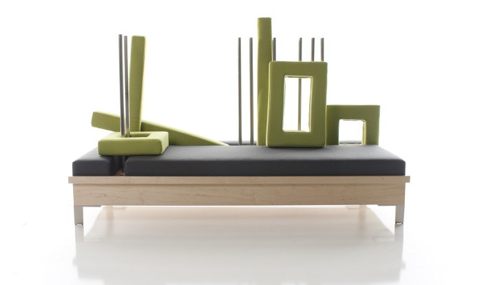
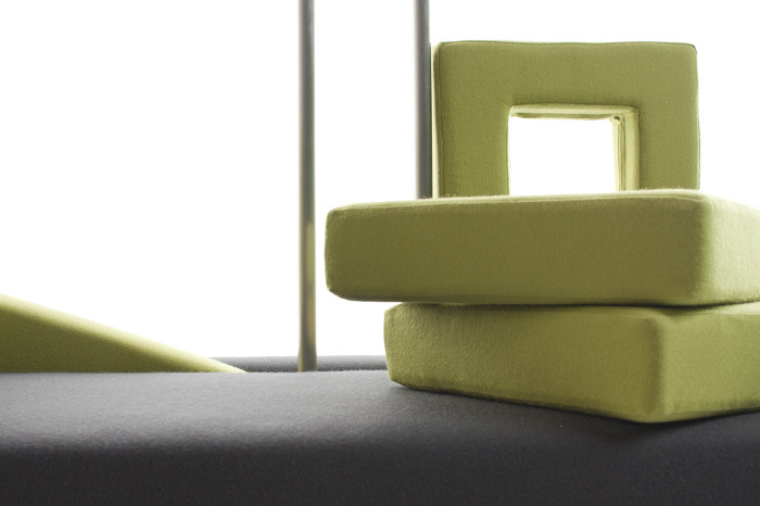
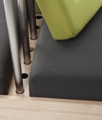
(Thank you Inga)Mathew Otto of the NMU School of Art & Design created this clever chaise lounge in the effort to achieve sustainability through adaptability. The piece, called Construct, is indeed adaptable and can be transformed from daybed to pillowed sofa. By mixing the elements, we are invited to ‘construct’ a lounge piece to our liking. ‘The lounge stays new, never blending into the world around it and allowing the users to continually reuse it, rather than replace it,’ – says the designer. Smart.
When the Keukenkabinet is closed, it is just a piece of furniture that is a part of living space. By opening it you crete a new space – a compact kitchen. The piece was created by Dutch designer Johanneke Procee in collaboration with Plugers & Vercoulen. The inspiration for it came during Johanneke’s trip to Sough America (I’m guessing she saw a few studio apartments here). She sensed the need for a design that can fit into confined living spaces, where cooking and sleeping is happening in the same room. ‘The compact spaces inspired me to approach the different functions a single room house needs to have from an other perspective,’ – says the designer. The end result turned out to be this elegant and functional piece. We, urban dwellers, are grateful!..
This piece from British designer John Green is so multifunctional, I cannot say affirmatively what it is. Depending on your needs, it can be a coffee table, a magazine rack, a media storage, a laptop table, a stool, a bench, a kid’s desk, even a tray for breakfast in bed. It is called Embrace, because of the two pieces that are ’embraced’ together to form a storage space in between. The item, a proud winner of several awards (including Grand Designs Awards Product of the Year’11), was presented during this year’s New York Design Week.
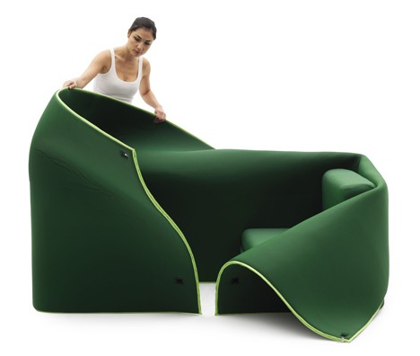
The only constant thing in our life is change. It dictates the way we look at the things that surround us. Milan-based designer Emanuele Magini created a piece of furniture for Italian brand Campeggi perfectly in tune with this desire for change and adaptability. The sofa, called Sosia, consists of two sits wrapped in a piece of fabric. By manipulating these three components we can achieve several looks and configurations. The sits can be pushed together to create a daybed, they can be pulled apart to make two separate chairs, the fabric can be zipped over the chairs for privacy or draped around them in various ways. You get the picture.
Small Kitchen is an innovative space-saving solution from German designers Kristin Laass and Norman Ebelt. It is intended to combine all kitchen essentials – stove, cooktop, refrigerator, sink, prep surface, storage, dinning table – into a 1m² structure. All this was possible thanks the clever layered design – different parts of the Small Kitchen are rolled out to reveal the rest. Efficient and very impressive! It is hard to believe that the piece was one of the student projects presented at the DMY International Design Festival’10 in Berlin.
This thing of beauty is called Sullivan/Barnes Table and made by Con Form Lab. On an average night it can accomodate six people, but when a party is in plans – the table expands to sit as many as ten. The expanding mechanism is fully integrated, so all you need to do is pull the tabletop from both sides. Thanks to perfectly fitted slots – the table changes its size (and its density) with one fluid movement. All parts are made of plywood, so Sullivan/Barnes table is not only a looker and a wonder of practicality, it is also ecologically agreeable.
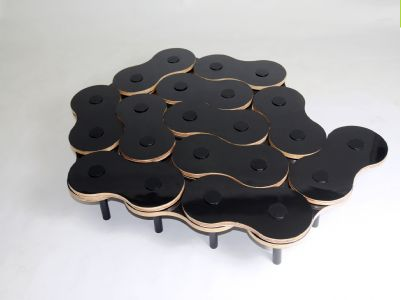
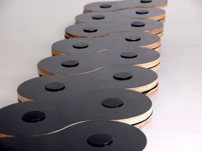
If you think about it – a coffee table is one of the most used and abused items in our home. It serves as a footrest, a book storage, a dinner table, an occasional desk and more. So, if it plays so many different roles, shouldn’t it change shapes too? Designers at Nódesign studio thought it should and created Elos – an adjustable coffee table that can be transformed to your liking. The movable segments look like molecules and can literary ‘diffuse’ into any configuration. You can put them together for a bigger table, or stretch them into a line to accomodate more people. By putting a leg below each pivot point, designers made Elos stable as well as flexible. Brilliant.
This beauty of a chair was designed by Robert van Embricqs, whose idea was to create a comfortable, three-dimensional piece that folds flat. ‘The foundation of any chair is the flat surface you’ll eventually sit down on. Using this notion as a starting point, I made several cuts in the flat surface and pulled up the different beam-like strands of cut surface. This created the preliminary but already distinct features of any chair: back, seat and legs,’ – says the designer. The chair can be painted in various colors to emphasize its flowerpetal-like shape. Or two different colors can be applied to the sides of the chair to underline the contrast between them. The Rising Chair only exists as a concept yet, but something tells me – not for long…


