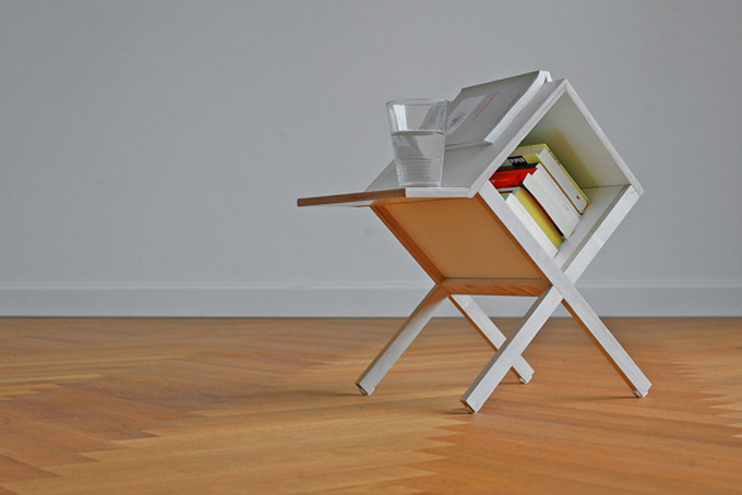
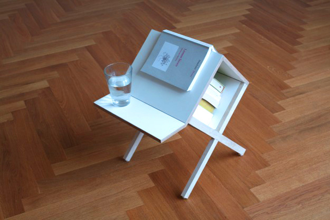
This little item, aptly called Buchtisch (German for Book Table), by Germany based design firm Studio Voigt Dietrich is a lovely companion to a reading chair. Small in size, it can fit in any space, even a tiny one. The unusual shape of the piece allows you to use it as a side table, book storage and also a bookmark. It will hold your teacup as well as your curent page. A nice idea for any ‘active reading’ you might have scattered across the room.
(via Stilsucht)
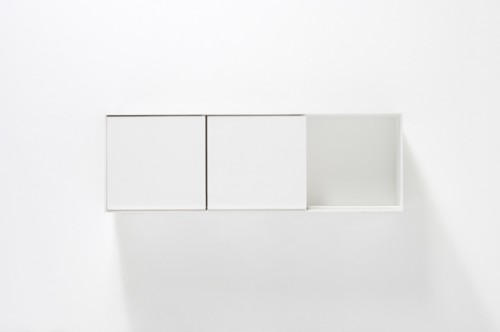
Othello is a modular bathroom cabinet, designed by famous Japanese studio Nendo for Italian brand Boffi. Minimalist and functional, the piece is a perfect remedy for bathroom clutter. The unit is fully customizable and can be arranged into many configurations. The modules come as open or closed cabinets with plain or mirrored doors. These doors, in fact, are the most notable feature of Othello – they rotate 180°, closing and opening the next unit. The hardware is integrated in the cabinet and completely out of sight. The matte white, varnished metal handle can be fixed to the door magnetically, if you so choose. Every detail of this piece is carefully thought out and simplified to perfection, which made for a timeless understated design.
(via 3rings)
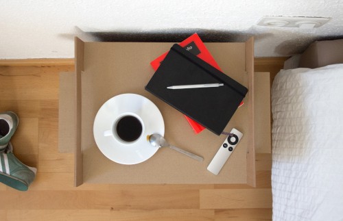
As an unfortunate possessor of two left hands, I’ve always admired DIY projects from a distance. But this fun eco-friendly idea by Adrian Candela looks so simple, even I find it unthreatening. Maybe because the material for the project comes from used boxes, a low key resource. Even if you mess things up, so what? You were going to discard the boxes anyway. No pressure.
Adrian explains: “The scenario is quite common: You move into a new apartment, which usually requires the familiar trip to IKEA (or some other similar furnishing store)… The final outcome: A fully furnished place and a large stack of decent quality corrugated fiberboard (most commonly referred to as cardboard).” Thanks to the downloadable instruction, this cardboard is folded into a nightstand. The result is simple and elegant. What a nice way to save money, space and, if the effort is successful enough to repeat, a few trees…
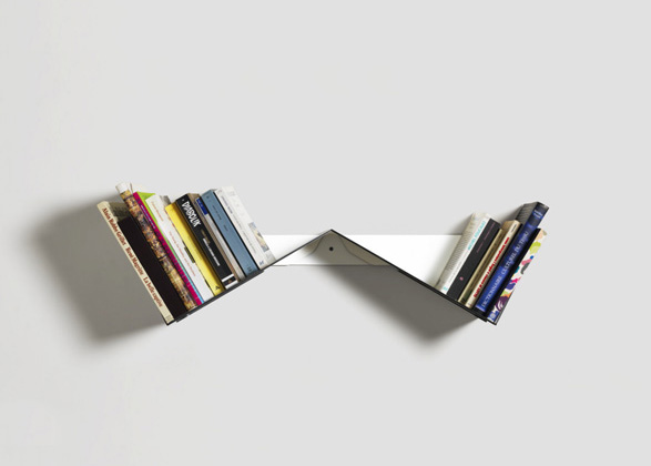
Read vs. unread bookshelf idea is not new, but Australian designer Robert Stadler executed it so beautifully, it made me look. The Origami-like object is made of aluminum composite and folded into a clever W-shaped structure, allowing us to divide the books into two stacks.
Here is how the designer describes it: “‘Transitory bookshelf’ points out a well known dilemma – books are piling up at home because we lack time to read them. This object combines two inclined platforms which help us to handle the situation : the ‘read!’ section reminds us that we should take time to read; the ‘read.’ section’s purpose is to digest books we have recently read before they disappear into the jungle of our main bookshelf.”
The Transitory Bookshelf is shown at the Milan Design Week till April 22nd.
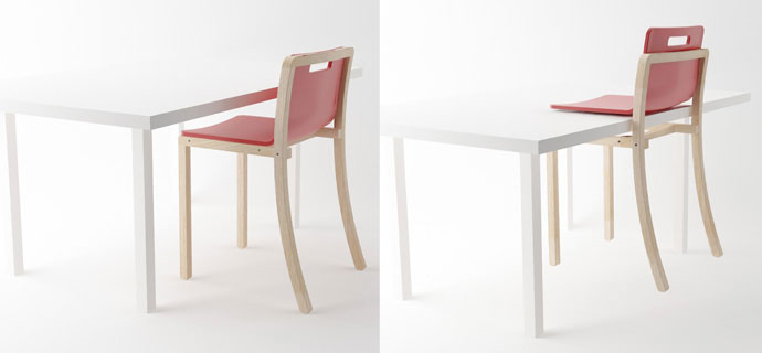
Cleaning the floor is tedious enough, but what makes it worse is having to fiddle with chairs. Trying to find a temporary place for them is tricky in a small space and turning them upside down over the table is unhygienic. But what are other options?.. Malaysia-based designer Poh Liang Hock came up with an answer. His Hold Chair has a seat and back that slide up the backrest frame. This separates the seat from the frame below it. The chair can then be slid onto the table. Genius! I especially like the fact that at no point of this operation you have to handle the chair’s feet. This concept piece is a winner of the prestigious Red Dot Design Award. Can’t wait to see it produced.
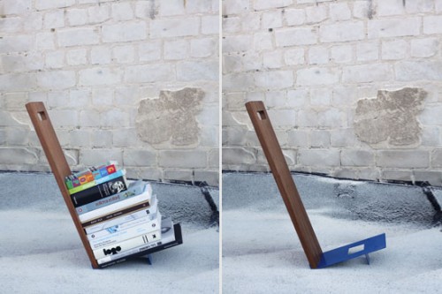
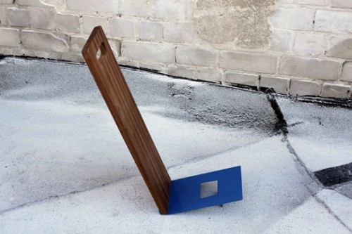
Avid readers – rejoice. The Eli shelf by Tel Aviv based Studio Ve is designed specifically for your active piles. Instead of scattering the books you are currently reading around the apartment or leaving them in heaps near your sofas and chairs – you can neatly store them on this mobile shelf. This temporary housing for your active library can be easily moved, it will save your precious tomes from damage and free some valuable floor space.
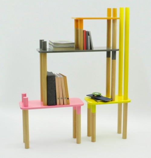
Welcome to the Jungle is the name of the furniture collection, designed by Rui Alves, force behind My Own Superstudio. It is comprised of five pieces that can be stacked in many different ways, creating shelving, seating, multilevel console/occasional tables and even coat hangers. I love the colorful fun the line projects. Little columns on the side of each piece really do add animal resemblance, something kinds of all ages will appreciate.
(via swissmiss)
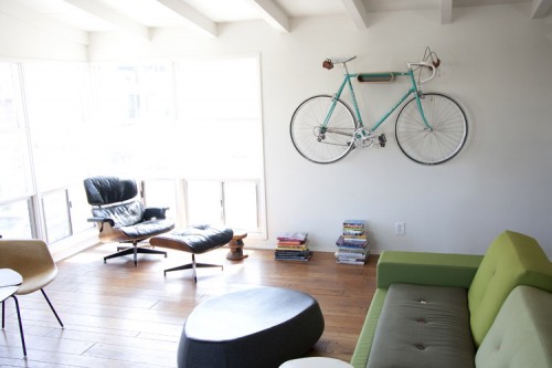
I cannot possibly pass by bike storage without noticing. Especially if it is as beautiful as this piece. A product by Long Beach based design studio Ballou Projects is quite literally called Very Nice Bike Rack. And I couldn’t help but agree with this self-congratulatory name. Minimal and sleek, the item blends with its surroundings, looking like a cool shelf. And although the idea is not particularly new, I do like the Ballou Projects’ variation. The rack is mounted on the wall, elevating your bike and freeing precious floor space. It is perfect for a horizontal top tube bike that weighs less than 25 pounds. The floor stand version is also available. It holds just about any type of bike and comes with felt spacer pads to accommodate various tire widths. These racks come in bent plywood, walnut veneer or white powder coasted steel.
(via Gessato)
As the name suggests, the Mastro table, created by Gum Design for De Castelli, has derived from an old worktable design. But unlike its predecessors this piece has some serious space-saving advantages. The metal tabletop is folded on the sides to serve as a holder for the legs. The same tabletop allows to store the legs and flatten the table when it is not in use. Beautiful dual function! I also love the visual contrast between the patinated top and light wooden legs.
(via designerblog)
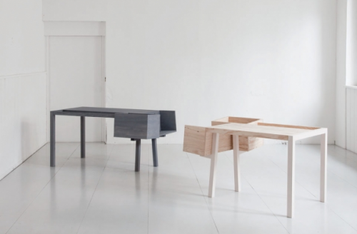
The Clark desk is an unusual creation of German studio Llot Llov. Unlike traditional desks, that often try to conceal storage, this one displays it for you to see at all times. The idea is to provide a comfortable nest for stacking things rather then filing them away. “Everything stays within reach and does not disappear in drawers or cupboards,” – designers explain, – The desk picks up on the most common way of keeping objects on your desk and enables to do this in a variety of ways.” This storage concept could be useful for us, visual types, who need a full view of their “work-in-progress” piles to stay focused and inspired. The piece is made of natural pine wood and comes in two finishes.

