Versatility is a must when it comes to children’s furniture, and this clever item from Country Living fits the bill beautifully. These colorful benches, called Groowy, can be transformed into shelving. Stacked on top of each other, they create a bookcase, a free-standing room divider, as high or as low as your space allows. And if your child is having a play-date, and some extra sitting is needed, you can easily take the storage unit apart and transform it back into cool and child-friendly benches.
HT Babble
SO3 is an efficient and practical DIY shelving system from Zhaolei, designed to fit any space. These wooden shelves can be assembled into any configuration, they are the building blocks with which you can create a bookcase, a decorative shelf, a room divider etc. SO3 arrives to you in a form of a flat and compact package – another sign of a well thought out design.
Source: Yanko Design
http://vimeo.com/20014868
Two Danish design school students Anne Ahrendt Futtrup and Anita Johansen created this adorable thing, called The Starling Box. This table/storage combination can save space, but what it also does is make you feel like a kid on a treasure hunt. As you explore the labyrinth of the twisted tabletop – you discover bright boxes that are both intriguing and functional. The Starling Box is made from MDF and solid beech, oak veneer, and a colorful palette of felt.
Source: Abitare
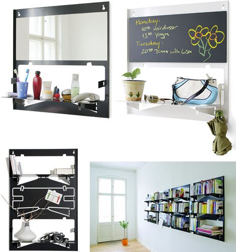
Fold them down when you need an extra storage, flip them up when you don’t – this is the idea behind the Piegato, a mobile storage system, created by Matthias Ries for Serafini. These colorful metal shelves are as minimalistic as can be. Easy to install, fold flat, provide storage while taking zero space for themselves… They come as individual units or as sheets of three (for creating bigger configurations). In addition to all this goodness, the unused Piegato shelves serve as an interesting aesthetic accent on your wall. As rightly stated by Dornob, these shapes become somewhat iconic – a passive element of decor.


There is something distinctly architectural about this piece – a wooden side table with acrylic windows looks like a miniature building. Designed by Teddy Luong in collaboration with Dennis Cheng for Umbra, the Condolisa table provides more than just a place for your teacup and a book. It has compartments for storage inside, which can hold books, magazines, pillows, throws, – you name it. The frosted acrylic windows add visual interest and also give the subtle view of the stored items. The removable lid works as a surface. Thus, the Condolisa side table is multifunctional and minimalistic – the two M’s we, shoebox dwellers, appreciate the most…
We, urban dwellers, constantly struggle to come up with compact and functional bike storage. This unusual piece goes beyond simply providing a place for your two-wheeled friend, it puts your bike to work! Created by Store Muu Design Studio, the PIT IN bike desk utilizes the bike saddle, turning it into a chair. Made entirely from plywood, the piece is fairly light and easily movable. Skeptics might argue that a bike seat makes the most uncomfortable chair imaginable. However, if you are not planning to write a novel and just want to take a coffee break and check emails, the PIT IN desk will serve you well.
Source: bookofjoe
Here is a concept that goes beyond aesthetics and functionality. It actually expresses a point of view. This optical illusion, turned into a bookshelf, is a reminder that ideas can be misinterpreted when passed from one end to the other. Created by ClarkeHopkinsClarke, the Bias of Thoughts bookshelf was inspired by the famous 2D drawing of the optical illusive bookshelf. Here is how the notion of the piece is explained by designers: ‘Thoughts are biased. When ideas are passed from one person to another, due to the transfiguration of the communication process and the frame of mind of the receiver, they are always perceived with bias.’ The Bias of Thoughts bookshelf is strong enough to withstand books and iPads, as well as hanging magazines.

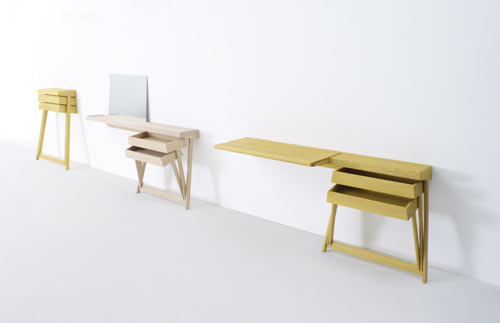
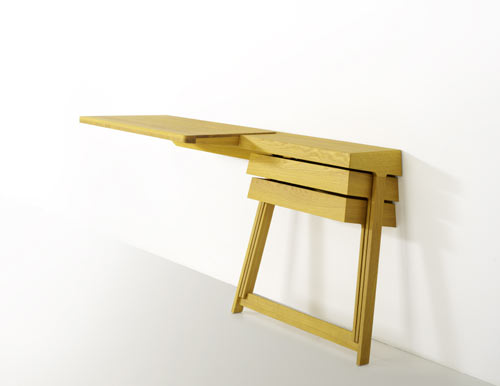
When designer Shay Alkalay created his first Pivot cabinet for Arco in 2008, it became an instant hit. The simplicity, paired with the space-saving qualities, earned this piece a well-deserved recognition. It even received the Dutch Design Award, 2008 in ‘best residential product’ category. Recently the Pivot family expanded. The new Pivot desk and vanity table were added to the line. The objects exhibit the same minimalistic approach to space and form. And because the drawers are hinged together, they can be opened at the same time, – a convenience most traditional cabinets cannot match.
Source: Design Milk


If you are a Harry Potter geek – this piece will appeal to you on several levels. There is something distinctly Potteresque about the whole concept. This unusual cabinet has no shelves, doors or drawers. To store an item you have to push it into the wooden beams, and a solid volume opens up when objects are stored within it. Designer Chung-Tang Ho envisioned the Push and Store cabinet as a sculpture, where your items are participants in the act of creation.

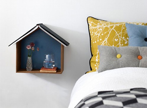
This unusual shelf from Fern Living, called Studio 1, beautifully doubles as a wall decoration. If displayed on a wall in several different sizes and colors, it creates a cute skyline (with the possibility of storage and/or display). You can also use it as a bedside reading nest. It can house your alarm clock, a glass of water and some other small items. The ‘roof’ can serve as a bookmark. With its size and openness, Studio 1 also promotes minimal, clutter free approach to storage.
Source: Better Living Through Design


