If you are a Harry Potter geek – this piece will appeal to you on several levels. There is something distinctly Potteresque about the whole concept. This unusual cabinet has no shelves, doors or drawers. To store an item you have to push it into the wooden beams, and a solid volume opens up when objects are stored within it. Designer Chung-Tang Ho envisioned the Push and Store cabinet as a sculpture, where your items are participants in the act of creation.

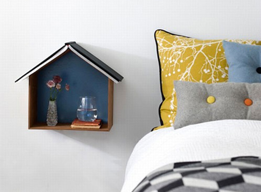
This unusual shelf from Fern Living, called Studio 1, beautifully doubles as a wall decoration. If displayed on a wall in several different sizes and colors, it creates a cute skyline (with the possibility of storage and/or display). You can also use it as a bedside reading nest. It can house your alarm clock, a glass of water and some other small items. The ‘roof’ can serve as a bookmark. With its size and openness, Studio 1 also promotes minimal, clutter free approach to storage.
Source: Better Living Through Design

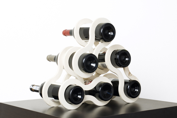
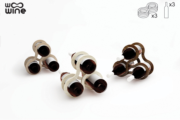
This cool modular wine rack, called Woo Wine, was initially created by the Warsaw-based designer Sandra Laskowska as a birthday gift for a wine-lover friend. Built from individual wooden or plexiglas hoops, these racks can take as much or as little space as you wish. They can take different shapes too. The hoops can be painted in different colors, which makes them even more customizable. And if you simply run out of bottles to hive (in an infinite Universe anything can happen), the Woo Wine maze can be taken apart and stored flat. Brilliant!
Collecting things is one of the basic human conditions, and flaunting them is one of the known joys. In a small space, however, doing so could be tricky. Display furniture often costs a lot in square footage and provides little function. Unless it can perform other roles. This collector’s table from the New York-based architect John Berg is a great example. A walnut frame supports two sheets of glass; the collector’s treasures float in between. The top sheet of glass slides from side to side to allow for object placement. The shape of the piece has a slight retro flair, which makes this clever table a display-worthy item by itself.
You know what they say – all things are temporary, unless they were designed by Charles Eames. This chair was not. However, there is something unmistakably Eamesian about the shape and the use of the materials. The Shrimp Armchair, designed by Jehs+Laub for Cor, is a new twist on the universally loved classic. The piece appeals to all human senses with its elegant curves, firm support, and refined workmanship. As Design Milk pointed out, the leather looks as though it sinks directly into the plywood, which creates the effect of lightness. Truly mesmerizing piece of design. And who knows, maybe in half a century the Shrimp Armchair will be the one to emulate.
Here is an example of taking a good idea and making it even better. Initially the Window table, created by Eero Koivisto for Offecct, had an inserted colored glass feature that served as a stylish way to indicate the storage area. Now Koivisto went further and replaced the glass with an insertion for flowers and plants. The result is refreshing and chic. The timing is right too. Spring is coming, so it might be a good idea to give those planters another optimistic try…
No matter what kind of opinions you hold on the subject, your cat will always believe that climbing on top of bookcases is awesome. And majestically eyeing the premises from the top shelf is even awesomer. You can enter a painful (and most likely futile) process of imposing restrictions on the cat, or you can embrase the inevitable and give him/her this brilliant thing. Created by belgian designer Corentin Dombrecht, the Cat Library bookcase is made in a shape of a staircase with a built-in sitting basket at its top. The piece is modular, which allows to fit it in any space. According to Designboom, the shelf is intentionally unpainted and is not oiled, so that the surface is not too slippery for cat paws. So, this may be furniture to you, to your cat it is just another toy. But isn’t this true for everything else in your home?
The Stick lamp by Todd Bracher is the minimalist’s dream. Inspired by the walking stick insect, the lamp blends with the surroundings while providing an adequate illumination. This biometric design is also pleasing to the eye – the piece looks both modern and natural. The LED lamp can be pointed in any direction, the metal tubing hides the cord. Elegant, functional, space-saving… This design quite simply has it all.
This piece is a combination of raw function and illusion, created by the Lisbon-based designer Fernando Brízio for Droog. From a certain angle it looks like a real side table with an open drawer, but, as the product name suggests, What You See Is Not. In reality only the drawer is three-dimensional, the rest of the piece is a sticker on a wall. Here is how Brizio describes this concept: ‘The illusion in this piece creates a situation where you observe the object’s form and deform, depending on your position in space. I am interested in this type of interaction between the object and the viewer—what you see is a result of who you are, how you think and how you are mentally and physically constituted.’ The What You See Is Not side table also allows to save on materials. So, it only tricks the eye, not the environment…
Here is an idea – furniture inspired by puzzles. And not just any puzzles – burr puzzles, assembled without a single nail or fastener. The result – a collection of beautiful pieces, made of natural, ecological materials, with no high-tech and no harmful glues. The project belongs to the Bulgarian studio Praktrik and created by the designer Petar Zaharinov, who sees big utilitarian and environmental potential in this puzzle idea. All items are sold in pieces that can be assembled and disassembled if not exactly with ease, but definitely with a lot of fun.


