This 1950s mid century modern Seattle home is only 600 square feet. But instead of increasing the footprint, this redo by architectural bureau Atelier Drome amplified usability of the existing space, which makes it so ingenious. The solutions included lots and lots of built in shelving in very unexpected areas, including one above the shower. I especially liked that these built in shelves do not project into the open area of the home, helping it feel larger. In order to open the space even further – similar materials were used throughout, providing the sense of cohesiveness. Another clever move was to eliminate the wall between the office/second bedroom and the main living space. This increases the feeling of space in the main living area, while providing a direct connection to the backyard. The large desk does double duty as a large dining table for family get-togethers, and the built-in shelves provide the necessary storage without creeping into the office. Additionally, a new sliding glass door was added to the exterior, harvesting every bit of the limited Seattle natural light.
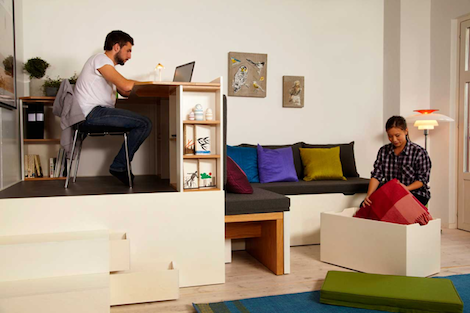
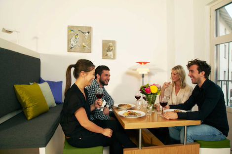
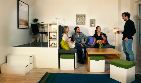
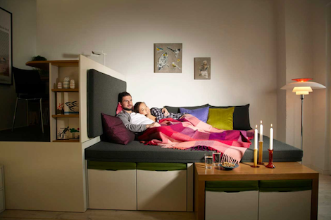
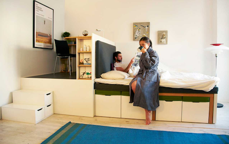
How delightful is this? Swedish company Matroshka Furniture AB managed to squeeze living room, dining room, bedroom and study in just 15m2 (about 160 square feet). This was achieved by inventing a piece of furniture that is able to transform into all of the above spaces. Matroshka system was inspired by Russian nesting dolls. Here too pieces fit into each other and save space.
Designers elaborate:
‘When the basic idea was being conceived, the focus was on seeing the room as a volume instead of an area, and on creating plenty of storage while also keeping the furniture comfortable and appealing. The L-shaped desk is fantastically spacious, with a standard height and depth. You may be living in a small space, but that’s no reason to use small furniture. A common problem in small residences is having guests round and finding somewhere for them to sit. With Matroshka, the solution is easy as the living room set-up has space for up to 12 people around the table.’
The entertainment area is built around a clever dining/coffee table hybrid, that can be moved up and down hydraulically. And when the party pieces are tucked in, they serve as a base for a double bed. Thus, all living systems are represented in one all-including piece of Matreshka furniture. It is pleasing that our humble Russian trinket propelled such an inspiring work.
Here is another beautiful example of urban adaptability, this time from France. Jérémie Buchholtz wanted an affordable apartment in Bordeaux (he’s a photographer who splits his time between Paris and Bordeaux so his budget was limited). He bought an abandoned garage and, with the help of his friend and architect Matthieu de Marien, transformed it into a 441 square foot living space. This tiny house has every basic component in place – living room, office, gourmet kitchen, bathroom, bedroom and lots of storage. All this was made possible by inventing a clever furniture piece that incorporates most of the components. With this clever organization, the architect was even able to allocate 129 square feet for a patio! So, again, we see that small space doesn’t have to come with lifestyle sacrifices. Watch the video above for a full house tour!
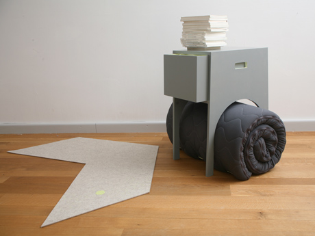
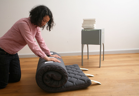
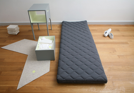
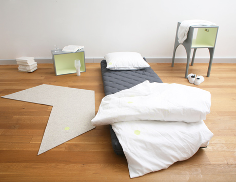
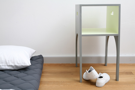
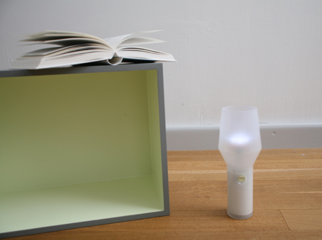
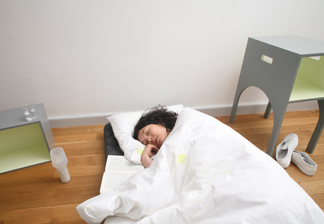
Swiss designers Luzia Kälin and Nicole Lehner created a clever solution for accommodating house guests called Stay At My Home. The kit includes all the basics needed for a comfortable night stay. These components are neatly stored within each other, which makes a lot of space-saving sense. The mattress is rolled under the nightstand, which in turn houses linens and a bedside lamp. The drawer can be removed from the stand and placed as a storage box within easy reach from the bed. The arrow-shaped rug completes the set. All pieces are lightweight, which allows the guest to move them around with ease. This design is kind to both receiving and visiting parties and perfect for a limited space.
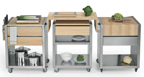
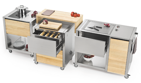
Modular kitchens comprised of interchangeable components are perfect for small spaces. They can be tailored to any room, moved around to accommodate different cooking needs… The Cun kitchen from Joko Domus does all of these things, while being an aesthetically pleasing object as well. All pieces are highly customizable. You can add storage options, accessories, choose between casters and fixed legs. Pieces can be hooked together or function as free-standing components. Side panels are available in a variety of woods, Corian or stainless steel.
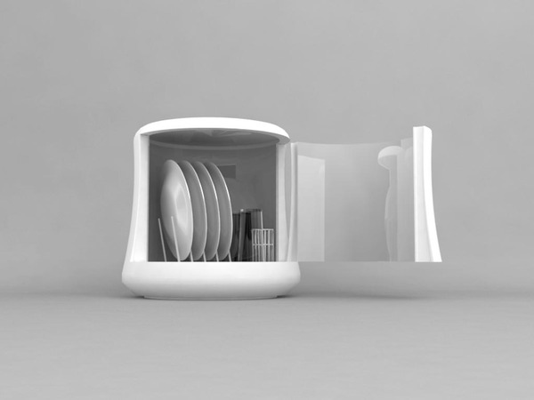
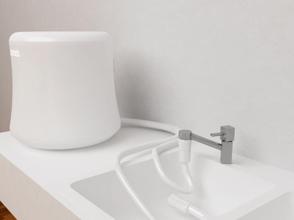
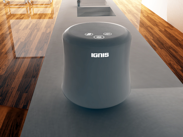
Mono dishwasher, designed by Daniel Simonini, is smaller than your average dish rack. Yet it can hold 4 plates, 4 glasses (or cups), and a set of flatware. Inspired by sea sponges, the piece has a smooth exterior and slick design that can agree with any space. But the best feature, in my opinion, is the fact that the pressurized water, used for cleaning the dishes, is also employed to power the device’s battery making it carbon-neutral. Perfect for an eco-friendly urban apartment.
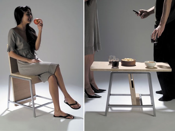
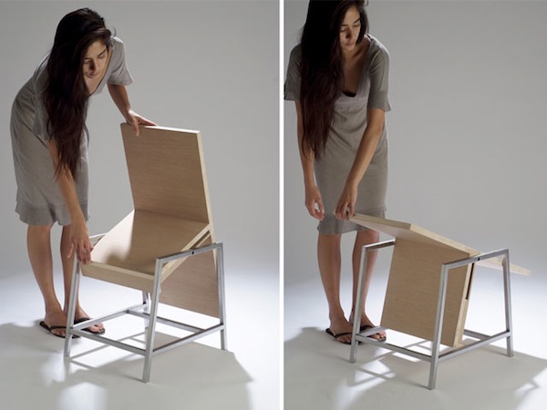
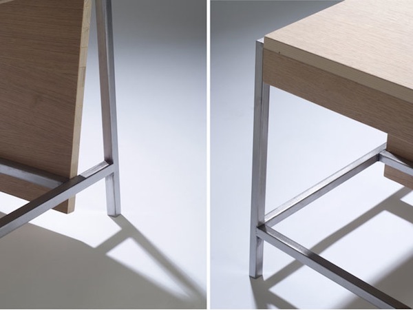
Here is a great example of dual function done right. The XY chair by Paris based designer Aïssa Logerot can be turned into a low table. And it can be done with one swift pivoting motion – no hustle or muscle required. The chair’s back becomes a tabletop and can hold drinks and appetizers in a party situation, cup of tea, books, and anything else you might need a surface for. The small size of XY makes it perfect for an urban setting.
People used mirrors and fake doors to create an illusion of bigger spaces since the dawn of time. Designer Sarah T. Kang suggests us to use both. Her clever mirror design, named Glimpse, creates effect of a door, leading to another room. The reflection and movement you might catch in the mirror completes the deception.
‘The door half opened always stirs up a sense of seduction and curiosity within us, – says Kang. – Inspired by these ordinary yet inexplicable moments in our daily lives, I designed a mirror that gives an illusion of a door opening on any given surface.’
Manhattan based architect Luke Clark Tyler lives the life of extreme space-saving in his 78 square foot studio. Even though the place can barely house his bed and has no kitchen, Luke does not see living small as a sacrifice. He employed his professional skills to customize this closet-sized dwelling to his needs. Another proof that we, New Yorkers, can endure almost anything for a great location.
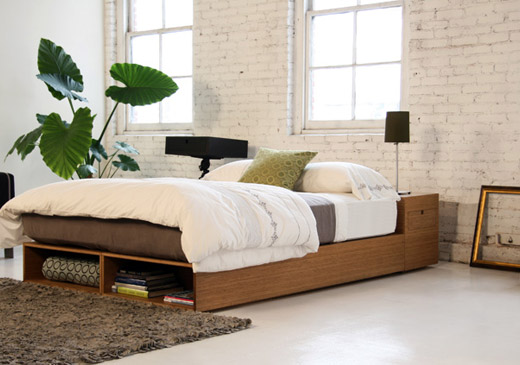
There is a lot to love about this cool minimalistic bed with integrated storage. Called Buden, the item was created by LA-based company Viesso, a young business that prides itself on making furniture ‘as Green as possible.’ The company uses environmentally friendly practices and chooses sustainable sources. This bed, for example, is made from bamboo – a fast-growing renewable material. But what gives it many space-saving points is the storage. Optional foot drawers, as well as base compartments and headboard drawers, are all available. Buden is customizable too – just give Viesso your specs.


