There are different ways to achieve seclusion and solitude. This one literally allows us to rise above things. This desk, called Consider One’s Place, from Japanese creative office Fift looks suspiciously like a ladder. And it can definitely serve as one. But unlike your average ladder, it has a seat and a laptop holder on its top. So, no matter whether you feel antisocial or just want to elevate your creative thinking, you can climb on top of one of these and reclaim your space. I wonder how the Consider One’s Place desk will affect one’s mood and productivity.
Parents beware – this adorable thing might turn your house into the most popular sleepover spot in town. Designed by photographer Yusuke Suzuki, this portable bed, called Child’s Play, is built to delight, entertain and, hopefully, lul to sleep your precious youngsters. Complete with the mattress cover and duvet pages, this ‘book’ has the generous size of two twin beds put together. So, no luxury has been speared. And what a better way to plant the right idea into the future avid reader’s mind?..
Source: Snoop

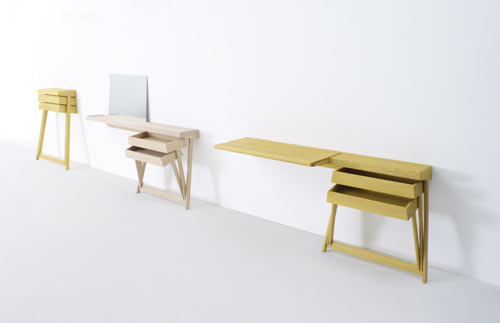
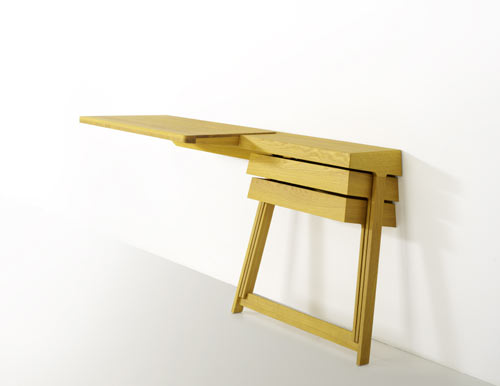
When designer Shay Alkalay created his first Pivot cabinet for Arco in 2008, it became an instant hit. The simplicity, paired with the space-saving qualities, earned this piece a well-deserved recognition. It even received the Dutch Design Award, 2008 in ‘best residential product’ category. Recently the Pivot family expanded. The new Pivot desk and vanity table were added to the line. The objects exhibit the same minimalistic approach to space and form. And because the drawers are hinged together, they can be opened at the same time, – a convenience most traditional cabinets cannot match.
Source: Design Milk


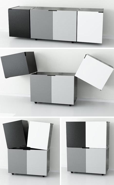
This piece was definitely designed with space limitations in mind. Cubox from Elemento Diseno is a horisontal string of boxes that can form several different configurations. The end cabinets can be flipped up, and the whole piece can be transformed into two vertical stacks of two, cutting the required floor area in half. The color scheme is a bit boring (black, white and two gray shades in between), but it makes Cubox even more universal.
Source: Dornob
The Stick lamp by Todd Bracher is the minimalist’s dream. Inspired by the walking stick insect, the lamp blends with the surroundings while providing an adequate illumination. This biometric design is also pleasing to the eye – the piece looks both modern and natural. The LED lamp can be pointed in any direction, the metal tubing hides the cord. Elegant, functional, space-saving… This design quite simply has it all.

A spacious and functional workspace in the morning, a social hot-spot in the afternoon, and a dining table at night – these are the roles this piece of furniture can play. A truly multifunctional table, called Doppelleben, is the recent creation of the Ahhaproject design studio. The idea is ingenious in its simplicity. The tabletop consists of two layers. If you need to use the lower layer, you can slide two lightweight panels down the sides. And when the work is done (or is safe to be interrupted), the panels come up creating a surface for dining and entertaining. This working/dining combo is merely a suggestion, of course. You can use the lower layer tabletop as a bookshelf, a utensil storage, a display for your collectables, or in any way you see fit.
Combining sitting and book storage is a popular game these days, and here is another impressive effort in this direction. The Ransa sofa, designed by Younes Duret studio, consists of a sit elevated above the book shelves. The piece not only has the obvious space-saving capabilities, but also provides a pleasing book display. Ransa is big enough for an average person to lie down, which makes it a proper couch, designed for an avid bookworm. The piece only exists as a concept, but when put into production, it will surely find many fans.
This unusual lamp was designed by the young Pasadena-based designer Soo Kwon. The idea of the piece, which is reservedly called Licht, was to combine high-design with low-tech manufacturing (the latter allowed for the relatively low price of the product). Kwon noticed how the traditional lamp silhouette shapes the light and made this shape an inspiration. The result – clever, functional and effortless design. The piece comes in two colors and in both floor and table versions. The Licht can be purchased online.
Source: Losangelist
The words ‘modular’ and ‘customizable’ are music to our ears, especially if we live in an awkward and/or limited space. Consider the Cocoon, a versatile shelving unit created for Ideal Form Team by the Italian designer Paola Navone. The Cocoon allows all customization imaginable – the shelf can be built to fit any space and any stylistic preference. You can choose between open and closed storage, various effects and finishes, several digitally printed designs… The combinations are endless. As is fun to pick and change them.
The fewer pieces of furniture we have, the more they have to matter. This item, for example, is not going to stand in the corner unnoticed. Designed by Pierre Brichet, the Marie-Sophie chair is definitely made to create a visual impact. Manufactured out of steel trellis and leather, the piece seems to be suspended in the air. The clever geometry of the base creates a negative space around the seat and showcases the elegant simplicity of the object. The Marie-Sophie chair is currently displayed at the Coming Soon Galerie in Paris.


