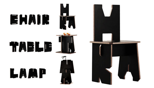
If you love typography and flat-pack furniture – you will appreciate these pieces. Originally designed as an advertising campaign for Penguin Books, this line was created to promote reading. The concept is pretty simple – every book is made up of words; and all words are composed of 26 letters of the alphabet, arranged and rearranged in infinite combinations. Building on this fact, DDB Singapore advertising agency created a new Penguin font with one unique difference. Each letter, cut out from plywood and coated with black laminate, could be slotted into another to form furniture. Thus, the letters C, H, A, I, and R make up a chair; the letters T, A, B, L, and E – a table… You get the picture. The campaign was held in eight busy urban locations, encouraging passers by to stop, sit down and read something. The Alphabet collection is now on sale to general public and can be purchased here.
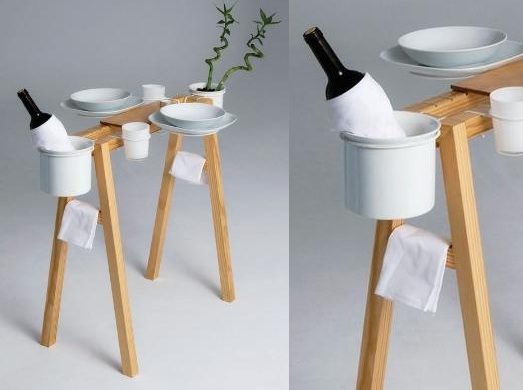
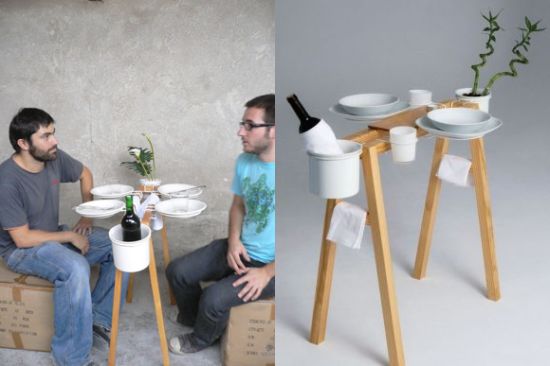
Here is an example of extreme space-saving from Valencia based designer Daniel Gantes. His La Cool Vie Bohème dining table is reduced to its raw function. The piece is nothing more than a foldable pine wood stand that holds all your necessary dining paraphernalia – plates, wine bottle, glasses, napkins, even a flowerpot. Envisioned as a mobile dining solution for someone who lives on a shoestring budget, the table will be just as useful to those who live in a shoebox space…
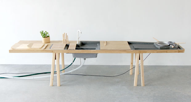
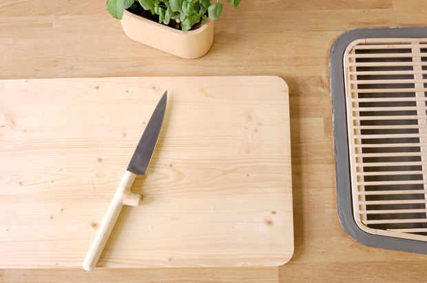
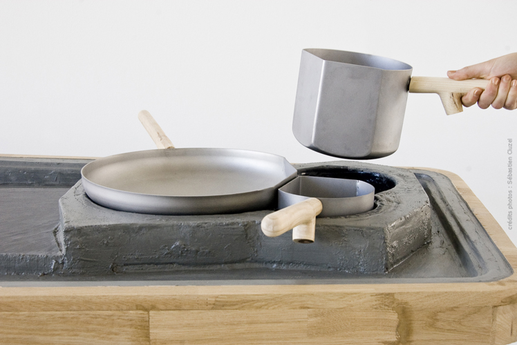
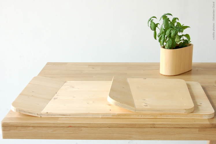
This minimalistic kitchen workstation is a student project by Sébastien Cluzel of the École Supérieure d’Art et Design de Saint Étienne. The piece, called Culinary Landscape, is comprised of four essential parts – preparation area, water station, cutting board, and stove. Everything you can realistically need for cooking is incorporated in this design – cutlery, cookware and even herbs. The designer used interesting and innovative materials; thus, the sink is made from Ductal (a fiber reinforced form of concrete), and the stove is constructed out of soapstone. Other materials include wood, laminated plywood and cons (oak and pine), stainless steel. All are sustainable and functional choices.
The subtle humor of these pieces made me look. The Inside-Out storage furniture from FreshWest design studio features an unusual decorative approach – while concealing the contents inside, it also showcases their contours on the outside. The line includes bathroom and drink cabinets. Made from an aluminum composite, the pieces can be painted in different colors. The design on the doors is routed into a paint finish, allowing the silver edge of the aluminum to shine through.
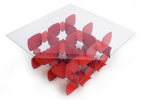
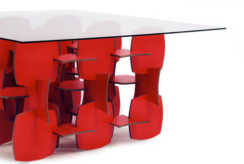
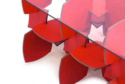
Fun, flat-pack and DIY – this table has it all. Designed by Patrick Carmody and Kfir Shetrit of OCD (which stands for Obsessively Crafted Design), the Mudo table is a great example of a 3d structure that can fold completely flat when stored or transported. The piece is cut out of a 1/4″ thick sheet of Masonite and covered with plastic laminate on both sides. The manufacturing process leaves very little waist, which can give you satisfaction of owning an eco-conscious piece of furniture. Not to mention the joy of assembling it yourself. Hard to beat that…
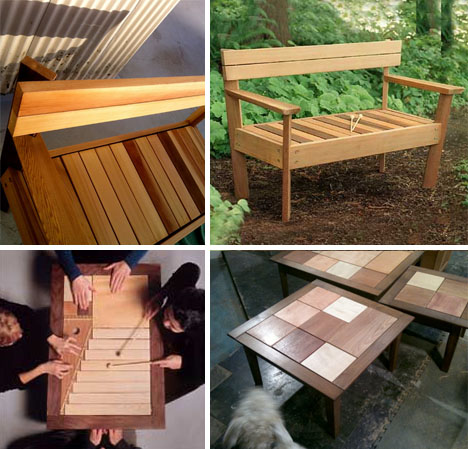
This delightful project belongs to Tor Clausen, who decided that silent pieces of furniture aren’t just larky enough. His designs feature musical instruments (bongs, chimes, bells, drums, cymbals, etc.) underneath the wooden surfaces. The line ranges from chairs and benches to chests and tables, and each of them can be played. Watch the video and see for yourself. You might discover you too have an ear for designy furniture…
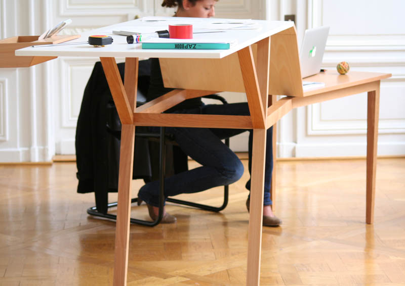
There is a theory that standing while working at the computer is good for our health. There is also a theory that the opposite is true. While this great egg controversy is taking place, young French designer Jérémy Guénolé created a desk that allows to alternate the two approaches. The piece, called Postures, features different levels and encourages movement, which cannot be bad for anyone. ‘Starting from different work situations of a creative, I drew a range of hybrid furnitures that comply with the concept of wellness.’ – says the designer.
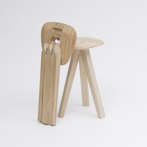
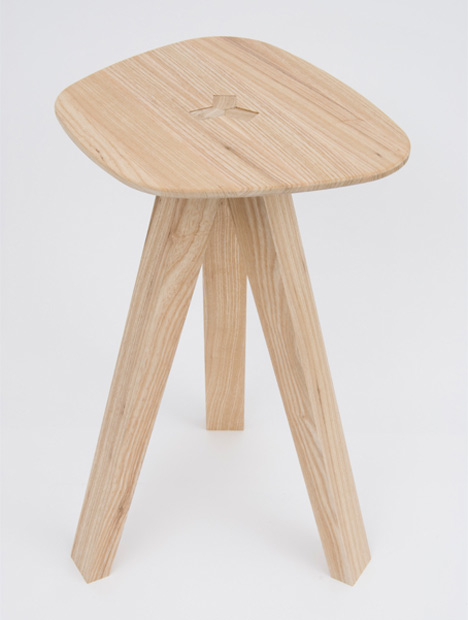
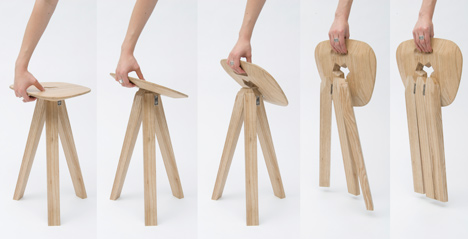
This clever folding stool by Jack Smith was recently presented at the Royal College of Art show in London. The stool folds away neatly when lifted by one side. When the piece is unfolded, three hinged legs fit perfectly into a y-shaped hole in the seat. As weight is placed on the frame, the legs get pinched together creating a stronger join. So, the heavier the load the stronger the stool. Brilliant!
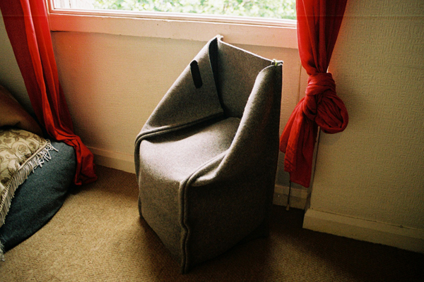
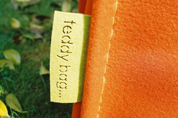
London based designer Andrew Millar created this fun storage/seating hybrid, called Teddy Bag. Made from 100% natural wool material, the piece is completely recyclable and biodegradable. In addition to its obvious eco-friendliness, the item wins many space-saving points. Envisioned as flexible storage for kid’s room, the Teddy Bag holds clothes and soft toys, promoting tidiness at an early age. It can also be incorporated into an adult interior (which is to say – I want one).
The Piano hanger, designed by Patrick Seha for the Belgian company Feld, is completely flat when not in use. When you need to hang something – you can unfold numerous wardrobe hooks on the different levels of the panel (so, the piece is child-friendly as well). The fold mechanism functions according to a simple principle – when one side is pressed down, the other one moves upwards. Just like a piano…

