This cool children’s dresser by Peter Bristol has drawers that are shaped as their predetermined contents. Called Training Dresser, the piece comes in two gender specific designs. Beautiful, fun, promotes tidiness, made from all kid-friendly components… Here is how the designer describes it: ‘Like Dr. Suess and Pixar, the Training Dresser is for more than one audience. The informative drawers create an engaging dresser for kids and an iconic furniture piece for parents.’
This piece from British designer John Green is so multifunctional, I cannot say affirmatively what it is. Depending on your needs, it can be a coffee table, a magazine rack, a media storage, a laptop table, a stool, a bench, a kid’s desk, even a tray for breakfast in bed. It is called Embrace, because of the two pieces that are ’embraced’ together to form a storage space in between. The item, a proud winner of several awards (including Grand Designs Awards Product of the Year’11), was presented during this year’s New York Design Week.
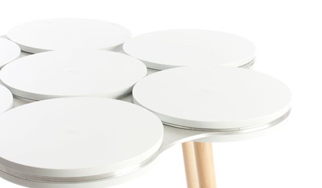
If you are in New York this weekend – do visit the American Design Club‘s ‘Use Me’ exhibition in NoHo. I just have and I saw this brilliant thing there – the Link table by Milwaukee-based designer Peter J. Pless. Seven rotating discs are connected via metal panels, which in turn transform this mobil tabletop into various shapes. Slim elegant wooden legs support the structure. Link will make an excellent occasional or entry table. I really hope that talented Mr. Pless decides to make a coffee table version as well.
Jigsaw is a modular coffee table designed by Belgian designer Linde Hermans for Mooz. It is comprised of four independent angular pieces that can be arranged into different configurations or placed separately around your home. These L-shaped wedges can be used as handy companions to the furniture you already have, because they fit perfectly around corners. Manufactured from a single piece of steel, the Jigsaw table is minimalistic and adaptable. Smart stuff!
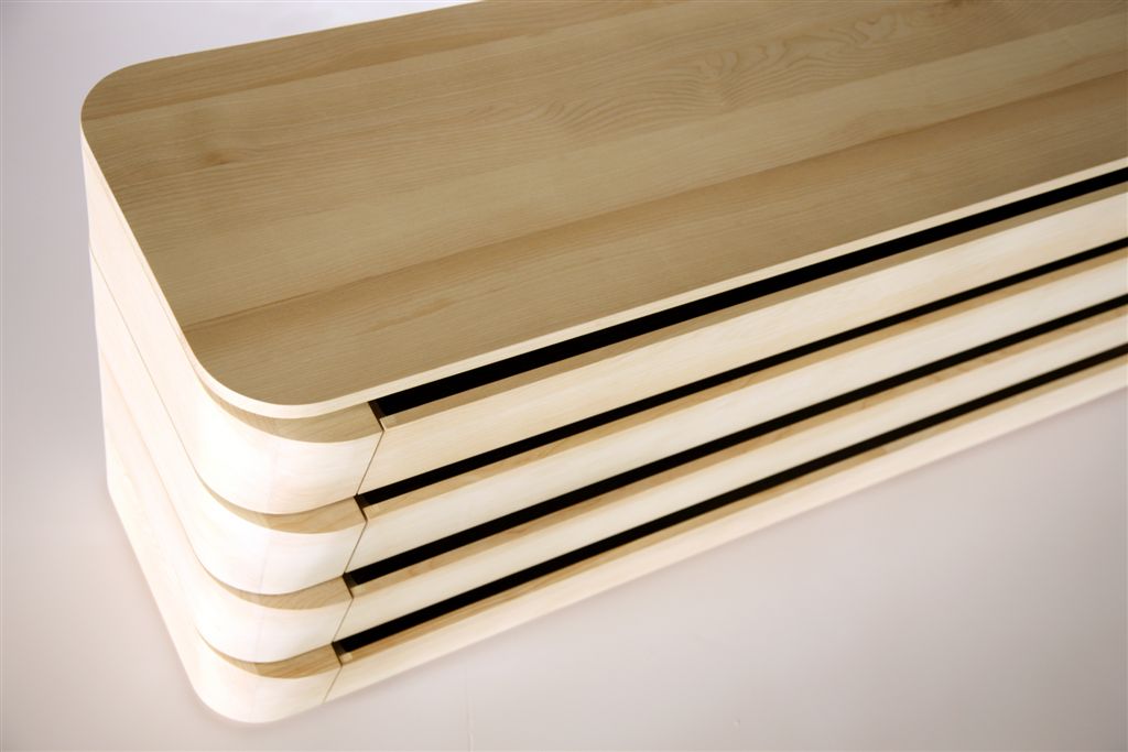
This minimalist dresser caught my eye not only because of its simple and aesthetically pleasing form. It opens in both directions, which makes it an ideal room divider for a small space. The Yabane dresser, created by Paris-based design studio A+A Cooren, was revealed during Milan Design Week. An inspiration for the piece came from the traditional ‘Yabané’ Japanese graphic pattern (meaning ‘arrow’ in Japanese). Made from ash wood.
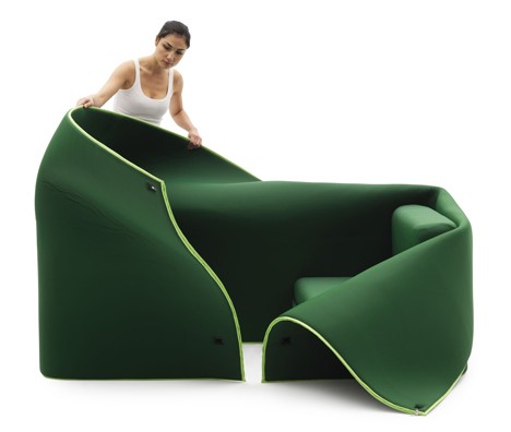
The only constant thing in our life is change. It dictates the way we look at the things that surround us. Milan-based designer Emanuele Magini created a piece of furniture for Italian brand Campeggi perfectly in tune with this desire for change and adaptability. The sofa, called Sosia, consists of two sits wrapped in a piece of fabric. By manipulating these three components we can achieve several looks and configurations. The sits can be pushed together to create a daybed, they can be pulled apart to make two separate chairs, the fabric can be zipped over the chairs for privacy or draped around them in various ways. You get the picture.
Small Kitchen is an innovative space-saving solution from German designers Kristin Laass and Norman Ebelt. It is intended to combine all kitchen essentials – stove, cooktop, refrigerator, sink, prep surface, storage, dinning table – into a 1m² structure. All this was possible thanks the clever layered design – different parts of the Small Kitchen are rolled out to reveal the rest. Efficient and very impressive! It is hard to believe that the piece was one of the student projects presented at the DMY International Design Festival’10 in Berlin.
This thing of beauty is called Sullivan/Barnes Table and made by Con Form Lab. On an average night it can accomodate six people, but when a party is in plans – the table expands to sit as many as ten. The expanding mechanism is fully integrated, so all you need to do is pull the tabletop from both sides. Thanks to perfectly fitted slots – the table changes its size (and its density) with one fluid movement. All parts are made of plywood, so Sullivan/Barnes table is not only a looker and a wonder of practicality, it is also ecologically agreeable.
We love our pets to bits and share everything with them. So why, when it comes to rocking chairs, we should get all the fun? Rocking-2-gether by Paul Kweton fixes the injustice. The piece is a rocking chair and a pet bed combined. Here is how the designer describes it: ‘The “merge” & “morph” manipulation of the old school rocking chair and doghouse generates a hybrid “furniture” that combines the idea of shelter and body relaxation and pushes its functionality to a different, more personal level.’ So there you are – a dual function both you and your pet will love.
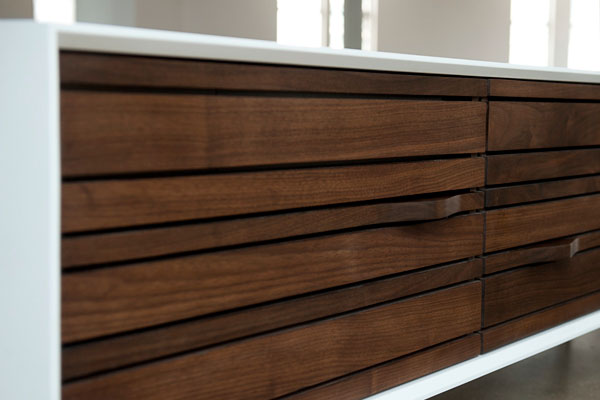
This retro-looking credenza from RAAD studio is not only an inspired piece of design, made to give your space that awesome mid-century vibe. There is a high-end stereo system incorporated into the piece — a solution to all of those hideous stereos and speakers. The cabinet itself is fitted with speakers and at the same time serves as a storage unit. So, no more unsightly music equipment miscellany, and no more wires and cords scattered on the floor. Everything is concealed inside this elegant, hand-crafted living room cabinet.


