Two Danish design school students Anne Ahrendt Futtrup and Anita Johansen created this adorable thing, called The Starling Box. This table/storage combination can save space, but what it also does is make you feel like a kid on a treasure hunt. As you explore the labyrinth of the twisted tabletop – you discover bright boxes that are both intriguing and functional. The Starling Box is made from MDF and solid beech, oak veneer, and a colorful palette of felt.
Source: Abitare
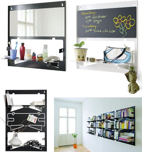
Fold them down when you need an extra storage, flip them up when you don’t – this is the idea behind the Piegato, a mobile storage system, created by Matthias Ries for Serafini. These colorful metal shelves are as minimalistic as can be. Easy to install, fold flat, provide storage while taking zero space for themselves… They come as individual units or as sheets of three (for creating bigger configurations). In addition to all this goodness, the unused Piegato shelves serve as an interesting aesthetic accent on your wall. As rightly stated by Dornob, these shapes become somewhat iconic – a passive element of decor.


There is something distinctly architectural about this piece – a wooden side table with acrylic windows looks like a miniature building. Designed by Teddy Luong in collaboration with Dennis Cheng for Umbra, the Condolisa table provides more than just a place for your teacup and a book. It has compartments for storage inside, which can hold books, magazines, pillows, throws, – you name it. The frosted acrylic windows add visual interest and also give the subtle view of the stored items. The removable lid works as a surface. Thus, the Condolisa side table is multifunctional and minimalistic – the two M’s we, shoebox dwellers, appreciate the most…
Children’s furniture is an investment. I am yet to meet a parent who would not want the safest, prettiest, fluffiest items imaginable for the baby’s room. However, while no expenses are speared for accommodating your child’s needs and wants, the question remains – how to make these expenses count in the long run? This clever collection from Castor & Chouca could provide an answer. These pieces grow with their owner and transform from cutesy baby things into more adult items. Thus, a crib becomes a desk for a schoolchild; a toy cabinet goes under the work station in a form of a storage unit; and a child’s bed is transformed into a lounging sofa that would not embarras a socializing teenager. All pieces are eco-friendly and made from sustainable and recyclable materials.
We, urban dwellers, constantly struggle to come up with compact and functional bike storage. This unusual piece goes beyond simply providing a place for your two-wheeled friend, it puts your bike to work! Created by Store Muu Design Studio, the PIT IN bike desk utilizes the bike saddle, turning it into a chair. Made entirely from plywood, the piece is fairly light and easily movable. Skeptics might argue that a bike seat makes the most uncomfortable chair imaginable. However, if you are not planning to write a novel and just want to take a coffee break and check emails, the PIT IN desk will serve you well.
Source: bookofjoe

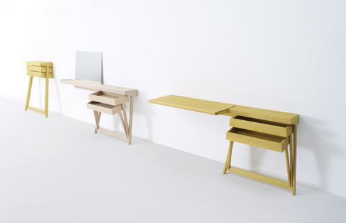
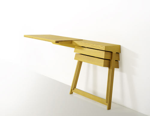
When designer Shay Alkalay created his first Pivot cabinet for Arco in 2008, it became an instant hit. The simplicity, paired with the space-saving qualities, earned this piece a well-deserved recognition. It even received the Dutch Design Award, 2008 in ‘best residential product’ category. Recently the Pivot family expanded. The new Pivot desk and vanity table were added to the line. The objects exhibit the same minimalistic approach to space and form. And because the drawers are hinged together, they can be opened at the same time, – a convenience most traditional cabinets cannot match.
Source: Design Milk

Have you ever been tired of neat surfaces, familiar shapes and rows upon rows of identical drawers? After all, ‘variety is the whatnot of thingamajig,’ as one of my friends likes to say… This furniture collection from Folkform, called Unique Standard, celebrates variety on several levels. Designers Chandra Ahlsell and Anna Holmquist played with shapes, and also with the use of materials. The collection shows what happens when the original material is combined with surfaces that try to imitate its appearance. For example, the piece above, the chest with 18 drawers, was made of Masonite and birch wood. Other combinations include Carrara Marble/marble laminate, granite/MDF, original leather from Danish designer Arne Jacobsen’s Swan Chair/synthetic leather imitation used in car seats. So, you can delight your visual and tactile senses with the contrast between noble and basic, exclusive and cheap, unique and standard.
Source: MoCoLoco
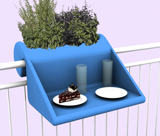
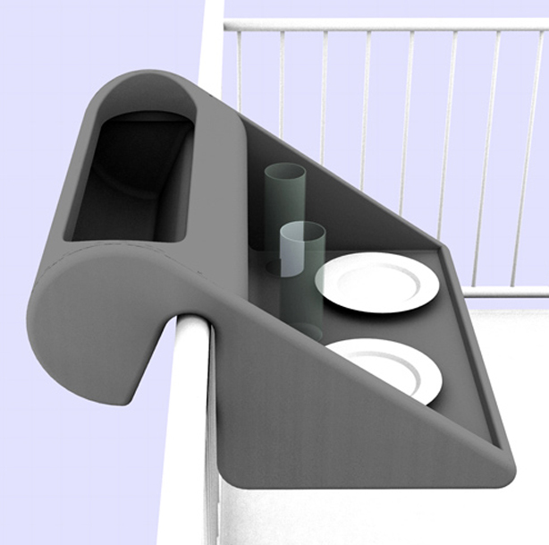
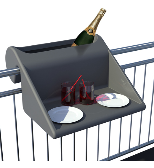
If you own a balcony – you are among the lucky shoebox dwellers who are able to enjoy this item. This over-the-balcony table with an integrated planter from Rephorm can function well in small spaces where there might not be enough room for both. The piece is made of weatherproof recyclable PE, the raised side surfaces offer protection from the wind. The size of this planter/table (width: 60cm / depth inside: approx 40cm) is small enough for even a very modest balcony. And if you are terrible at growing things – you can always use the planter part for additional storage.
Source: Urban Gardens
If you are a Harry Potter geek – this piece will appeal to you on several levels. There is something distinctly Potteresque about the whole concept. This unusual cabinet has no shelves, doors or drawers. To store an item you have to push it into the wooden beams, and a solid volume opens up when objects are stored within it. Designer Chung-Tang Ho envisioned the Push and Store cabinet as a sculpture, where your items are participants in the act of creation.
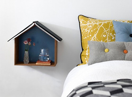
This unusual shelf from Fern Living, called Studio 1, beautifully doubles as a wall decoration. If displayed on a wall in several different sizes and colors, it creates a cute skyline (with the possibility of storage and/or display). You can also use it as a bedside reading nest. It can house your alarm clock, a glass of water and some other small items. The ‘roof’ can serve as a bookmark. With its size and openness, Studio 1 also promotes minimal, clutter free approach to storage.
Source: Better Living Through Design


