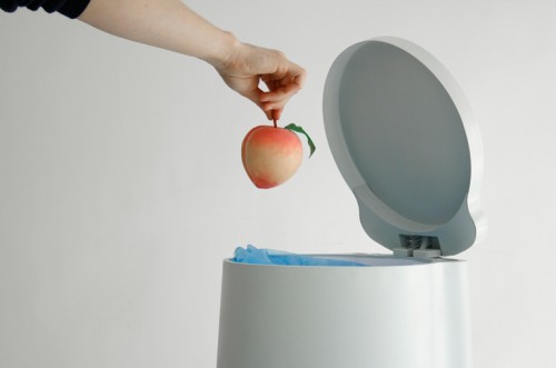
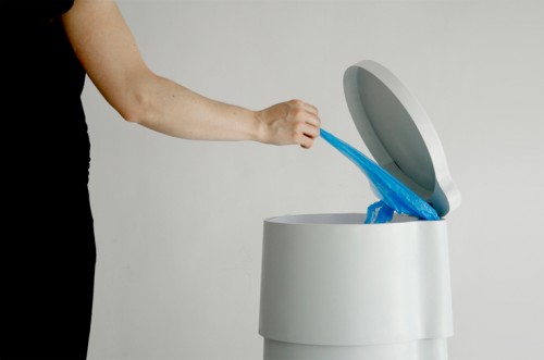
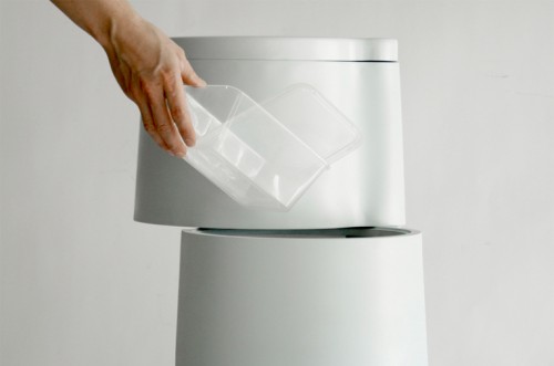
Garbage disposal is a prosaic process, but unless it is properly organized, nothing poetic is possible. And Tri3 by Paris based designer Constance Guisset is an organizational beauty, allowing for this process to go smoothly. The piece is essentially a trash bin and a recycling station in one. It consists of three parts (hence the name): the top segment is meant for organic waste, the middle one pivots to the side and stores plastic litter and the bottom compartment, the biggest one of the three, is dedicated to glass. All three parts are brought to movement by their respective pedals on the bottom. The disposable bags are stored under the hood. The vertical shape of Tri3 is not only attractive to the eye, it also saves space, allowing vertical storage. I also like the fact that the organic waste compartment is small enough to ensure frequent removal.
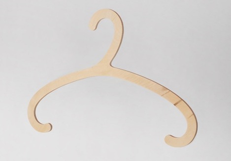
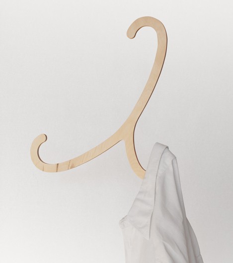
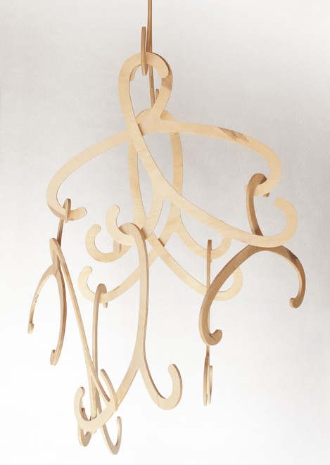
Can a hanger become a decorative element? Vilnius based designer Julius Bucelis argues that it can. His sleek and beautiful Hook hanger can serve this purpose aside from holding clothes. Thanks to its curvy shape, each piece can also be used as three hooks (hence the name). And when utilitarian duties are over, several Hook hangers can form a pendant. Triple function done right.
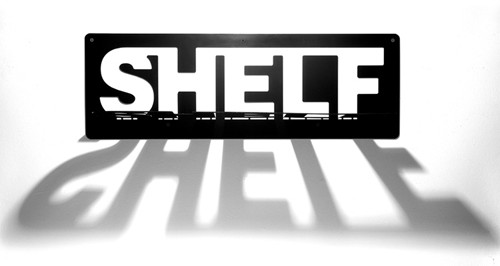
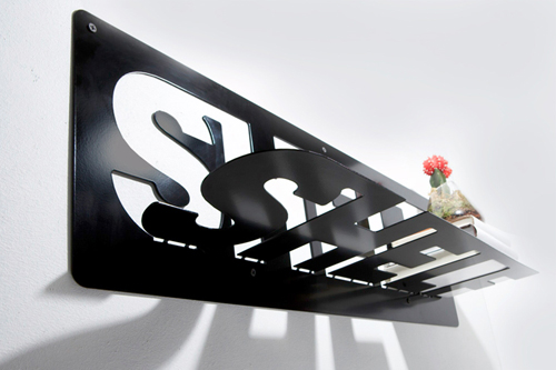
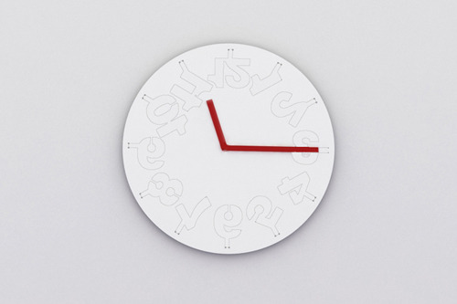
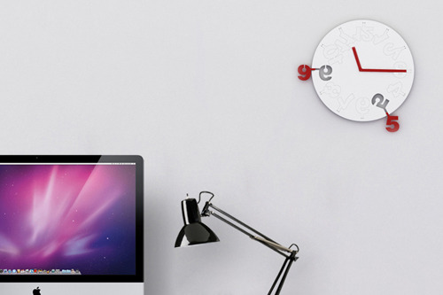
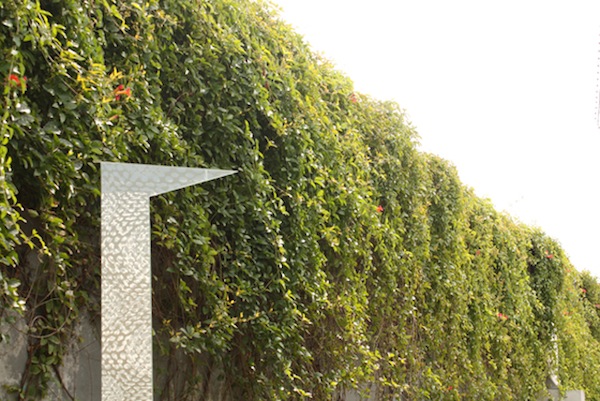
Flat-pack designs are very popular today, and there is a reason for it. They minimize the manufacturing efforts, reduce shipping costs and allow us to save space. And they also promote creativity. Just look at this collection by Ufuk Keskin! Called Flatobjects, the line consists of three pieces: Typeshelf – a type nerd’s delight and my personal favorite; Timewarp – a wall clock with laser cut numbers on the face that are ready to be bent; and Highrise – a dual function object which can be used as a vase or wall accessory. The collection is currently on display at the New York International Gift Fair until August 18.
People used mirrors and fake doors to create an illusion of bigger spaces since the dawn of time. Designer Sarah T. Kang suggests us to use both. Her clever mirror design, named Glimpse, creates effect of a door, leading to another room. The reflection and movement you might catch in the mirror completes the deception.
‘The door half opened always stirs up a sense of seduction and curiosity within us, – says Kang. – Inspired by these ordinary yet inexplicable moments in our daily lives, I designed a mirror that gives an illusion of a door opening on any given surface.’
Here is a concept that goes beyond aesthetics and functionality. It actually expresses a point of view. This optical illusion, turned into a bookshelf, is a reminder that ideas can be misinterpreted when passed from one end to the other. Created by ClarkeHopkinsClarke, the Bias of Thoughts bookshelf was inspired by the famous 2D drawing of the optical illusive bookshelf. Here is how the notion of the piece is explained by designers: ‘Thoughts are biased. When ideas are passed from one person to another, due to the transfiguration of the communication process and the frame of mind of the receiver, they are always perceived with bias.’ The Bias of Thoughts bookshelf is strong enough to withstand books and iPads, as well as hanging magazines.
There are different ways to achieve seclusion and solitude. This one literally allows us to rise above things. This desk, called Consider One’s Place, from Japanese creative office Fift looks suspiciously like a ladder. And it can definitely serve as one. But unlike your average ladder, it has a seat and a laptop holder on its top. So, no matter whether you feel antisocial or just want to elevate your creative thinking, you can climb on top of one of these and reclaim your space. I wonder how the Consider One’s Place desk will affect one’s mood and productivity.
Parents beware – this adorable thing might turn your house into the most popular sleepover spot in town. Designed by photographer Yusuke Suzuki, this portable bed, called Child’s Play, is built to delight, entertain and, hopefully, lul to sleep your precious youngsters. Complete with the mattress cover and duvet pages, this ‘book’ has the generous size of two twin beds put together. So, no luxury has been speared. And what a better way to plant the right idea into the future avid reader’s mind?..
Source: Snoop
Collecting things is one of the basic human conditions, and flaunting them is one of the known joys. In a small space, however, doing so could be tricky. Display furniture often costs a lot in square footage and provides little function. Unless it can perform other roles. This collector’s table from the New York-based architect John Berg is a great example. A walnut frame supports two sheets of glass; the collector’s treasures float in between. The top sheet of glass slides from side to side to allow for object placement. The shape of the piece has a slight retro flair, which makes this clever table a display-worthy item by itself.
You know what they say – all things are temporary, unless they were designed by Charles Eames. This chair was not. However, there is something unmistakably Eamesian about the shape and the use of the materials. The Shrimp Armchair, designed by Jehs+Laub for Cor, is a new twist on the universally loved classic. The piece appeals to all human senses with its elegant curves, firm support, and refined workmanship. As Design Milk pointed out, the leather looks as though it sinks directly into the plywood, which creates the effect of lightness. Truly mesmerizing piece of design. And who knows, maybe in half a century the Shrimp Armchair will be the one to emulate.
Here is an idea – furniture inspired by puzzles. And not just any puzzles – burr puzzles, assembled without a single nail or fastener. The result – a collection of beautiful pieces, made of natural, ecological materials, with no high-tech and no harmful glues. The project belongs to the Bulgarian studio Praktrik and created by the designer Petar Zaharinov, who sees big utilitarian and environmental potential in this puzzle idea. All items are sold in pieces that can be assembled and disassembled if not exactly with ease, but definitely with a lot of fun.


