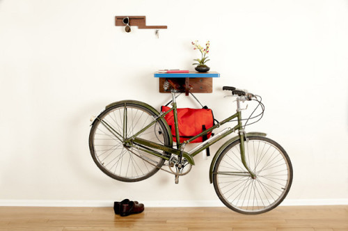
The Bike All shelf by Colorado based studio Board by Design is an interesting transition between a bike hanger and a bike stand. The piece doesn’t keep your bike fully suspended in the air – one wheel still touches the ground. But with the saddle firmly parked under the shelf, it is a sturdy solution. And, because the saddle part is common for all bikes, the shelf is compatible with all bike models. Available in two natural woods, the Bike All comes with all the necessary mounting hardware. Available for purchase here.
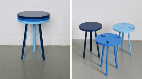
Modest Stool by French designer Paul Menand is a clever nesting design that follows the same principle as the one we saw in Menand’s Tripplette Chair, featured in one of my previous posts. Again, the piece can be used as a single stacked item or taken apart and function as three individual ones. The bottom and middle stools feature slots that allow to fit the components into each other. And the half pipe legs make the stacking process seamless. Watch the video after the break to see Modest Stool in action.
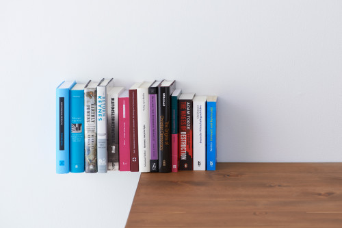
This clever little shelf/bookend has been created by Tokyo based design studio YOY. The piece, called Extend, can be attached to a desk or to an existing bookshelf in order to generate some extra space. With the books in place, Extend becomes invisible and creates an illusion of books floating in the air. Beautiful. The piece is made from powder coated steel.
http://youtu.be/ltuMA80ka4g
In a tiny space having a full size bed and a full size desk is a rare combination. Unless some clever thinking is involved. Hers is an interesting idea from Baltimore based designer Graham Phakos – Urban Desk. The spacious desk is hidden underneath a double bed. As the bed pivots to lean against the wall, the desk is lifted to the appropriate height. The arrangement also makes room for extra storage – always a welcome addition to any urban dwelling. The piece is only a concept at this point. I really hope it finds its way to production.
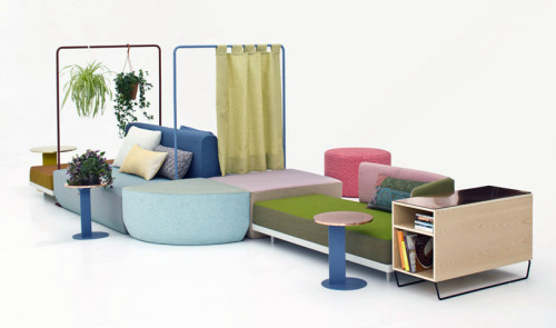
Bikini Island by German designer Werner Aisslinger, created for Italian furniture brand Moroso, is a new approach to a living room couch. Instead of traditional mono-directional sofa, facing the common TV screen, this modular item can be arranged to accommodate different space uses.
Here is how designer describes his idea: “Life in the living room has changed quite a lot recently: families and their kids are ‘chilling’ with different activities: reading, downloading files, writing emails, gaming, chatting with friends, watching movies on a pad, relaxing, talking, thinking, meditating… The easy to arrange bikini-sofa landscape invites to find ones own composition due to space and activities.”
The piece is comprised of various soft volumes of three different heights. Additionally, small storage items, coffee tables, bookshelves, and other accessories can be integrated into the unit. The curtains allow to isolate certain segments and provide privacy – perfect for a single-room layout.
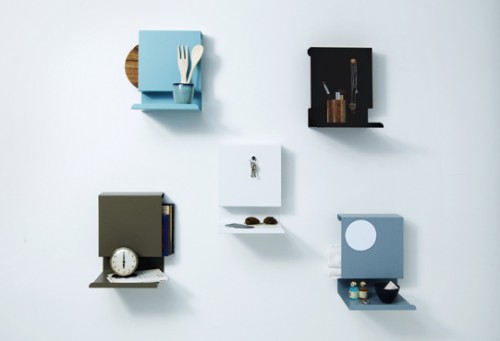
This cool and versatile shelf from Danish design studio Linde&Linde takes very little space while providing a convenient solution for many storage scenarios. The item is perfect for entry area, kitchen, bathroom, home office, even by your bedside… Made from powder coated metal, it can also double as a magnetic board. The variations are endless. The shelf comes in a variety of neutral colors.
Editor’s note: This is a guest post from Donald M. Rattner.
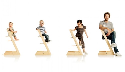
In 1972, Scandinavian designer named Peter Opsvik took it on himself to revolutionize the design of infant high chairs after watching his son’s struggles with table eating. The result was the Tripp Trapp Convertible High Chair.
Opsvik’s thoughtful response to the challenges of early eating stages was to more fully engage the child with loved ones by making it possible to slide the chair right up to the table without an intervening tray. Presciently, he also designed the chair to accommodate growth by making its various parts adjustable, thus anticipating today’s cradle-to-college design philosophy and its associated environmentalism.
Winner of multiple awards, the Tripp Chair was selected as the signature piece at MoMA’s 2012 exhibition “Century of the Child”. Check out the wonderful video produced by the museum. Purchase here.
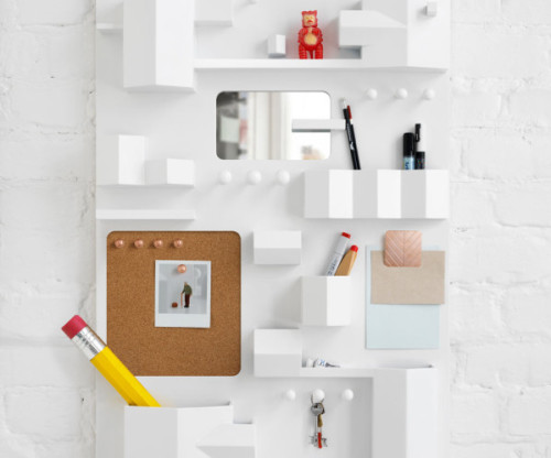
I’m a big fan of Note studio designs, and this one is especially delightful. Suburbia is a wall storage, created for Italian brand Seletti. The piece is made to resemble the bird’s-eye view of a town. Each cubby represents a house or a section of a building. Adorable! The piece is made from wood with brass details.
(via design-milk)
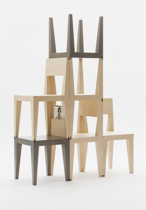
Seating and storage are the things any home needs more of. So Sweden based designers Kyuhyung Cho and Hironori Tsukue obliged and created the Oneness collection, consisting of two chairs and a low table that can be flipped, stacked and turned into a shelving unit. Designers explain their vision: “The multifunctional purpose and extendable system can enrich a variety of spaces from office to home, through its simple, combinable and modern form inspired by the fusion of East Asian and Scandinavian design.” The assembly is easy and intuitive – the structure is fixed by connecting each element with a clip inserted into small holes on the corners of the chair or table. This way you can build your storage as high and wide as you like by adding more chairs and tables. When the chair is turned upside down to make a shelf, it reveals a hidden space on the bottom of the back for books and other small objects. Oneness is made from Finnish natural birch plywood.
The D*Table, by The D*Haus Company, is a concept I’m really hoping to see produced. Composed of four components, the piece can be arranged into eight different shapes, allowing you to customize it according to your needs and space requirements. The parts are connected to each other via removable hinges, so you can take the table apart just as well. There are various storage compartments you can find in each segment – drawers, shelves, slots for books and magazines, even a hole for a plant. Nothing seems to be overlooked here. D*House had taken the idea for the table from the works of mathematician Henry Ernest Dudeney, who discovered that we can turn a perfect square into an equilateral triangle (and many other shapes in between), by segmenting it into four pieces. Designers are now trying to apply this same principle to architecture. Check out their Kickstarter campaign to read more about the project and to reserve a table of your own.
(via design-milk)
