Half lamp, half bookshelf, all brilliant… Called Readme, the piece belongs to German designer Peter Böckel. The shape of this unusual object resembles a lampshade with some characteristics of a small chest. The elegant hybrid includes two storage levels, one inside the ‘shade’ and another one – on top. The business part of Readme is made of steel and supported by four maple legs; the light is coming through the translucent top surface. The piece will be presented at DMY Berlin this week.
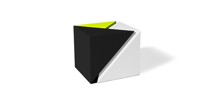
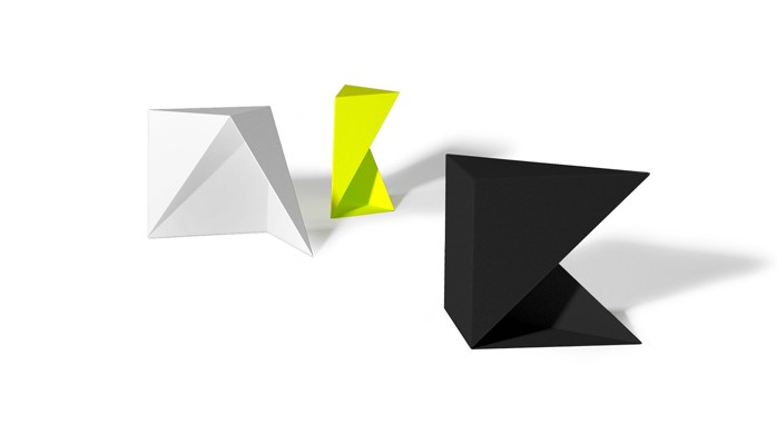
The 3:1 table is a cool creation by Chicago based studio TJOKEEFE. Their signature is in playing with geometry and distilling an object down to its essential parts. Powerful form and efficiency is what TJ O’Keefe, the founder of the studio, strives to achieve. This table, for example, is a clever geometric set of nesting tables, each of which can function independently. Even if scattered around the room, the pieces ‘interact’ with each other, creating a visual tension. The 3:1 table is made of matte powder-coated aluminum.
We all have something to conceal, have we not? Valuables, personal correspondence, bad habits, embarrassing sentimentals… The Secret Stash project by Yi-Ting Cheng will show us how to conceal in style. Hiding our things in plain sight by utilizing stereotypes and visual camouflage – is the general idea behind these pieces. Here is what designer has to say about this beautiful minimalist collection: “We make judgments based mainly on our experiences and what we see. This dependency on visual information can create large blind spots. Thus, usual stereotypes of how we perceive solid, transparency and lighting are employed in this project to play with notions of ‘solid and void’, and ‘true and false’.”
HT Mocoloco
Scratching furniture for cats is like sport for humans. They pride themselves on it. And when you are trying to renegotiate the immunity of your new couch and offer your cat toys and boards instead, – s/he thinks you are just being silly. This collection from Czech Republic company Catworks can provide a mutually acceptable solution for you and your cat. The alphabet-inspired line of functional pieces will look good around the house and channel feline enthusiasm at the same time. Every piece is equipped with a scratchy board and can be used as a side table, stool, accent object, you name it. With several colors available, you can easily incorporate Catworks into any room.
Source: 2 Modern Blog
We, urban dwellers, constantly struggle to come up with compact and functional bike storage. This unusual piece goes beyond simply providing a place for your two-wheeled friend, it puts your bike to work! Created by Store Muu Design Studio, the PIT IN bike desk utilizes the bike saddle, turning it into a chair. Made entirely from plywood, the piece is fairly light and easily movable. Skeptics might argue that a bike seat makes the most uncomfortable chair imaginable. However, if you are not planning to write a novel and just want to take a coffee break and check emails, the PIT IN desk will serve you well.
Source: bookofjoe
Here is a concept that goes beyond aesthetics and functionality. It actually expresses a point of view. This optical illusion, turned into a bookshelf, is a reminder that ideas can be misinterpreted when passed from one end to the other. Created by ClarkeHopkinsClarke, the Bias of Thoughts bookshelf was inspired by the famous 2D drawing of the optical illusive bookshelf. Here is how the notion of the piece is explained by designers: ‘Thoughts are biased. When ideas are passed from one person to another, due to the transfiguration of the communication process and the frame of mind of the receiver, they are always perceived with bias.’ The Bias of Thoughts bookshelf is strong enough to withstand books and iPads, as well as hanging magazines.
There are different ways to achieve seclusion and solitude. This one literally allows us to rise above things. This desk, called Consider One’s Place, from Japanese creative office Fift looks suspiciously like a ladder. And it can definitely serve as one. But unlike your average ladder, it has a seat and a laptop holder on its top. So, no matter whether you feel antisocial or just want to elevate your creative thinking, you can climb on top of one of these and reclaim your space. I wonder how the Consider One’s Place desk will affect one’s mood and productivity.

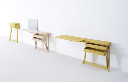
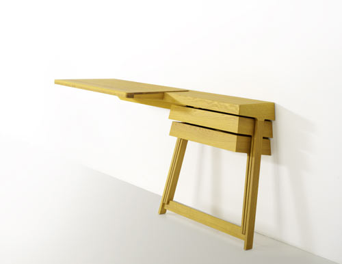
When designer Shay Alkalay created his first Pivot cabinet for Arco in 2008, it became an instant hit. The simplicity, paired with the space-saving qualities, earned this piece a well-deserved recognition. It even received the Dutch Design Award, 2008 in ‘best residential product’ category. Recently the Pivot family expanded. The new Pivot desk and vanity table were added to the line. The objects exhibit the same minimalistic approach to space and form. And because the drawers are hinged together, they can be opened at the same time, – a convenience most traditional cabinets cannot match.
Source: Design Milk

Have you ever been tired of neat surfaces, familiar shapes and rows upon rows of identical drawers? After all, ‘variety is the whatnot of thingamajig,’ as one of my friends likes to say… This furniture collection from Folkform, called Unique Standard, celebrates variety on several levels. Designers Chandra Ahlsell and Anna Holmquist played with shapes, and also with the use of materials. The collection shows what happens when the original material is combined with surfaces that try to imitate its appearance. For example, the piece above, the chest with 18 drawers, was made of Masonite and birch wood. Other combinations include Carrara Marble/marble laminate, granite/MDF, original leather from Danish designer Arne Jacobsen’s Swan Chair/synthetic leather imitation used in car seats. So, you can delight your visual and tactile senses with the contrast between noble and basic, exclusive and cheap, unique and standard.
Source: MoCoLoco
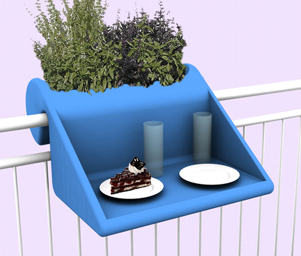
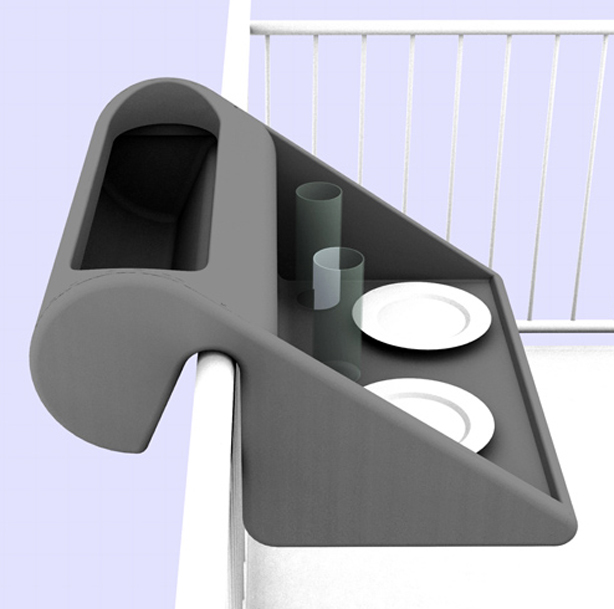
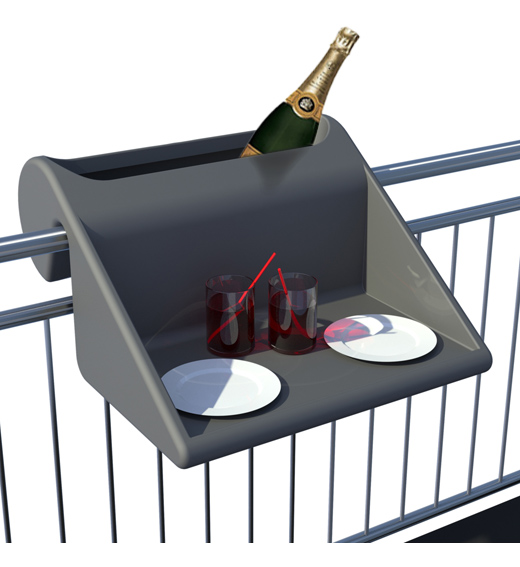
If you own a balcony – you are among the lucky shoebox dwellers who are able to enjoy this item. This over-the-balcony table with an integrated planter from Rephorm can function well in small spaces where there might not be enough room for both. The piece is made of weatherproof recyclable PE, the raised side surfaces offer protection from the wind. The size of this planter/table (width: 60cm / depth inside: approx 40cm) is small enough for even a very modest balcony. And if you are terrible at growing things – you can always use the planter part for additional storage.
Source: Urban Gardens
